利用pyecharts读取csv并进行数据统计可视化的实现
因为需要一个html形式的数据统计界面,所以做了一个基于pyecharts包的可视化程序,当然matplotlib还是常用的数据可视化包,只不过各有优劣;基本功能概述就是读取csv文件数据,对每列进行数据统计并可视化,最后形成html动态界面,选择pyecharts的最主要原因就是这个动态界面简直非常炫酷。
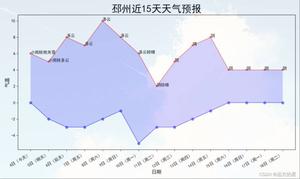
先上成品图:
数据读取和数据分析模块:
#导入csv模块
import csv
#导入可视化模块
from matplotlib import pyplot as plt
from pylab import mpl
import numpy as np
import random
from pyecharts import Line,Pie,Grid,Bar,WordCloud
#指定文件名,然后使用 with open() as 打开
python_file = 'haiyang.csv'
#filename = 'release/111.csv'
#python3 LieCharts.py test_chart --python_file 'haiyang.csv'
with open(python_file) as f:
#创建一个阅读器:将f传给csv.reader
reader = csv.reader(f)
#使用csv的next函数,将reader传给next,将返回文件的下一行
header_row = next(reader)
for index, column_header in enumerate(header_row):
print(index, column_header)
#读取置信度
#创建置信度的列表
confidences =[]
#创建风险等级数组
highRisk = []
middleRisk = []
lowRisk = []
noRisk = []
person = []
#创建时间点
timePoint = []
#文件信息
fileInformation = []
#遍历reader的余下的所有行(next读取了第一行,reader每次读取后将返回下一行)
for row in reader:
# 下面就是对某一列数据进行遍历,因为项目保密,就不列出具体代码了,其实就是各种循环语句,大家根据自己的数据简单写一下就行
fileInformation.append('某某某某')
fileInformation.append(row[0])
fileInformation.append(row[1])
fileInformation.append(row[2])
fileInformation.append(len(confidences))
int_confidences = []
for i in confidences:
# 同上
len_noRisk = len(noRisk)
len_lowRisk = len(lowRisk)
len_middleRisk = len(middleRisk)
len_highRisk = len(highRisk)
len_person = len(person)
total = int(len_person+len_highRisk+len_middleRisk+len_lowRisk+len_noRisk)
if (len_highRisk > total/2):
# 同上
数据可视化模块:
pie_title = Pie('某某某分析报表', "", title_pos='center',title_top="1%",title_text_size=42,subtitle_text_size=20)
value=[10000,6181,4386,4055,4000]
wordcloud=WordCloud(width=30,height=12,title="某某某某信息",title_pos="22%",title_top="12%",title_text_size=32)
wordcloud1=WordCloud(width=30,height=12,title="某某:"+fileInformation[1],title_pos="22%",title_top="22%",title_text_size=26)
wordcloud2=WordCloud(width=30,height=12,title="某某:"+fileInformation[2],title_pos="22%",title_top="30%",title_text_size=26)
#wordcloud3=WordCloud(width=30,height=12,title="音频采样率:"+fileInformation[3],title_pos="22%",title_top="38%",title_text_size=26)
#wordcloud4=WordCloud(width=30,height=12,title="总时长/s:"+fileInformation[4],title_pos="22%",title_top="36%",title_text_size=32)
# wordcloud.add("",fileInformation,value,word_size_range=[20,100],rotate_step=3
# ,xaxis_pos=200,grid_left="1%",grid_bottom="50%",grid_top="5%",grid_right="80%")
#折线图
line=Line("某某某某某走势图",title_pos='center',title_top="51%",title_text_size=32,width=600,height = 20)
attr=timePoint
line.add("某某某某某",attr,int_confidences,legend_pos="85%",legend_top="54%",
mark_point=["max","min"],mark_line=["average"])
#饼图
attr=["某某某某", "某某某某", "某某某某", "某某某"]
v1=[len_highRisk, len_middleRisk, len_lowRisk,len_noRisk]
pie=Pie("某某某某某某某",title_pos="65%",title_top="12%",title_text_size=32,width=100,height = 100)
pie.add("",attr,v1,radius=[0,30],center=[71,35],
legend_pos="85%",legend_top="20%" ,legend_orient="vertical")
grid=Grid(width = 1800 ,height= 900)#调整画布大小
grid.add(line,grid_left="5%",grid_bottom="2%",grid_top="60%")
grid.add(pie_title,grid_bottom="10%")
grid.add(wordcloud,grid_left="1%",grid_bottom="50%",grid_top="5%",grid_right="80%")
grid.add(wordcloud1,grid_left="1%",grid_bottom="50%",grid_top="5%",grid_right="80%")
grid.add(wordcloud2,grid_left="1%",grid_bottom="50%",grid_top="5%",grid_right="80%")
#grid.add(wordcloud3,grid_left="1%",grid_bottom="50%",grid_top="5%",grid_right="80%")
#grid.add(wordcloud4,grid_left="1%",grid_bottom="50%",grid_top="5%",grid_right="80%")
grid.add(pie,grid_left="50%",grid_bottom="50%")
#grid.render()
grid.render(path='./release/XXXX.html')
根据需求这个还可以跨平台跨语言调用,比如C++程序调用python进行数据分析。
到此这篇关于利用pyecharts读取csv并进行数据统计可视化的实现的文章就介绍到这了,更多相关pyecharts读取csv可视化内容请搜索以前的文章或继续浏览下面的相关文章希望大家以后多多支持!
以上是 利用pyecharts读取csv并进行数据统计可视化的实现 的全部内容, 来源链接: utcz.com/z/362107.html