Python数据分析之Matplotlib的常用操作总结
使用准备
使用matplotlib需引入:
import matplotlib.pyplot as plt
通常2会配合着numpy使用,numpy引入:
import numpy as np
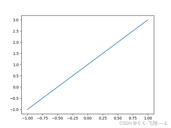
1、简单的绘制图像
def matplotlib_draw():# 从-1到1生成100个点,包括最后一个点,默认为不包括最后一个点
x = np.linspace(-1, 1, 100, endpoint=True)
y = 2 * x + 1
plt.plot(x, y) # plot将信息传入图中
plt.show() # 展示图片
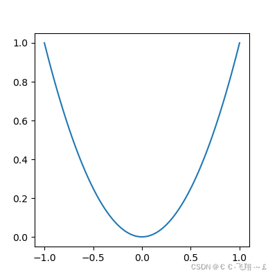
2、视图面板的常用操作
def matplotlib_figure():x = np.linspace(-1, 1, 100)
y1 = 2 * x + 1
y2 = x ** 2 # 平方
plt.figure() # figure是视图面板
plt.plot(x, y1)
# 这里再创建一个视图面板,最后会生成两张图,figure只绘制范围以下的部分
plt.figure(figsize=(4, 4)) # 设置视图长宽
plt.plot(x, y2)
plt.show()

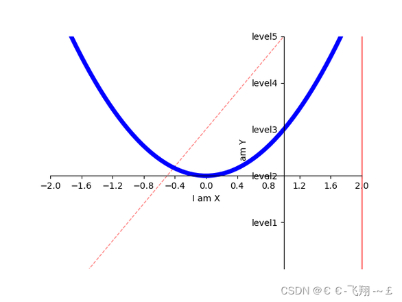
3、样式及各类常用修饰属性
def matplotlib_style():x = np.linspace(-3, 3, 100)
y1 = 2 * x + 1
y2 = x ** 2 # 平方
# 限制xy输出图像的范围
plt.xlim((-1, 2)) # 限制x的范围
plt.ylim((-2, 3)) # 限制y的范围
# xy描述
plt.xlabel('I am X')
plt.ylabel('I am Y')
# 设置xy刻度值
# 从-2到2上取11个点,最后生成一个一维数组
new_sticks = np.linspace(-2, 2, 11)
plt.xticks(new_sticks)
# 使用文字代替数字刻度
plt.yticks([-1, 0, 1, 2, 3], ['level1', 'level2', 'level3', 'level4', 'level5'])
# 获取坐标轴 gca get current axis
ax = plt.gca()
ax.spines['right'].set_color('red') # 设置右边框为红色
ax.spines['top'].set_color('none') # 设置顶部边框为没有颜色,即无边框
# 把x轴的刻度设置为'bottom'
ax.xaxis.set_ticks_position('bottom')
# 把y轴的刻度设置为'left'
ax.yaxis.set_ticks_position('left')
# 设置xy轴的位置,以下测试xy轴相交于(1,0)
# bottom对应到0点
ax.spines['bottom'].set_position(('data', 0))
# left对应到1点
ax.spines['left'].set_position(('data', 1)) # y轴会与1刻度对齐
# 颜色、线宽、实线:'-',虚线:'--',alpha表示透明度
plt.plot(x, y1, color="red", linewidth=1.0, linestyle='--', alpha=0.5)
plt.plot(x, y2, color="blue", linewidth=5.0, linestyle='-')
plt.show() # 这里没有设置figure那么两个线图就会放到一个视图里
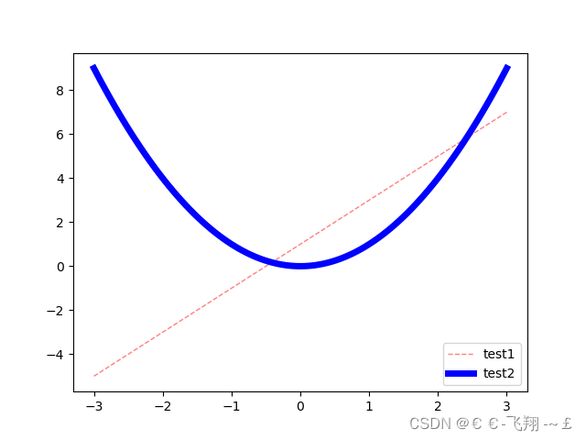
4、legend图例的使用
def matplotlib_legend():x = np.linspace(-3, 3, 100)
y1 = 2 * x + 1
y2 = x ** 2 # 平方
l1, = plt.plot(x, y1, color="red", linewidth=1.0, linestyle='--', alpha=0.5)
l2, = plt.plot(x, y2, color="blue", linewidth=5.0, linestyle='-')
# handles里面传入要产生图例的关系线,labels中传入对应的名称,
# loc='best'表示自动选择最好的位置放置图例
plt.legend(handles=[l1, l2], labels=['test1', 'test2'], loc='best')
plt.show()
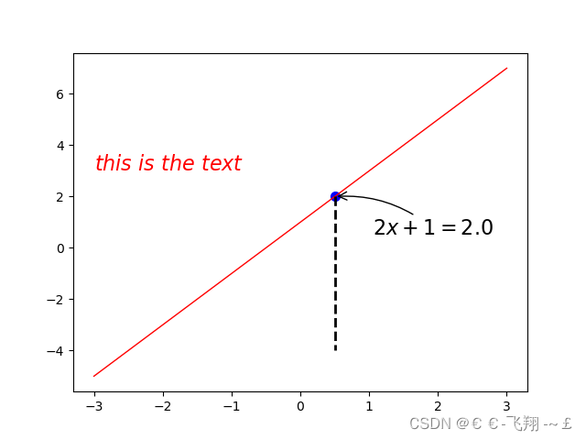
5、添加文字等描述
def matplotlib_describe():x = np.linspace(-3, 3, 100)
y = 2 * x + 1
plt.plot(x, y, color="red", linewidth=1.0, linestyle='-')
# 画点,s表示点的大小
x0 = 0.5
y0 = 2 * x0 + 1
plt.scatter(x0, y0, s=50, color='b')
# 画虚线,
# k代表黑色,--代表虚线,lw线宽
# 表示重(x0,y0)到(x0,-4)画线
plt.plot([x0, x0], [y0, -4], 'k--', lw=2)
# 标注,xytext:位置,textcoords设置起始位置,arrowprops设置箭头,connectionstyle设置弧度
plt.annotate(r'$2x+1=%s$' % y0, xy=(x0, y0), xytext=(+30, -30),
textcoords="offset points", fontsize=16,
arrowprops=dict(arrowstyle='->', connectionstyle='arc3,rad=.2'))
# 文字描述
plt.text(-3, 3, r'$this\ is\ the\ text$', fontdict={'size': '16', 'color': 'r'})
plt.show()
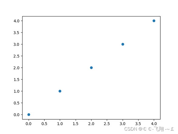
6、不同类型图像的绘制
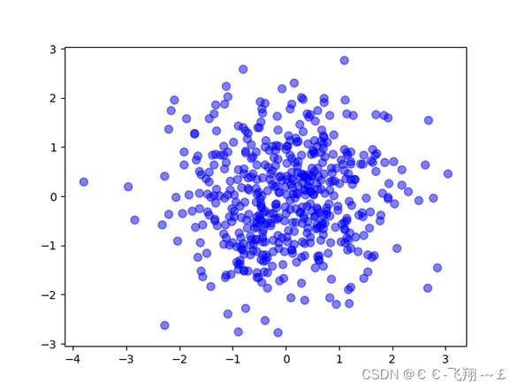
(1)scatter绘制散点图:
def matplotlib_scatter():plt.figure()
plt.scatter(np.arange(5), np.arange(5)) # 安排两个0到4的数组绘制
x = np.random.normal(0, 1, 500) # 正态分布的500个数
y = np.random.normal(0, 1, 500)
plt.figure()
plt.scatter(x, y, s=50, c='b', alpha=0.5)
plt.show()
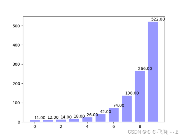
(2)bar绘制直方图:
def matplotlib_bar():x = np.arange(10)
y = 2 ** x + 10
# facecolor块的颜色,edgecolor块边框的颜色
plt.bar(x, y, facecolor='#9999ff', edgecolor='white')
# 设置数值位置
for x, y in zip(x, y): # zip将x和y结合在一起
plt.text(x + 0.4, y, "%.2f" % y, ha='center', va='bottom')
plt.show()
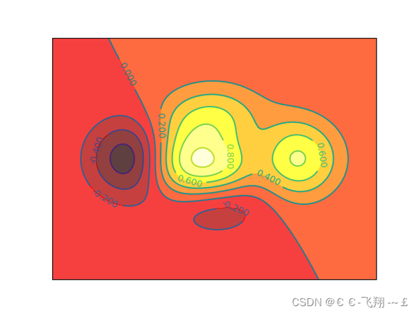
(3)contour轮廓图:
def matplotlib_contours():def f(a, b):
return (1 - a / 2 + a ** 5 + b ** 3) * np.exp(-a ** 2 - b ** 2)
x = np.linspace(-3, 3, 100)
y = np.linspace(-3, 3, 100)
X, Y = np.meshgrid(x, y) # 将x和y传入一个网格中
# 8表示条形线的数量,数量越多越密集
plt.contourf(X, Y, f(X, Y), 8, alpha=0.75, cmap=plt.cm.hot) # cmap代表图的颜色
C = plt.contour(X, Y, f(X, Y), 8, color='black', linewidth=.5)
plt.clabel(C, inline=True, fontsize=10)
plt.xticks(())
plt.yticks(())
plt.show()
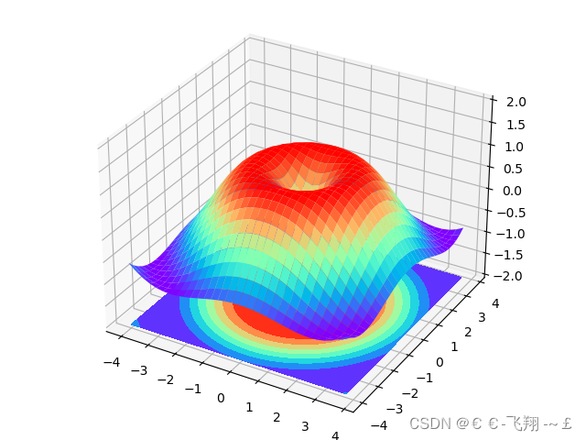
(4)3D图:
3D图绘制需额外再引入依赖:
from mpl_toolkits.mplot3d import Axes3D
def matplotlib_Axes3D():fig = plt.figure() # 创建绘图面版环境
ax = Axes3D(fig) # 将环境配置进去
x = np.arange(-4, 4, 0.25)
y = np.arange(-4, 4, 0.25)
X, Y = np.meshgrid(x, y)
R = np.sqrt(X ** 2 + Y ** 2)
Z = np.sin(R)
# stride控制色块大小
ax.plot_surface(X, Y, Z, rstride=1, cstride=1, cmap=plt.get_cmap('rainbow'))
ax.contourf(X, Y, Z, zdir='z', offset=-2, cmap='rainbow')
ax.set_zlim(-2, 2)
plt.show()
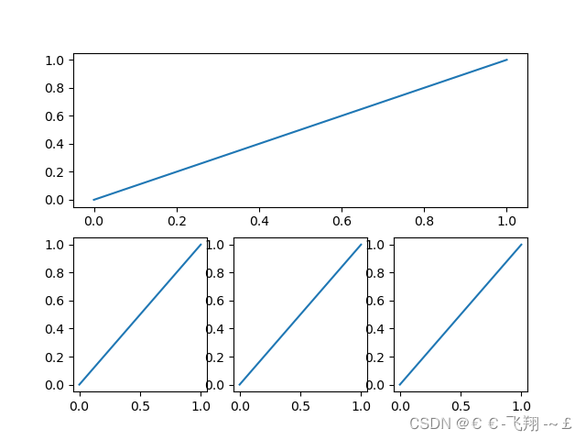
(5)subplot子图绘制:
def matplotlib_subplot():plt.figure() # 生成绘图面板
plt.subplot(2, 1, 1) # 两行1列绘图位置的第1个位置
plt.plot([0, 1], [0, 1]) # 绘制从(0,0)绘制到(1,1)的图像
plt.subplot(2, 3, 4) # 两行3列绘图位置的第4个位置
plt.plot([0, 1], [0, 1]) # 绘制从(0,0)绘制到(1,1)的图像
plt.subplot(2, 3, 5) # 两行3列绘图位置的第5个位置
plt.plot([0, 1], [0, 1]) # 绘制从(0,0)绘制到(1,1)的图像
plt.subplot(2, 3, 6) # 两行3列绘图位置的第6个位置
plt.plot([0, 1], [0, 1]) # 绘制从(0,0)绘制到(1,1)的图像
plt.show()
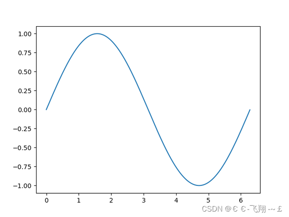
(6)animation动图绘制
需额外导入依赖:
from matplotlib import animation
# ipython里运行可以看到动态效果def matplotlib_animation():
fig, ax = plt.subplots()
x = np.arange(0, 2 * np.pi, 0.01)
line, = ax.plot(x, np.sin(x))
def animate(i):
line.set_ydata(np.sin(x + i / 10))
return line,
def init():
line.set_ydata(np.sin(x))
return line,
ani = animation.FuncAnimation(fig=fig, func=animate, init_func=init, interval=20)
plt.show()
附:直方图代码实现
import numpy as npimport matplotlib.pyplot as plt
np.random.seed(1)
# 产生30个学生身高数据
hight = np.random.randint(low=140, high=190, size=30)
print("身高数据", hight)
# 绘制直方图 plt.hist
# 参数1:要统计的数据; 参数2:区间信息
# 区间信息有默认值 bins =10 分10组
# bins = [140, 145, 160, 170, 190]
# 除了最后一个 都是前闭后开;最后一组是前闭后闭
# [140,145) [145,160) [160,170) [170,190]
bins = [140, 180, 190]
cnt, bins_info, _ = plt.hist(hight,
bins=10,
# bins=bins,
edgecolor='w' # 柱子的边缘颜色 白色
)
# 直方图的返回值有3部分内容
# 1. 每个区间的数据量
# 2. 区间信息
# 3. 区间内数据数据信息 是个对象 不能直接查看
# print("直方图的返回值", out)
# cnt, bins_info, _ = out
# 修改x轴刻度
plt.xticks(bins_info)
# 增加网格线
# 参数1:b bool类型 是否增加网格线
# 参数 axis 网格线 垂直于 哪个轴
plt.grid(b=True,
axis='y',
# axis='both'
alpha=0.3
)
# 增加标注信息 plt.text
print("区间信息", bins_info)
print("区间数据量", cnt)
bins_info_v2 = (bins_info[:-1] + bins_info[1:]) / 2
for i, j in zip(bins_info_v2, cnt):
# print(i, j)
plt.text(i, j + 0.4, j,
horizontalalignment='center', # 水平居中
verticalalignment='center', # 垂直居中
)
# 调整y轴刻度
plt.yticks(np.arange(0, 20, 2))
plt.show()
更多见官方文档:教程 | Matplotlib 中文
总结
到此这篇关于Python数据分析之Matplotlib常用操作的文章就介绍到这了,更多相关Python Matplotlib常用操作内容请搜索以前的文章或继续浏览下面的相关文章希望大家以后多多支持!
以上是 Python数据分析之Matplotlib的常用操作总结 的全部内容, 来源链接: utcz.com/z/257049.html