请问如这种flex 布局 如何去写 没有遇到过?
<style> .row_left_and_right_layout{
width:300px;
display: flex;
align-items: center;
}
.name{
}
.info{
}
.right{
}
</style>
<view class="row_left_and_right_layout">
<view class="name">领优惠券--</view>
<view class="info">
<view class="btn_coupon">券满1111减333</view>
<view class="btn_coupon">券满1111减333</view>
<view class="btn_coupon">券满1111减333</view>
<view class="btn_coupon">券满1111减333</view>
</view>
<view class="right">></view>
</view>
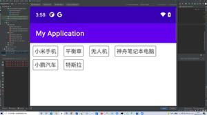
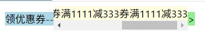
上面的flex布局,我想做成下图这种
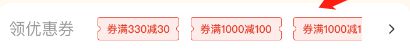
中间的优惠券内容 也就是 info 里的内容,可以 在一行横向滚动,左右两部分内容则和图片一样分布在两边
回答:
<style> .row_left_and_right_layout{
width:300px;
display: flex;
align-items: center;
}
.name{
flex-shrink: 0;
}
.info{
flex:auto;
font-size:0;
overflow-x: auto;
overflow-y: hidden;
white-space: nowrap;
}
.info .btn_coupon{
display: inline-block;
}
.right{
flex-shrink: 0;
}
</style>
<view class="row_left_and_right_layout">
<view class="name">领优惠券--</view>
<view class="info">
<view class="btn_coupon">券满1111减333</view>
<view class="btn_coupon">券满1111减333</view>
<view class="btn_coupon">券满1111减333</view>
<view class="btn_coupon">券满1111减333</view>
</view>
<view class="right">></view>
</view>
回答:
<style> .row_left_and_right_layout {
width: 300px;
display: flex;
align-items: center;
}
.info {
flex: 1;
overflow: auto;
display: flex;
}
.btn_coupon {
white-space: nowrap;
}
.right {
width: 100px;
}
</style>
<view class="row_left_and_right_layout">
<view class="name">领优惠券--</view>
<view class="info">
<view class="btn_coupon">券满1111减333</view>
<view class="btn_coupon">券满1111减333</view>
<view class="btn_coupon">券满1111减333</view>
<view class="btn_coupon">券满1111减333</view>
</view>
<view class="right">></view>
</view>
回答:
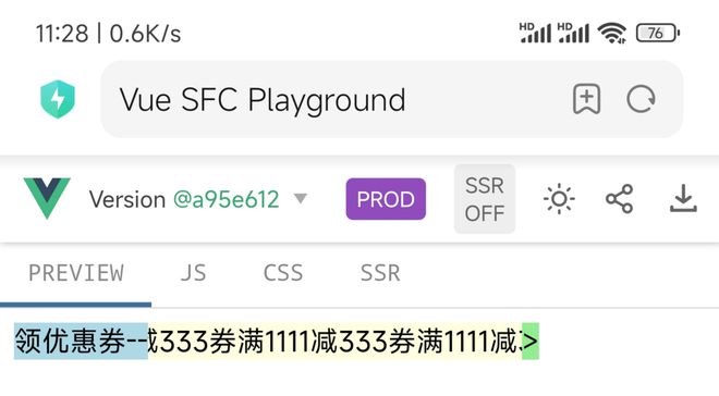
演示地址:http://2t8.cn/5UJZL
在 PC 上看效果,因为滚动条没有处理,看起来比较难看(如果想处理看这里)。但是手机上看不显示滚动条还行(手指可左右拖动)
.row_left_and_right_layout { width: 300px;
display: flex;
align-items: center;
}
.name {
flex: none;
background: lightblue;
}
.info {
background: lightyellow;
flex: auto;
white-space: nowrap;
overflow: auto;
}
.right {
flex: none;
background: lightgreen;
}
回答:
你这个布局就是常见的圣杯布局,只不过是横过来。
思路很简单:
1..row_left_and_right_layout设置flex
2..name和.right多宽就给多大的宽度
3.设置中间.info撑开剩下的内容:flex:1
4.再给.info内部的元素设置浮动或者继续flex也可以
这个命名看着很怪
<div class="container"> <div class="left-section">
</div>
<div class="middle-section">
<div class="coupon">满100减5</div>
<div class="coupon">满200减10</div>
</div>
<div class="right-section">
</div>
</div>
回答:
.name和.right设置固定 width,设置flex-shink: 0;,保持长度固定。- 中间
.info设置flex-grow: 1;,填充剩余空间。 .info设置overflow: auto确保可以滑动,设置flex-wrap: nowrap;避免换行。.info使用 flex 布局,.btn_coupon继续设置flex-shink:0,确保内容完全展示,不被压缩;.btn_coupon设置 padding 或者 margin 确保相互之间固定间距。
其他: .info 设置 align-item: center;,使内容上下居中;......
回答:
就正常的三栏布局的实现方式,中间可伸缩那个元素的容器加入css样式(overflow:auto),再隐藏滚动条就OK啦
回答:
onMounted(async () => {
await getDeviceList()
deviceList.forEach((item: any, index: number) => {
timers[index] = setInterval(() => { item.localTime = new Date(
new Date(item.localTime).getTime() + 1000
).toLocaleString()
}, 1000)
})
})
const getDeviceList = () => {
deviceApi
.getDeviceList().then((res) => {
const { data } = res
deviceList = data.map((item: any) => {
item.localTime = new Date(item.localTime).toLocaleString()
})
})
以上是 请问如这种flex 布局 如何去写 没有遇到过? 的全部内容, 来源链接: utcz.com/p/934443.html