CSS3 Flex 布局之 flex-flow
弹性布局是 CSS3 引入的强大的布局方式,用来替代以前 Web 开发人员使用的一些复杂而易错 hacks 方法(如使用 float 进行类似流式布局)。
CSS 语法
flex-flow: row | column |row wrap;其中 flex-flow 是 flex-direction 和 flex-wrap 属性的简写方式,语法如下:
- flex-flow: <flex-direction> || <flex-wrap>
- flex-direction: row(初始值) | row-reverse | column | column-reverse
- flex-wrap: nowrap(初始值) | wrap | wrap-reverse
注意事项
- flex-flow 属性是 flex-direction 和 flex-wrap 属性的速记属性。
- flex-direction 属性规定灵活项目的方向。
- flex-wrap 属性规定灵活项目是否拆行或拆列。
- IE10 以下和 Safari 不支持此属性
flex-direction 定义了弹性项目在弹性容器中的放置方向,默认是 row,即行内方向(一般而言是由左往右,但注意这个和书写模式有关)。
flex-wrap 定义是否需要拆行以使得弹性项目能被容器包含。*-reverse 代表相反的方向。
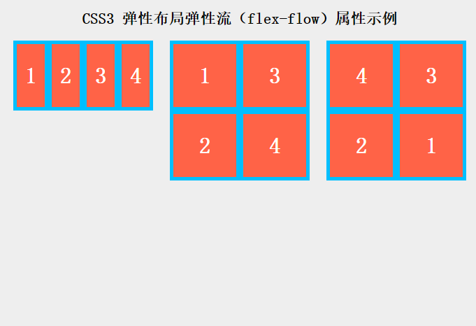
两者结合起来即 flex-flow 属性就确定了弹性容器在 main axis 和 cross axis 两个方向上的显示方式,下面的例子很直观的说明了各个属性值的区别:
.flex-container { display: flex;
}
.flex-container.first {
flex-flow: row;
}
/* Initial value. Main-axis is inline, no wrap. */
.flex-container.second {
flex-flow: column wrap;
-webkit-flex-flow: column wrap;
}
/* Main-axis is block-direction (top to bottom) and lines wrap in the inline direction (rightwards). */
.flex-container.third {
flex-flow: row-reverse wrap-reverse;
}
/* Main-axis is the opposite of inline direction (right to left). New lines wrap upwards. */ /* other styles just for format */
ul {
padding: 0;
}
li {
list-style: none;
}
.flex-container {
background: deepskyblue;
width: 200px;
height: 200px;
margin: 5px auto;
}
.flex-container.first {
height: 100px;
}
.flex-item {
background: tomato;
padding: 5px;
width: 80px;
height: 80px;
margin: 5px;
line-height: 80px;
color: white;
font-weight: bold;
font-size: 2em;
text-align: center;
}
h1 {
font-size: 22px;
text-align: center;
}
.flex-demo {
display: flex;
}
上例中的第1个弹性项列表使用了默认属性也就是 row 且不拆行,弹性项的宽度在需要的时候会被压缩。
第2个列表使用了 column wrap,表示主轴方向是从上往下,而行拆分的方向是行内方向(向右)。
而第3个列表使用了 row-reverse wrap-reverse,表示主轴方向是行内相反方向(从右到左),新行向上拆分。
以上是 CSS3 Flex 布局之 flex-flow 的全部内容, 来源链接: utcz.com/p/234074.html