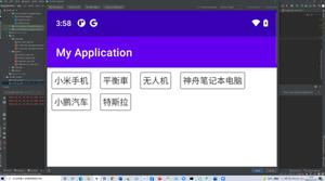
【CSS】这样的flex布局应该怎么写呢?

回答:
继续用flex 你可以多造一份数据 这个数据对应的组件直接visiblity: hidden
回答:
父元素设为flex, 子元素各占 1/3 就好
.parent { display: flex
.child {
flex: calc(1 / 3)
}
}
回答:
弄一个空盒子就行了.
<div class="container"> <div class="box">
<div class="content">内容区域</div>
</div>
<div class="box">
<div class="content">内容区域</div>
</div>
<div class="box"></div>
</div>
box设置flex auto,为了不让box内容将盒子撑开(内容多少不一致时会导致盒子大小不一), 可以将真正的内容放到content里,然后绝对定位贴紧父元素
.box flex auto
position relative
.content
position absolute
left 0
right 0
top 0
bottom 0
回答:
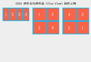
// html<div class="parent">
<div class="child">111</div>
<div class="child">222</div>
<div class="child">333</div>
<div class="child">444</div>
<div class="child">555</div>
</div>
// style
.parent {
display: flex;
flex-wrap: wrap;
justify-content: flex-start;
}
.child {
flex-basis: 33.3%;
}
以上是 【CSS】这样的flex布局应该怎么写呢? 的全部内容, 来源链接: utcz.com/a/154580.html