vue使用echarts实现水平柱形图实例
文件结构:

testData.js文件
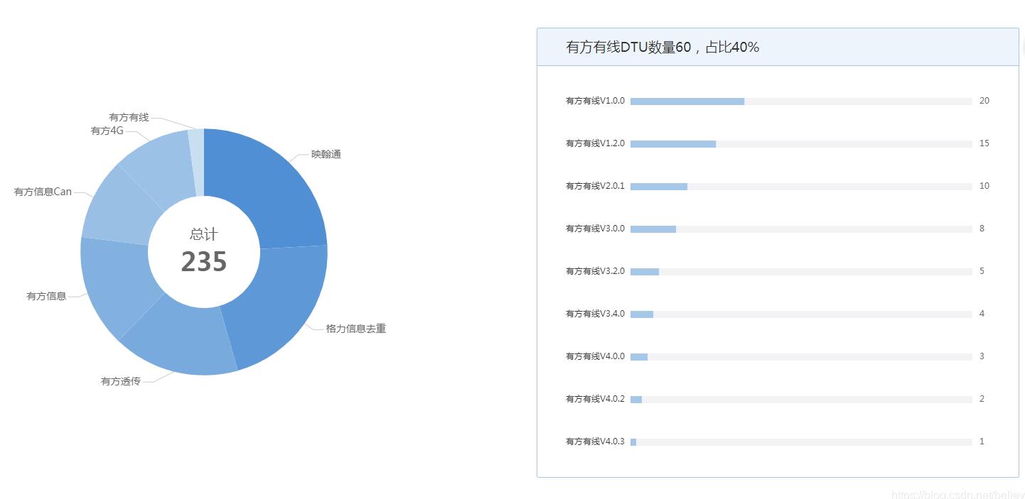
const dtuEdition = {
name: '有方有线',
number: 60,
proportion: 40,
edition: {
'有方有线V1.0.0': 20,
'有方有线V1.2.0': 15,
'有方有线V2.0.1': 10,
'有方有线V3.0.0': 8,
'有方有线V3.2.0': 5,
'有方有线V3.4.0': 4,
'有方有线V4.0.0': 3,
'有方有线V4.0.2': 2,
'有方有线V4.0.3': 1
}
}
export default {
namespaced: true, // 用于在全局引用此文件里的方法时标识这一个的文件名
dtuEdition
}
dtuDistributionCurve.js文件
// DTU连接率bar图的option
let barOption = {
grid: {
// width: '85%', // 设置gird宽度
left: 40, // gird距离容器左边距
right: 65,
top: 20,
bottom: 0,
containLabel: true
},
xAxis: {
show : false, // 不显示横轴
type: 'value',
max: 1000, // 横轴最大值
},
yAxis: {
type: 'category',
data: [],
axisLine: {
show: false
},
axisTick: {
show: false
},
splitLine: {
show: false
}
},
series: [{
type: 'bar',
stack: 'chart',
z: 3,
itemStyle: {
normal: {
color: '#a7c7e9'
}
},
data: []
}, {
type: 'bar',
stack: 'chart',
silent: true,
label: {
normal: {
formatter: (params) => {
// console.log(params)
return barOption.xAxis.max-params.value
},
color: '#666666',
position: 'right',
distance: 10,
show: true
}
},
itemStyle: {
normal: {
color: '#f3f3f6'
}
},
barWidth : 10,//柱图宽度
data: []
}]
}
// 设置y轴标签
export function setYAxisData(edition) {
let data = []
for (let key in edition) {
data.push(key)
}
barOption.yAxis.data = data.reverse()
console.log(barOption.yAxis.data)
}
// 设置x轴最大值
export function setXAxisMax(number) {
barOption.xAxis.max = number
}
// 设置series的data数据
export function setSeriesData(edition, number) {
let data0 = []
let data1 = []
for(let key in edition) {
data0.push(edition[key])
data1.push(number - edition[key])
}
barOption.series[0].data = data0.reverse()
barOption.series[1].data = data1.reverse()
}
export default {
barOption,
setYAxisData,
setXAxisMax,
setSeriesData
}
vue文件
<template>
<div ref="dtuEdition" class="project-survey-dtu-edition"></div>
</template>
<script>
import testData from '../constvalue/testData'
import dtuDistributionOption from '../curveoption/dtuDistributionCurve'
export default {
name: 'ProjectSurvey',
data() {
return {
dtuEditionChart: null
}
},
methods: {
// 点击DTU模块数量分布展示图的扇区item
distributionChartClick(param) {
console.log(param)
let dtuEdition = testData.dtuEdition
this.dtuName = dtuEdition.name
this.dtuNumber = dtuEdition.number
this.dtuProportion = dtuEdition.proportion + '%'
dtuDistributionOption.setYAxisData(dtuEdition.edition)
dtuDistributionOption.setXAxisMax(dtuEdition.number)
dtuDistributionOption.setSeriesData(dtuEdition.edition, dtuEdition.number)
this.dtuEditionChart.setOption(dtuDistributionOption.barOption)
this.dtuEditionChart.resize()
},
// 点击tab的某页
tabClick(tab, event) {
console.log(this.activeName)
if(this.activeName === 'first') { // 从后端获取连接率统计数据
} else { // 从后端获取模块数量分布展示数据
let distributionInfo = testData.dtuDistribution.distributionInfo
this.deadline = testData.dtuDistribution.deadline
dtuDistributionOption.setSectorValue(distributionInfo)
dtuDistributionOption.setSectorName(testData.dtuDistribution.allDistribution)
this.distributionChart.setOption(dtuDistributionOption.pieOption)
this.distributionChart.resize()
this.distributionChart.on('click', this.distributionChartClick)
}
}
},
mounted() {
this.dtuEditionChart = this.$echarts.init(this.$refs.dtuEdition)
this.distributionChart = this.$echarts.init(this.$refs.dtuDistribution)
let maxV = this.getMaxV()
let minV = this.getMinV()
for(let item of this.connectionInfo) {
this.charts[item.dtuName] = this.$echarts.init(document.getElementById(item.dtuName))
let normalizationRatio = this.normalization(item.connectionRatio, maxV, minV)
dtuConnectionOption.setSectorColor(normalizationRatio)
dtuConnectionOption.setTitleText(item.dtuName)
dtuConnectionOption.setSectorValue(item.connectionRatio)
dtuConnectionOption.setSectorName(item.connectionRatio)
// console.log(dtuConnectionOption.option)
this.charts[item.dtuName].setOption(dtuConnectionOption.option)
this.charts[item.dtuName].resize()
}
window.onresize = () => {
this.distributionChart.resize()
this.dtuEditionChart.resize()
}
},
updated() {
this.distributionChart.resize()
for(let item of this.connectionInfo) {
this.charts[item.dtuName].resize()
}
}
}
</script>
<style>
.project-survey-dtu-edition {
height: 580px;
}
</style>
图表
补充知识:vue+echart实现 X轴 双柱状图 渐变色
一: 安装
1. 首先需要安装echarts依赖包
npm install echarts -S
2. 或者使用国内的淘宝镜像:
npm install -g cnpm --registry=https://registry.npm.taobao.org
二: 创建图表
全局引入
main.js
>```javascript
// 引入echarts
import echarts from 'echarts'
Vue.prototype.$echarts = echarts
Hello.vue
<div id="myChart" :style="{width: '300px', height: '300px'}"></div>
export default {
data(){
return {}
},
mounted(){
this.myChart() //函数调用
},
methods:{
myChart(){
let myChart= this.$echarts.init(document.getElementById('myChart'));
// var colors = ['rgba(15,115,255,0.6)', 'rgba(15,235,255,0.6)'];
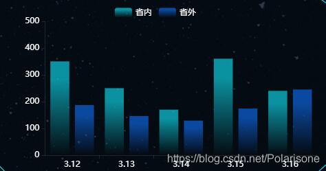
var data1 = [350, 250, 170, 360, 240];
var data2 = [187, 146, 129, 174,245];
var xData = ['3.12','3.13','3.14','3.15','3.16']
rightBtns.setOption({
// backgroundColor:'#fff',
tooltip: {
trigger: "axis",
// formatter: '{b}<br/>{a1}-违规率:{c1}<br/>{a0}-违规率:{c0}',
axisPointer: {
type: "shadow",
textStyle: {
color: "#fff"
}
},
},
grid: {
top: '8%',
right: '8%',
bottom: '60%'
},
legend: {
data: ['省内', '省外'],
align: 'left',
left: '30%',
top: '4%',
textStyle:{
color:'#fff'
}
},
calculable: true,
xAxis: [{
type: "category",
data: xData,
axisLine: {
lineStyle: {
color: 'rgba(255,255,255,0.1)'
},
},
axisLabel: {
show: true,
textStyle: {
color: '#fff'
}
},
}],
yAxis: {
type: 'value',
// name:'单位:(人次 )',
min: 0,
max: 500,
interval: 100,
axisLine: {
lineStyle: {
color: 'rgba(255,255,255,0.1)'
}
},
splitLine: {
lineStyle: {
type: 'dashed',
},
show:false
},
axisLabel: {
show: true,
textStyle: {
color: '#fff'
}
},
},
series: [{
name: '省内',
type: 'bar',
// color: colors[0],
data: data1,
itemStyle:{
normal: {
//每个柱子的颜色即为colorList数组里的每一项,如果柱子数目多于colorList的长度,则柱子颜色循环使用该数组
//此处的箭头函数是为了不改变this的指向
color: (params) => {
var index = params.dataIndex;
var colorList = [
// 渐变颜色的色值和透明度
//双柱状图渐变的 第一个柱子的渐变色['rgba(15,235,255,0)','rgba(15,235,255,0)','rgba(15,235,255,0)','rgba(15,235,255,0)','rgba(15,235,255,0)'],
['rgba(15,235,255,0.6)','rgba(15,235,255,0.6)','rgba(15,235,255,0.6)','rgba(15,235,255,0.6)','rgba(15,235,255,0.6)']
];
if(params.dataIndex >= colorList.length){
index=params.dataIndex-colorList.length;
}
//方法一:
//不使用箭头函数的写法改变渐变色
// return {
// colorStops: [{
// offset: 0, //颜色开始的位置
// color: colorList[0][index] // 0% 处的颜色
// },{
// offset: 0.6, //颜色结束的位置
// color: colorList[1][index] // 100% 处的颜色
// }]
// }
//方法二:使用箭头函数的写法 改变双柱状图的渐变颜色
return new this.$echarts.graphic.LinearGradient(0,0,0,1,[
{offset: 0.2, color: colorList[1][index]},
{offset: 1, color: colorList[0][index]}
])
}
}
}
},
{
name: '省外',
type: 'bar',
// color: colors[1],
data: data2,
itemStyle:{
normal: {
//每个柱子的颜色即为colorList数组里的每一项,如果柱子数目多于colorList的长度,则柱子颜色循环使用该数组
color: (params) => {
var index = params.dataIndex;
var colorList = [
// 渐变颜色的色值和透明度
//双柱状图渐变的 渐变第二个柱子的渐变色['rgba(15,115,255,0)','rgba(15,115,255,0)','rgba(15,115,255,0)','rgba(15,115,255,0)','rgba(15,115,255,0)'],
['rgba(15,115,255,0.6)','rgba(15,115,255,0.6)','rgba(15,115,255,0.6)','rgba(15,115,255,0.6)','rgba(15,115,255,0.6)']
];
//方法一:
//不使用箭头函数的写法改变渐变色
// return {
// colorStops: [{
// offset: 0,
// color: colorList[0][index] // 0% 处的颜色
// },{
// offset:0.6,
// color: colorList[1][index] // 100% 处的颜色
// }]
// }
//方法二:使用箭头函数的写法 改变双柱状图的渐变颜色
return new this.$echarts.graphic.LinearGradient(0,0,0,1,[
{offset: 0.2, color: colorList[1][index]},
{offset: 1, color: colorList[0][index]}
])
}
}
}
}]
})
}
}
}
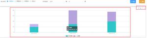
最终结果
以上这篇vue使用echarts实现水平柱形图实例就是小编分享给大家的全部内容了,希望能给大家一个参考,也希望大家多多支持。
以上是 vue使用echarts实现水平柱形图实例 的全部内容, 来源链接: utcz.com/p/238068.html