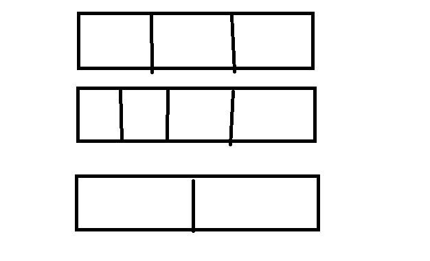
这种APP底部横线+文字该怎么布局?css

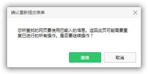
如图所示
下面是我做的,但是宽度不好控制,设备宽度不一样显示也不一样,有好的解决方案嘛
<div class="state flex flex-y flex-x"><span class="line"></span>
<p>用户须知</p>
<span class="line"></span>
</div>
.state{
color: #666;
font-size: 14px;
}
.line{
width: 35%;
height: 1px;
background-color: #dedede;
}```
回答
<div class="box"> <div class="line"></div>
<div class="text">用户登录</div>
<div class="line"></div>
</div>
.box{
width:80%;
margin:50px auto;
color:#ccc;
display: flex;
align-items: center;
}
.text{
padding:0 5px;
}
.line{
border:1px solid #ccc;
flex-grow: 1;
}

<div class="line"> <span>内容</span>
</div>
.line {
font-size: 14px;
position: relative;
}
.line:after {
content: "";
position: absolute;
top: 50%;
left: 50%;
transform: translate(-50%, -50%);
width: 100%;
height: 1px;
background: red;
}
.line span {
padding: 0 10px;
position: relative;
z-index: 1;
background: #fff;
}

<div class="state"> <div class="text">用户须知</div>
</div>
css">.state{ display: block;
height: 1px;
width: 100%;
margin: 24px 0;
background-color: #dcdfe6;
position: relative;
}
.text{
background: #fff;
margin: 0;
position: absolute;
background-color: #fff;
padding: 0 20px;
font-weight: 500;
color: #303133;
font-size: 14px;
left: 50%;
transform: translateX(-50%) translateY(-50%);
}
<!DOCTYPE html><html>
<head>
<meta charset="utf-8">
<meta name="viewport" content="width=device-width">
<title>JS Bin</title>
<style>
.divider {
color: #999;
text-align: center;
}
.divider::before,
.divider::after {
content: '';
display: inline-block;
margin: 0 10px;
width: 100px;
height: 1px;
background: currentColor;
vertical-align: middle;
}
</style>
</head>
<body>
<div class="divider">这是一个分割线</div>
</body>
</html>
上面这个如果考虑移动端宽度问题单位应该用rem,移动端这个应该是共识了。使用flex则可以不考虑宽度问题了,如下面这个:
<!DOCTYPE html><html>
<head>
<meta charset="utf-8">
<meta name="viewport" content="width=device-width">
<title>JS Bin</title>
<style>
.divider {
display: flex;
align-items: center;
color: #999;
text-align: center;
white-space: nowrap;
}
.divider::before,
.divider::after {
content: '';
top: 50%;
width: 50%;
height: 1px;
background: currentColor;
}
.text {
padding: 0 1em;
background: #fff;
}
</style>
</head>
<body>
<div class="divider"><span class="text">这是一个分割线sdfdsfssdfs</span></div>
</body>
</html>
<div style="padding-left: 10px; padding-right: 10px;position:relative;"> <div style="background-color: #666; height: 1px;"></div>
<label style="font-size: 14px; color: #666; background-color: #fff; padding: 0 10px; height:20px; position:absolute; margin-left: 50%; left: -40px; top: -10px">用户须知</label>
</div>
以上是 这种APP底部横线+文字该怎么布局?css 的全部内容, 来源链接: utcz.com/a/62560.html