css多列瀑布流布局
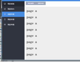
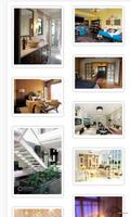
一、效果图

二、代码
<!DOCTYPE html><html>
<head>
<style>
/* https://www.cnblogs.com/bbc66/p/9434217.html */
html,body{
padding: 0;margin: 0;
}
.box {
padding: 10px;
/* display: flex;
flex-flow:column wrap; */
/* height: 100vh; */
column-count:2;
/*指定列宽*/
/* column-width:500px; */
/*指定列与列之间的间距*/
column-gap: 10px;
/*指定列与列之间间隙的样式*/
/*column-rule:2px dotted red*/
/*相对应下面的三个属性*/
/* column-rule-color:red;
column-rule-style:dotted;
column-rule-width:2px; */
}
.item {
/* margin: 10px; */
margin-bottom: 10px;
/* width: calc(100%/3 - 20px); */
height:300px;
}
.item img{
width: 100%;
height:100%;
background: pink;
}
</style>
</head>
<body>
<div class="box">
<div class="item">
<img alt="" />
</div>
<div class="item">
<img alt="" />
</div>
<div class="item">
<img alt="" />
</div>
<div class="item">
<img alt="" />
</div>
<div class="item">
<img alt="" />
</div>
<div class="item">
<img alt="" />
</div>
<div class="item">
<img alt="" />
</div>
<div class="item">
<img alt="" />
</div>
<div class="item">
<img alt="" />
</div>
<div class="item">
<img alt="" />
</div>
<div class="item">
<img alt="" />
</div>
<div class="item">
<img alt="" />
</div>
</div>
</body>
以上是 css多列瀑布流布局 的全部内容, 来源链接: utcz.com/a/43814.html