echarts柱形图—在排名的基础上,如何实现用颜色区分柱子上的数值类型呢?
原本深蓝色那个柱子代表的是金额类型的,但是在这个基础上数量不变,以及金额的柱子位置不变。只是金额换成了“肉类”和“蔬菜类”两种类型,如果是蔬菜类的话柱子就是绿色,如果是肉类的话柱子就是红色?
这个怎么实现呢?
.jpg")
有看到这种方法,但不太适用我这种做法。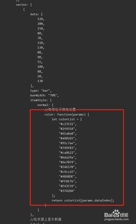
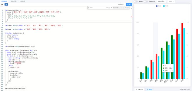
let departmentCard = { xData: ['玉米','玉米','萝卜','鸡肉','猪肉','黄瓜','西蓝花','芹菜','牛肉','羊肉'],
yData: [
[11.5,22.1,33.3,44.4,55.3,66.3,77.4,88.6,99.2,110],
[1,2,3,4,5,6,7,8,9,10]
]
};
// 左右分布图例+x轴数据超过4字省略号显示
option = {
tooltip: {
trigger: "axis",
axisPointer: {
type: "shadow",
}
},
grid: {
left: '2%',
right: '2%',
bottom: '2%',
top: '22%',
containLabel: true,
},
legend: [
{
orient: 'horizontal',
x: '2%',
y: '2%',
align: 'left',
data: ['刷卡次数'],
itemWidth: 14,
itemHeight: 14,
icon: 'rect',
itemGap: 20, //每条图例的距离
textStyle: {
color: '#ccc',
fontSize: 16,
},
},
{
orient: 'horizontal',
x: '93%',
y: '2%',
align: 'left',
data: ['违规次数'],
itemWidth: 14,
itemHeight: 14,
icon: 'rect',
itemGap: 20, //每条图例的距离
textStyle: {
color: '#ccc',
fontSize: 16,
},
}],
xAxis: {
type: 'category',
data: departmentCard.xData,
axisLine: {
lineStyle: {
color: '#00E4FF',
},
},
axisTick: {
show: false,
},
axisLabel: {
color: '#333',
fontSize: 16,
formatter: function (value, index) {
let values = value.length > 4 ? value.slice(0, 4) + '...' : value;
let str = values;
return str;
},
rich: {
no: {
color: '#ACEAF1',
fontSize: 16,
},
},
interval: 0,
rotate: 40,
},
},
yAxis: [
{
type: 'value',
nameTextStyle: {
color: '#ccc',
fontSize: 16,
align: 'left',
padding: 10,
},
axisLine: {
show: false,
lineStyle: {
color: '#cdd5e2',
},
},
splitLine: {
show: false,
lineStyle: {
color: 'rgba(142, 227, 255, 0.3)',
type: 'solid',
},
},
axisTick: {
show: false,
},
axisLabel: {
fontSize: 16,
color: '#ccc',
},
},
{
type: 'value',
nameTextStyle: {
align: 'center',
margin: 10,
padding: 10,
color: '#ccc',
fontSize: 16,
},
position: 'right',
axisTick: {
show: false,
},
axisLine: {
show: false,
},
splitLine: {
show: false,
lineStyle: {
color: 'rgba(142, 227, 255, 0.3)',
type: 'solid',
},
},
axisLabel: {
fontSize: 16,
color: '#ccc',
},
},
],
series: [
{
name: '金额',
left: '0%',
type: 'bar',
barWidth: '16',
itemStyle: {
normal: {
color: '#0079FE',
},
},
data: departmentCard.yData[0],
},
{
name: '数量',
yAxisIndex: 1,
type: 'bar',
barWidth: '16',
itemStyle: {
normal: {
color: '#00E4FF',
},
},
data: departmentCard.yData[1],
},
],
};
回答:
在外面做下处理就行,另外legend的图标可以使用svg 替换成对应颜色的,这里就不举例了,
可以通过 'path://' 将图标设置为任意的矢量路径,文档
let departmentCard = { xData: ['玉米','萝卜','鸡肉','猪肉','黄瓜','西蓝花','芹菜','牛肉','羊肉'],
yData: [
[11.5, 22.1, 33.3, 44.4, 55.3, 66.3, 77.4, 88.6, 99.2, 110],
[1, 2, 3, 4, 5, 6, 7, 8, 9, 10]
]
};
let vegetable: Array<string> = ['玉米', '玉米', '萝卜', '黄瓜', '西蓝花', '芹菜'];
let meat: Array<string> = ['鸡肉', '猪肉', '牛肉', '羊肉'];
interface barDataProps {
value: number;
itemStyle: {
color: string;
};
}
let barData: Array<barDataProps> = [];
const getBarData = (originData: any) => {
const firstR = originData.yData[0];
const length = originData.xData.length;
for (let i = 0; i < length; i++) {
const x: string = originData.xData[i];
let color = '';
if(vegetable.includes(x)){
color = 'green'
}else{
color = 'red'
}
barData.push({
value: firstR[i],
itemStyle: {
color: color
}
});
}
};
getBarData(departmentCard);
series: [ {
name: '蔬菜',
type: 'bar',
barWidth: '16',
colorBy: 'data',
data: barData
},
{
name: '肉类',
yAxisIndex: 1,
type: 'bar',
barWidth: '16',
itemStyle: {
color: '#00E4FF'
},
data: departmentCard.yData[1],
}
]
-----------------------
legend: [
{
orient: 'horizontal',
align: 'left',
itemWidth: 14,
data:['蔬菜','肉类'],
itemHeight: 14,
icon: 'rect',
itemGap: 20, //每条图例的距离
textStyle: {
color: '#ccc',
fontSize: 16
}
}
],
回答:
data里面调整、
data: [ 120,
{
value: 200,
itemStyle: {
color: '#a90000'
}
},
150,
80,
70,
110,
130
],
参考:
https://echarts.apache.org/examples/zh/editor.html?c=bar-data-color
以上是 echarts柱形图—在排名的基础上,如何实现用颜色区分柱子上的数值类型呢? 的全部内容, 来源链接: utcz.com/p/937505.html