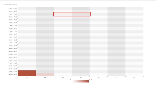
vue echarts heatmap 热力图 单元格默认灰色改为白色
代码:
const days = ['12a', '1a', '2a', '3a', '4a', '5a', '6a']
const hours = [
'00:00~00:59',
'01:00~01:59',
'02:00~02:59',
'03:00~03:59',
'04:00~04:59',
'05:00~05:59',
'06:00~06:59',
'07:00~07:59',
'08:00~08:59',
'09:00~09:59',
'10:00~10:59',
'11:00~11:59',
'12:00~12:59',
'13:00~13:59',
'14:00~14:59',
'15:00~15:59',
'16:00~16:59',
'17:00~17:59',
'18:00~18:59',
'19:00~19:59',
'20:00~20:59',
'21:00~21:59',
'22:00~22:59',
'23:00~23:59',
]
const data = [
[0, 0, 5],[0, 1, 1],
[0, 2, 0],
[0, 3, 0],
[0, 4, 0],
[0, 5, 0],
[0, 6, 0],
[0, 7, 0],
[0, 8, 0],
[0, 9, 0],
[1, 0, 7],
[1, 1, 0],
[1, 2, 0],
[1, 3, 0],
[1, 4, 0],
]
const series = data.map(item => {
return [item[1], item[0], item[2] || '-']})
const option = {
title: { text: '近一周事件发生热力图',
textStyle: {
color: '#999999',
fontSize: 12,
fontWeight: 'lighter',
},
},
tooltip: {
position: 'top',
},
grid: {
height: '87%',
top: '30px',
bottom: '15px',
},
xAxis: {
type: 'category',
data: days,
splitArea: {
show: true,
},
},
yAxis: {
type: 'category',
axisTick: { show: true },
data: hours,
axisLabel: {
interval: 0,
},
splitArea: {
show: true,
},
},
visualMap: {
min: 0,
max: 4,
calculable: true,
orient: 'horizontal',
left: 'center',
inRange: {
color: ['#ffffff', '#b2503b'],
},
},
series: [
{
name: 'Punch Card',
type: 'heatmap',
data: series,
label: {
show: true,
color: 'white',
},
itemStyle: {
color: '#ffffff',
borderType: 'solid',
borderWidth: '1px',
borderColor: '#000000',
},
emphasis: {
itemStyle: {
borderWidth: '1px',
shadowBlur: 10,
shadowColor: '#000000',
},
},
},
],
}
回答:
echarts 图表后面背景色
"splitArea": { "show": true, "areaStyle": { "color": [ "blue" ] } }
以上是 vue echarts heatmap 热力图 单元格默认灰色改为白色 的全部内容, 来源链接: utcz.com/p/936151.html