请教下 echarts 柱状图 数据 与 x轴对不齐?
getStatisFactionChart(val) {
const xlChart = this.$echarts.init(document.getElementById('statisChart'))
xlChart.setOption({
tooltip: { trigger: 'axis',
axisPointer: {
type: 'cross',
crossStyle: {
color: '#999'
}
}
},
toolbox: {
feature: {
dataView: {
show: false,
readOnly: false
},
magicType: {
show: false,
type: ['line', 'bar']
},
restore: {
show: false
},
saveAsImage: {
show: false
}
}
},
legend: {
data: val.legend,
textStyle: {
color: '#FFFFFF'
}
},
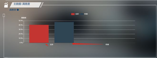
xAxis: [{
type: 'category',
data: val.xAxis,
axisPointer: {
type: 'shadow'
},
axisLabel: {
textStyle: {
color: '#FFFFFF'
}
}
}],
yAxis: [{
type: 'value',
name: '满意度',
axisLabel: {
formatter: '{value} %',
textStyle: {
color: '#FFFFFF'
}
},
axisLine: {
show: true,
lineStyle: {
color: '#FFFFFF'
}
}
}
],
series: val.series
})
}
回答:
因为写的不对,x轴、y轴外加series,这其实是三个维度,legend是控制series的,你这里x轴使用了北京、传祺,那么series就不能写两个,一个series一个数据,应该写一个series,两个数据都放在这个series里面
以上是 请教下 echarts 柱状图 数据 与 x轴对不齐? 的全部内容, 来源链接: utcz.com/p/935721.html