echarts 配置项修改参数?
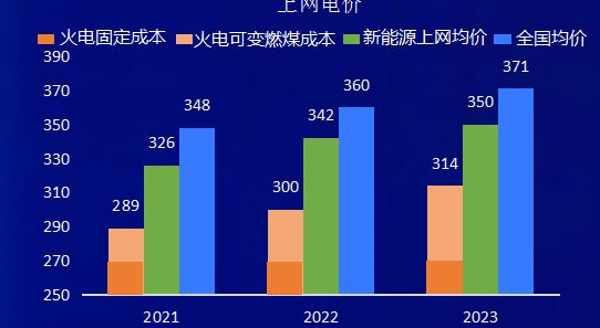
请教echarts像这种的柱状图该怎么配置,翻阅了资料也没有达到这个效果
回答:
以下代码演示了如何在 ECharts 中绘制多个柱子,并显示相应的图例:
option = { tooltip: {},
legend: {
data:['销量', '库存']
},
xAxis: {
data: ["衬衫","羊毛衫","雪纺衫","裤子","高跟鞋","袜子"]
},
yAxis: {},
series: [
{
name: '销量',
type: 'bar',
data: [5, 20, 36, 10, 10, 20]
},
{
name: '库存',
type: 'bar',
data: [15, 26, 8, 11, 15, 21]
}
]
回答:
堆叠图:https://echarts.apache.org/examples/zh/editor.html?c=bar-stack
回答:
使用这个barGap属性实现,
具体参考官网的堆叠图:、
网址:
https://echarts.apache.org/examples/zh/editor.html?c=bar-labe...
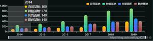
效果图: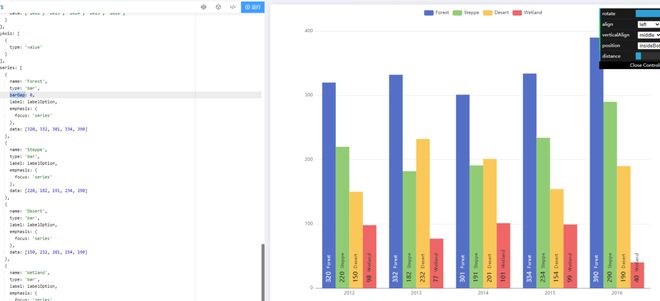
回答:
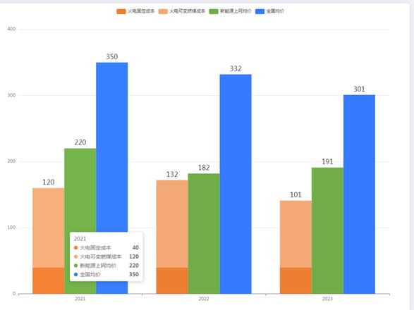
option = { tooltip: {
trigger: 'axis',
axisPointer: {
type: 'shadow'
}
},
legend: {},
grid: {
left: '3%',
right: '4%',
bottom: '3%',
containLabel: true
},
xAxis: [
{
type: 'category',
data: ['2021', '2022', '2023']
}
],
yAxis: [
{
type: 'value'
}
],
series: [
{
name: '火电固定成本',
type: 'bar',
stack: 'Ad',
color: '#ed7d31',
data: [40, 40, 40]
},
{
name: '火电可变燃煤成本',
type: 'bar',
stack: 'Ad',
label:{
show:true,
position:'top',
fontSize:18
},
color: '#f3a875',
data: [120, 132, 101]
},
{
name: '新能源上网均价',
type: 'bar',
label:{
show:true,
position:'top',
fontSize:18
},
color: '#70ad47',
data: [220, 182, 191]
},
{
name: '全国均价',
type: 'bar',
label:{
show:true,
position:'top',
fontSize:18
},
color: '#357aff',
barGap:0,
data: [350, 332, 301]
},
]
};
以上是 echarts 配置项修改参数? 的全部内容, 来源链接: utcz.com/p/934088.html