Vue+Element UI实现下拉菜单的封装
本文实例为大家分享了Vue+Element UI实现下拉菜单封装的具体代码,供大家参考,具体内容如下
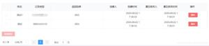
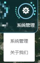
1、效果图
先贴个效果图,菜单项没有做样式美化,图中显示的边框也是没有的(边框是外部容器的边框),其它的根据需要自己修改一下样式即可。
2、组件封装
组件的封装用到了CSS动画、定位,以及Element UI提供的下拉菜单组件el-dropdown,代码如下
<template>
<div class="all" @click="clickFire">
<span class="item-border">
<el-image
class="item"
style="width: 24px; height: 24px"
fit="cover"
:lazy="isLazy"
:src="itemProperty.url"
:title="itemProperty.name"
:placeholder="itemProperty.name"
></el-image>
</span>
<div class="wrap-item"></div>
<!-- 下拉菜单 -->
<el-dropdown class="dropMenu" @command="handleCommand">
<span class="el-dropdown-link" v-text="itemProperty.name"></span>
<el-dropdown-menu slot="dropdown" class="dropMenuitems">
<!-- <el-dropdown-item>黄金糕</el-dropdown-item>
<el-dropdown-item>狮子头</el-dropdown-item>
<el-dropdown-item>螺蛳粉</el-dropdown-item> -->
<el-dropdown-item
class="dropMenu-item"
v-for="(item, index) in itemProperty.menus"
:key="index"
:command="item"
>{{ item }}</el-dropdown-item
>
</el-dropdown-menu>
</el-dropdown>
</div>
</template>
<script>
export default {
props: {
itemProperty: Object,
require: true,
},
data() {
return {
isLazy: true,
item: {
name: 'item',
url: require('../../../static/imgs/menus/warning.png'),
menus: [
'submenu-1',
'submenu-2',
'submenu-3',
'submenu-4',
'submenu-5',
],
},
}
},
mounted() {
this.$data.item = this.$props.itemProperty
// console.log(this.$props.itemProperty)
},
methods: {
//父级图标点击事件
clickFire() {
//参数1:自定义组件事件,在父组件中被调用才能触发父子组件的值传递;参数2:向父组件传递的数据[可为数组形式]
this.$emit('clickItem', this.$data.item)
},
//下拉菜单点击事件
handleCommand(command) {
// console.log(command)
this.$emit('handleCommand', command)
},
},
}
</script>
<style lang="less" scoped>
.all {
// border: 1px solid skyblue;
display: inline-block;
position: relative;
width: 65px;
height: 65px;
// overflow: hidden;
}
// 最内层
.item-border {
display: inline-block;
margin: 0 auto;
margin-left: 0px;
margin-top: 10px;
width: 44px;
height: 44px;
border-radius: 50%;
border: 3px solid skyblue;
// background-color: slateblue;
.item {
position: absolute;
top: 50%;
left: 50%;
transform: translate(-50%, -50%);
}
}
// 最外层
.wrap-item {
position: absolute;
top: 0;
left: 0;
display: inline-block;
width: 56px;
height: 56px;
border: 5px dotted transparent;
border-left: 5px dotted #73ffff;
border-left-width: 3px;
border-right-color: #73ffff;
border-top-color: transparent;
border-radius: 50%;
// background-color: burlywood;
animation: circle 3s infinite linear;
}
@keyframes circle {
0% {
transform: rotate(0deg);
}
100% {
transform: rotate(-360deg);
}
}
//下拉菜单
.dropMenu {
margin-top: 5px;
// background-color: yellowgreen;
color: #fff;
//标题项
.el-dropdown-link {
cursor: pointer;
}
//菜单子项
.el-dropdown-menu__item {
color: red !important;
}
.dropMenu-item {
background-color: rosybrown;
}
}
</style>
3、父组件中使用举例
<template>
<!-- 功能模块:使用子组件-注意自定义事件clickItem与handleCommand -->
<div class="funcModules">
<RingItem
class="ringitem-style"
v-for="(item, index) in funcItems"
:key="index"
:itemProperty="item"
@clickItem="clickRingItem"
@handleCommand="handleCommandDropMenu"
/>
</div>
</template>
<script>
//1-导入子组件
import RingItem from '../Controls/RingItem'
export default {
components: {
//2-注册组件
RingItem,
},
data() {
return {
//功能模块图标资源
funcItems: [
{
name: '系统管理',
url: require('../../../static/imgs/menus/management.png'),
menus: ['细则管理', '关于我们'],
},
],
}
},
methods: {
/**
* RingItem子组件点击事件:value是子组件中通过emit传递的值
*/
clickRingItem(value) {
//判断子组件的name属性值,实现相应的业务逻辑
switch (value.name) {
case '系统管理': {
console.log('系统管理')
//执行页面跳转-管理中心(看自己的需求,添加业务逻辑)
//this.$router.push({ path: '/admincenter' })
break
}
}
},
/**
* RingItem子组件:下拉菜单点击事件(value是子组件中通过emit传递的值)
*/
handleCommandDropMenu(value) {
console.log(value)
switch (value.name) {
case '细则管理': {
console.log('系统管理')
//执行页面跳转-管理中心(看自己的需求,添加业务逻辑)
//this.$router.push({ path: '/admincenter' })
break
}
case '关于我们': {
console.log('系统管理')
//执行页面跳转-管理中心(看自己的需求,添加业务逻辑)
//this.$router.push({ path: '/admincenter' })
break
}
}
},
},
}
</script>
<style lang="less" scoped>
//样式调整
</style>
以上就是本文的全部内容,希望对大家的学习有所帮助,也希望大家多多支持。
以上是 Vue+Element UI实现下拉菜单的封装 的全部内容, 来源链接: utcz.com/p/239771.html