vue+echart实现双柱状图
本文实例为大家分享了vue+echart实现双柱状图的具体代码,供大家参考,具体内容如下
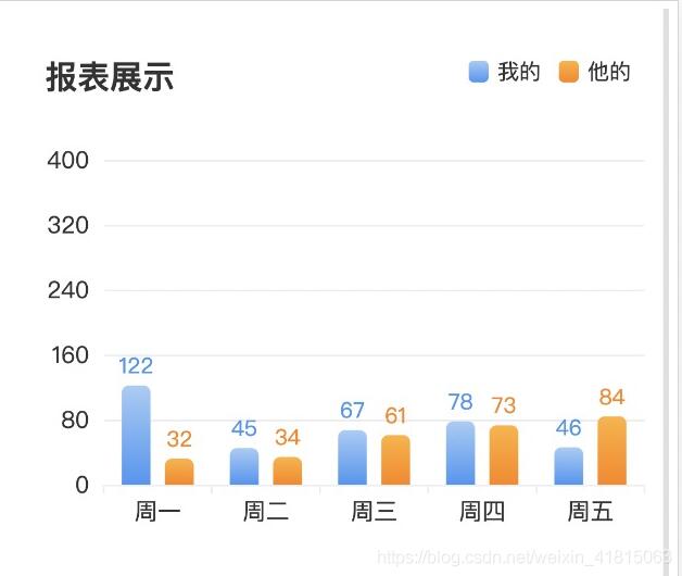
效果图:
一、安装
版本号建议安装"echarts": "^4.8.0”,其它版本init会报错
1、 首先需要安装echarts依赖包
npm install --save echarts@4.8.0
2、 或者使用国内的淘宝镜像:
npm install -g cnpm --registry=https://registry.npm.taobao.org
<template>
<div class="echarts_con">
<div
class="echarts_main"
ref="dialog_root"
title="节点指标"
@close="hideData()"
>
<!--负载情况-->
<div
ref="bar_dv"
:style="{
width: '100%',
minHeight: '300px',
}"
></div>
</div>
</div>
</template>
<script>
import echarts from 'echarts'
// import myIcon from './image/hot_icon.png' //自定义图标
// import averageIcon from './image/hot_icon.png'
export default {
name: "Echarts",
data () {
return {
maxStr: 400,
yInterval: 80,
myData: [122, 45, 67, 78, 46],
averageData: [32, 34, 6, 73, 84, 40]
}
},
//外部传入数据的话要监听数据start
// props: {
// myData: {
// type: Array,
// default: []
// },
// averageData: {
// type: Array,
// default: []
// }
// },
// computed: {
// address () {
// const { myData, averageData } = this
// return {
// myData,
// averageData
// }
// }
// },
// watch: {
// address: {
// handler: function (val) {
// this.compare(val.myData, val.averageData)
// let newArr = val.myData.concat(val.averageData)
// let maxNum = Math.max(...newArr)
// this.maxStr = maxNum
// if (maxNum >= 500) {
// this.yInterval = 200
// } else {
// this.yInterval = 50
// }
// this.drawLine(val.myData, val.averageData)
// },
// deep: true
// }
// },
// mounted () {
// this.$nextTick(function () {
// this.drawLine();
// });
// },
//外部传入数据的话要监听数据end
mounted () {
this.drawLine(this.myData, this.averageData)
},
methods: {
//判断一一对应数据低于平均就提示
compare (arr1, arr2) {
if (arr1[0] < arr2[0]) {
this.isCompare = true
} else if (arr1[1] < arr2[1]) {
this.isCompare = true
} else if (arr1[2] < arr2[2]) {
this.isCompare = true
} else if (arr1[3] < arr2[3]) {
this.isCompare = true
} else {
this.isCompare = false
}
},
clickClose () {
this.isCompare = false
},
/*负载情况图标*/
drawLine (a, b) {
var myData = a;
var averageData = b;
let bar_dv = this.$refs.bar_dv;
let myChart = echarts.init(bar_dv);
var autoHeight = parseInt(this.maxStr / 100) * 10 + 100;
myChart.getDom().style.height = autoHeight + "px";
myChart.resize(); //自适应高度
// 绘制图表
myChart.setOption({
title: { text: '报表展示' },
grid: {
// left: 40,
containLable: true
},
tooltip: {},
xAxis: {
data: ["看过我的", "沟通过的", "收到简历", "曝光人数"],
axisLine: {
lineStyle: {
type: 'solid',
color: '#eeeeee', //x左边线的颜色
fontSize: 13,
width: '0.5' //坐标线的宽度
}
},
axisLabel: { //x轴字体
textStyle: {
color: '#333333',
fontSize: 13
}
},
},
yAxis: {
type: 'value',
min: 0,
max: this.maxStr,
interval: this.yInterval,
axisLine: {
lineStyle: {
type: 'solid',
color: '#fff', //左边线的颜色
width: '0.5' //坐标线的宽度
}
},
axisLabel: {
textStyle: {
color: '#333333',
fontSize: 13
}
},
splitLine: {
show: true,
lineStyle: {
color: ['#eeeeee'],
width: 1,
type: 'solid'
}
}
},
legend: {
itemWidth: 11,
itemHeight: 12,
symbolKeepAspect: true,
textStyle: {
fontSize: 11,
lineHeight: 0,
backgroundColor: "rgba(11, 164, 19, 1)"
},
// icon: `image://${averageIcon}`,
data: [
{
name: '我的',
// icon: `image://${myIcon}`//自定义小图标
},
{
name: '行业平均',
// icon: `image://${averageIcon}`
}
],
align: 'left',
right: 40,
top: '0',
textStyle: {
fontSize: 12,
textAlign: 'center',
color: '#333333',
magrinRight: 3
},
},
series: [{
name: '我的',
type: 'bar',
data: myData,
barWidth: 16, //柱子宽度
barGap: '50%',//间距
label: {
show: true,
position: 'top',
textStyle: {
color: '#4695F3'
},
formatter: function (params) {
return params.value
}
},
itemStyle: {
normal: {
color: new echarts.graphic.LinearGradient(0, 0, 0, 1, [{
offset: 0,
color: '#A5CCF6'
}, {
offset: 1,
color: '#4695F3'
}]),
barBorderRadius: [4, 4, 0, 0],
}
}
},
{
name: '行业平均',
type: 'bar',
data: averageData,
barWidth: 16,
barGap: '50%',
label: {
show: true,
position: 'top',
textStyle: {
color: '#FE8401'
},
formatter: function (params) {
return params.value
}
},
itemStyle: {
normal: {
color: new echarts.graphic.LinearGradient(0, 0, 0, 1, [{
offset: 0,
color: '#FFB235'
}, {
offset: 1,
color: '#FE8401'
}]),
barBorderRadius: [4, 4, 0, 0],
},
emphasis: {
barBorderRadius: 30
},
}
}
]
}, true);
},
hideData () {
this.$emit("hideDialog")
},
confirm () {
this.hideData();
},
}
}
</script>
<style scoped>
.echarts_con {
width: 100%;
margin: 0 auto;
margin-top: 8px;
border-radius: 20px;
background: #fff;
padding-bottom: 35px;
}
.echarts_main {
width: 100%;
margin: 0 auto;
padding-top: 20px;
margin-bottom: -32px;
margin-right: 20px;
margin-left: 20px;
}
.bottom {
width: 90%;
margin: 0 auto;
background: #fef8e1;
border-radius: 6px;
height: 100%;
margin-top: 16px;
}
.bottom_con {
width: 90%;
margin: 0 auto;
display: flex;
justify-content: space-between;
align-items: center;
height: 34px;
line-height: 34px;
}
.bottom_text {
height: 34px;
line-height: 34px;
font-size: 13px;
font-family: PingFang, PingFang-SC;
font-weight: SC;
text-align: left;
color: #fa5d1d;
}
.right_close {
width: 13px;
height: 13px;
}
</style>
以上就是本文的全部内容,希望对大家的学习有所帮助,也希望大家多多支持。
以上是 vue+echart实现双柱状图 的全部内容, 来源链接: utcz.com/p/239654.html