vue自定义弹框效果(确认框、提示框)
本文实例为大家分享了vue自定义弹框效果的具体代码,供大家参考,具体内容如下
1、自定义确认框和提示框
根据传入的type来判断是确认框或提示框
<template>
<transition name="confirm-fade">
<div v-if="isShowConfirm" class="my-confirm" @click.stop="clickFun('clickCancel')">
<div class="confirm-content-wrap" @click.stop>
<h3 class="my-confirm-title" v-show="titleText != ''">{{ titleText }}</h3>
<p class="my-confirm-content">{{ content }}</p>
<div class="my-operation">
<div v-if="type==='confirm'" class="my-cancel-btn" @click="clickFun('clickCancel')">
<p class="my-btn-text my-border-right">{{ cancelText }}</p>
</div>
<div class="confirm-btn" @click="clickFun('clickConfirm')">
<p class="my-btn-text">{{ confirmText }}</p>
</div>
</div>
</div>
</div>
</transition>
</template>
<script type="text/ecmascript-6">
export default {
data () {
return {
isShowConfirm: false, // 用于控制整个窗口的显示/隐藏
titleText: '操作提示', // 提示框标题
content: 'Say Something ...', // 提示框的内容
cancelText: '取消', // 取消按钮的文字
confirmText: '确认', // 确认按钮的文字
type: 'confirm', // 表明弹框的类型:confirm - 确认弹窗(有取消按钮);alert - 通知弹框(没有取消按钮)
outerData: null // 用于记录外部传进来的数据,也可以给外部监听userBehavior,事件的函数提供判断到底是哪个事件触发的
}
},
methods: {
show (content, config) {
this.content = content || 'Say Something ...'
if (Object.prototype.toString.call(config) === '[object Object]') {
// 确保用户传递的是一个对象
this.titleText = config.titleText || ''
this.cancelText = config.cancelText || '取消'
this.confirmText = config.confirmText || '确认'
this.type = config.type || 'confirm'
this.outerData = config.data || null
}
this.isShowConfirm = true
},
hidden () {
this.isShowConfirm = false
this.titleText = '操作提示'
this.cancelText = '取消'
this.confirmText = '确认'
this.type = 'confirm'
this.outerData = null
},
clickFun (type) {
this.$emit('userBehavior', type, this.outerData)
this.hidden()
}
}
}
</script>
<style scoped>
.my-confirm {
position: fixed;
top: 0;
left: 0;
right: 0;
bottom: 0;
background-color: rgba(0, 0, 0, 0.5);
z-index: 998;
/* 这里防止当用户长按屏幕,出现的黑色背景色块,以及 iPhone 横平时字体的缩放问题 */
-webkit-text-size-adjust: 100%;
-webkit-tap-highlight-color: rgba(0, 0, 0, 0);
}
/* 进入和出去的动画 */
.confirm-fade-enter-active {
animation: opacity 0.3s;
}
.confirm-fade-enter-active .confirm-content-wrap {
animation: scale 0.3s;
}
.confirm-fade-leave-active {
animation: outOpacity 0.2s;
}
/* 包裹层容器样式 */
.confirm-content-wrap {
position: absolute;
top: 28%;
left: 0;
right: 0;
width: 280px;
margin: 0 auto;
background-color: #fff;
border-radius: 5px;
z-index: 999;
user-select: none;
}
/* 顶部标题部分 */
.my-confirm-title {
padding-top: 20px;
text-align: center;
font-size: 20px;
font-weight: 500;
color: #333;
}
/* 中间内容部分 */
.my-confirm-content {
padding: 0 15px;
padding-top: 20px;
margin-bottom: 32px;
text-align: center;
font-size: 16px;
color: #666;
line-height: 1.5;
}
/* 底部按钮样式 */
.my-operation {
display: flex;
border-top: 1px solid #eee;
}
.my-operation .my-cancel-btn, .confirm-btn {
flex: 1;
}
.my-operation .confirm-btn {
color: #ffb000;
}
.my-operation .my-btn-text {
text-align: center;
font-size: 16px;
margin: 8px 0;
padding: 6px 0;
}
/* 其他修饰样式 */
.my-border-right {
border-right: 1px solid #eee;
}
/* 进来的动画 */
@keyframes opacity {
0% {
opacity: 0;
}
100% {
opacity: 1;
}
}
@keyframes scale {
0% {
transform: scale(0);
}
60% {
transform: scale(1.1);
}
100% {
transform: scale(1);
}
}
/* 出去的动画 */
@keyframes outOpacity {
0% {
opacity: 1;
}
100% {
opacity: 0;
}
}
</style>
2、调用:
(1)提示框的使用:
<DialogView ref="myDialog" @userBehavior="changeData"></DialogView>
……
//提示框
this.$refs.myDialog.show(content, {
type: 'alert',
confirmText: 'OK',
cancelText: '取消',
titleText: '',
data: null
})
效果:
(2)确认框:
this.$refs.myDialog.show('要兑换这个商品么?', {
type: 'confirm',
confirmText: '立即兑换',
cancelText: '不用了',
titleText: '',
data: {shop: shop, operate: 'exchange'}
})
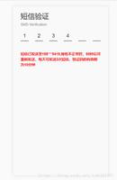
效果:

当为确认框时的按键处理:changeData
<DialogView ref="myDialog" @userBehavior="changeData"></DialogView>
……
changeData (type, data) {
console.log('changeData',data)
if (type === 'clickConfirm') {
if (data.operate === 'exchange') {
// this.reduceEnergy(data.shop)
this.exchangeCoupon(data.shop)
} else if (data.operate === 'downLoad') {
window.location = data.url
} else if (data.operate === 'login') {
this.uplusApi.upVdnModule.goToPage({url: 'mpaas://usercenter'})
this.isLogin = false
}
}
},
以上就是本文的全部内容,希望对大家的学习有所帮助,也希望大家多多支持。
以上是 vue自定义弹框效果(确认框、提示框) 的全部内容, 来源链接: utcz.com/p/239257.html