vue实现带过渡效果的下拉菜单功能
本文实例为大家分享了vue仿写下拉菜单功能,带有过渡效果(移动端),供大家参考,具体内容如下
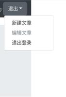
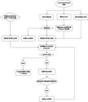
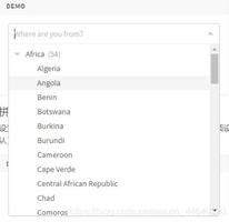
效果图

clickOutside.js 点击目标之外的地方,下拉框隐藏
代码如下:
export const clickOutside = {
bind(el, binding, vnode) {
function documentHandler(e) {
if (el.contains(e.target)) {
return false;
}
if (binding.expression) {
binding.value(e);
}
}
el.__vueClickOutside__ = documentHandler;
document.addEventListener("click", documentHandler);
},
update() {},
unbind(el, binding) {
document.removeEventListener("click", el.__vueClickOutside__);
delete el.__vueClickOutside__;
}
};
正文html如下:
<div class="info-select">
<div class="select">
<p class="select-p" @click="showSelectUl('s1')" v-clickOutside="hideSelectUl">
<span>{{issues}}</span>
<img :src="require('../../assets/images/support/icon_xiala.png')" alt="">
</p>
<transition name="slide-fade">
<div class="select-ul" v-show="!showIssues" >
<div v-for="(item, index) in list" :key="index" >
<div>{{item.class}}</div>
<div v-for="(item1, i) in item.node" :key="i" @click="getSize('s1', item1.class, index, i)">
<p :class="{active:item == issues}">{{item1.class}}</p>
</div>
</div>
</div>
</transition>
<transition leave-active-class="slideOutRight" enter-active-class="slideInRight">
<p class="animated errP" style="position: absolute;margin:0.2rem 0 0 -3%;" v-show="form.issueErr" >{{form.issueMsg}}</p>
</transition>
</div>
<div class="select">
<p class="select-p" @click="showSelectUl('s2')" v-clickOutside="hideSelectUl2">
<span>{{issues2}}</span>
<img :src="require('../../assets/images/support/icon_xiala.png')" alt="">
</p>
<transition name="component-fade" mode="out-in">
<div class="select-ul" v-show="!showIssues2">
<p v-for="(item, index) in childList" :class="{active:item == issues2}"
:key="index" @click="getSize('s2', item.class, index)">{{item.class}}</p>
</div>
</transition>
<transition leave-active-class="slideOutUp" enter-active-class="slideInUp">
<p class="animated errP" style="position:absolute;margin:0.2rem 0 0 -3%;" v-if="form.issueErr1" >{{form.issueMsg1}}</p>
</transition>
</div>
</div>
<div class="p-bts clearafter">
<button @click="form.issueErr = !form.issueErr">p1</button>
<button @click="form.issueErr1 = !form.issueErr1">p2</button>
</div>
js 代码如下:
import { clickOutside } from 'Models/clickoutside.js';
export default {
data(){
return{
catogery:'flight',
issues:"Select Category",
issues2:"Select Issue",
showIssues:true,
showIssues2:true,
list:[
{id:0,class:'flight',node:[
{class:'1.1 a1111111111111 11111111111111',node:[
{class:'问题a1?'},
{class:'问题a2?'}
]},
{class:'1.2 a2',node:[
{class:'问题a3?'},
{class:'问题a4?'}
]},
]},
{id:1,class:'hotel',node:[
{class:'1.1 b1',node:[
{class:'问题b1?'},
{class:'问题b2?'}
]},
{class:'1.2 b2',node:[
{class:'问题b3?'},
{class:'问题b4?'}
]},
]},
],
childList:[],
form:{
issueMsg:"Please select a category",issueErr:true,
issueMsg1:"Please select a issue",issueErr1:true,
},
}
},
methods: {
hideSelectUl(){
this.showIssues = true;
},
hideSelectUl2(){
this.showIssues2 = true;
},
showSelectUl(s){
if(s == 's1'){
this.showIssues = !this.showIssues;
this.showIssues2 = true;
}else{
this.showIssues = true;
this.showIssues2 = !this.showIssues2;
}
},
getSize(s, val, index, index2){
if(s == 's1'){
this.issues = val;
this.showIssues = true;
this.catogery = this.list[index].class;
this.childList = this.list[index].node[index2].node;
this.issues2 = 'Select Issue';
}else if(s == 's2'){
this.issues2 = val;
this.showIssues2 = true;
}
},
},
directives:{
clickOutside,
}
}
css代码如下:
.info-select{
display: flex;
justify-content: space-between;
.select{
width:40%;
position: relative;
padding:0.1rem 3% 0.1rem;
vertical-align: top;
font-size: 0.15rem;
border-radius:2px;
background: #fff;
border-top:1px solid #ddd;
border-bottom:1px solid #ddd;
border-right:1px solid #ddd;
}
.select:last-child{
border-right:0;
border-top:1px solid #ddd;
border-bottom:1px solid #ddd;
border-left:1px solid #ddd;
}
.select-p{
position: relative;
height:0.21rem;
line-height:0.21rem;
span{
font-size: 0.16rem;
display: inline-block;
width:90%;
overflow:hidden;
white-space:nowrap;
text-overflow:ellipsis;
}
img{
display:block;
width:0.12rem;
position: absolute;
right: 0;
top: 0;
vertical-align: middle;
}
}
.select-ul{
width:93.5%;
padding:0.12rem 3%;
position: absolute;
top: 0.42rem;
left: 0;
z-index: 12;
background: #fff;
border:1px solid #eee;
p{
padding:0.1rem 0 0.1rem 0.1rem;
overflow:hidden;
white-space:nowrap;
text-overflow:ellipsis;
}
p:hover{
background: #eee;
}
p.active{
background: #eee;
}
}
.errP{
color:#f00;
}
}
.p-bts{
margin-top: 0.4rem;
zoom: 1;// zoom(IE转有属性)可解决ie6,ie7浮动问题
button{
width:1.5rem;
height:0.4rem;
background: #ffa000;
float: left;
color:#fff;
font-size:0.25rem;
border-radius:2px;
}
button:last-child{
float: right;
}
}
.component-fade-enter-active, .component-fade-leave-active {
transition: opacity .3s ease;
}
.component-fade-enter, .component-fade-leave-to
/* .component-fade-leave-active for below version 2.1.8 */ {
opacity: 0;
}
// css animate
.slide-fade-enter-active{
transition:all .2s ease-in;
}
.slide-fade-leave-active {
transition: all .2s cubic-bezier(1.0, 0.5, 0.8, 1.0);
}
.slide-fade-enter, .slide-fade-leave-to{
/* .slide-fade-leave-active for below version 2.1.8 */
transform: translateY(20px);
opacity: 0;
}
// bounce
.bounce-enter-active {
animation: bounce-in .2s;
}
.bounce-leave-active {
animation: bounce-in .1s reverse;
}
@keyframes bounce-in {
0% {
transform: scale(0);
}
50% {
transform: scale(1);
}
100% {
transform: scale(1);
}
}
查看完整代码
更多教程点击《Vue.js前端组件学习教程》,欢迎大家学习阅读。
关于vue.js组件的教程,请大家点击专题vue.js组件学习教程进行学习。
以上就是本文的全部内容,希望对大家的学习有所帮助,也希望大家多多支持。
以上是 vue实现带过渡效果的下拉菜单功能 的全部内容, 来源链接: utcz.com/p/237030.html