解决vue自定义全局消息框组件问题
1.发现问题
在进行移动端适配的时候,为了在各个型号的设备上能够更好的提现结构排版,决定采用rem布局。采用rem布局的时候html的字体font-size是有一个标准的。我这边用的是750px的设计稿,就采用1rem = 100px。
在使用的过程中会用到一些第三方UI组件,而第三方UI组件是以px单位为标准的。
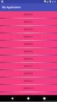
使用时发现:本来应该细长的提示语句变得很大!
最后发现可能是因为这个icon是继承了html设定的font-size,尝试加一些样式上去还是无效。(如果rem布局上有直接更改第三方组件样式成功的小伙伴欢迎告诉我哟!)
2.解决问题
有一种方法是可以可以用 px2rem-loader 插件可以将第三方ui库的px转换成rem单位,我们在写样式的时候用px,这个插件会帮我们转换为rem单位。(因为暂时只是一个提示框遇到这样的问题,不想大费周章,所以决定暂时不用,以后再用吧嘿嘿!)
自己写小组件,在网上冲浪了一会,选了几个小demo实现可以了下,确实比较好!(采用这个方法!)
3.自定义全局消息组件
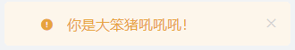
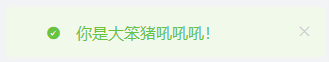
大概效果有点模仿 element-ui 中的提示样式,反正最后效果图如下:

vue-cli3中component下新建message文件夹,里面再建如下:

Message.vue源代码如下:
<template>
<transition name="fade"> <!--这个是动画的过渡效果-->
<div class="message" :class="type" v-if="visible">
<div class="content">
<i class="icon-type iconfont" :class="'icon-'+type"></i>
{{content}}
<i v-if="hasClose" class="btn-close iconfont icon-close" @click="visible=false"></i>
</div>
</div>
</transition>
</template>
<script>
export default {
name: 'Message.vue',
data () {
return {
content: '',
time: 3000,
visible: false,
type: 'info', // 'info','warning','error','success'
hasClose: false
}
},
mounted () {
this.close()
},
methods: {
close () {
window.setTimeout(() => {
this.visible = false
}, this.time)
}
}
}
</script>
<style scoped lang="scss">
/* 动画效果 淡入淡出 */
.fade-enter-active, .fade-leave-active{
transition: all 0.5s ease;
}
.fade-enter, .fade-leave-active{
opacity: 0;
}
/* 不同的提示语的样式 */
.info, .icon-info{
background-color: #DDDDDD;/*#f0f9eb*/
color: #909399;
}
.success, .icon-success{
background-color:#f0f9eb;
color: #67C23A;
}
.warning, .icon-warning{
background-color: #fdf6ec;
color: #e6a23c;
}
.error, .icon-error{
background-color: #fef0f0;
color: #f56c6c;
}
.message {
position: fixed;
left: 50%;
top: 10%;
transform: translate(-50%, -50%);
width:300px;
height:30px;
line-height: 30px;
font-size: 16px;
padding: 10px;
border-radius: 5px;
.content{
width:100%;
height:100%;
text-align:left;
.icon-type{
margin:0 10px 0 30px;
}
.btn-close{
font-size:20px;
margin:0 0 0 70px;
color:#ccc;
}
}
}
</style>
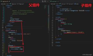
index.js源代码如下:
给Vue添加$my_message方法,判断参数,使用 $mount() 给组件手动挂载参数,然后将组件插入页面中
import Vue from 'vue'
import Message from './Message.vue'
const MessageBox = Vue.extend(Message)
Message.install = function (options, type) {
if (options === undefined || options === null) {
options = {
content: ''
}
} else if (typeof options === 'string' || typeof options === 'number') {
options = {
content: options
}
if (type !== undefined && options !== null) {
options.type = type
}
}
let instance = new MessageBox({
data: options
}).$mount()
document.body.appendChild(instance.$el)
Vue.nextTick(() => {
instance.visible = true
})
}
export default Message
main.js中:
// 在main.js里面全局引入 自定义的全局消息框组件
import Message from './components/message'
Vue.prototype.$my_message = Message.install

页面中调用:
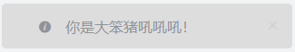
this.$my_message('你这个大笨猪吼吼吼!');
this.$my_message('你这个大笨猪吼吼吼!','success');
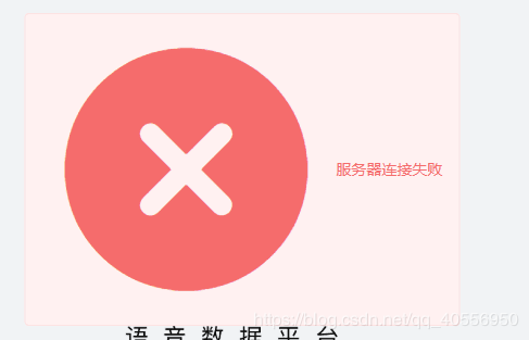
this.$my_message({
content:'服务器连接失败!', // 弹出的文字内容
time:5000, // 弹出后多久消失
type:'success', // 弹出的消息类型
hasClose:true, // 让按钮可以被使用,默认按钮是false不可以使用的
});
4.注意事项
本Demo中弹出的提示语句中的小图标是iconfont里面的。
总结
以上所述是小编给大家介绍的解决vue自定义全局消息框组件问题,希望对大家有所帮助,如果大家有任何疑问请给我留言,小编会及时回复大家的。在此也非常感谢大家对网站的支持!
如果你觉得本文对你有帮助,欢迎转载,烦请注明出处,谢谢!
以上是 解决vue自定义全局消息框组件问题 的全部内容, 来源链接: utcz.com/p/236735.html