python使用matplotlib绘图详解[python高级教程]
![python使用matplotlib绘图详解[python高级教程]](/wp-content/uploads/new2022/20220602jjjkkk3/997225631_1.jpg)
matplotlib是python最著名的绘图库,它提供了一整套和matlab相似的命令API,十分适合交互式地进行制图。而且也可以方便地将它作为绘图控件,嵌入GUI应用程序中。它的文档相当完备,并且Gallery页面中有上百幅缩略图,打开之后都有源程序。因此如果你需要绘制某种类型的图,只需要在这个页面中浏览/复制/粘贴一下,基本上都能搞定。
这篇我们用matplotlib从构造最简单的bar一步一步向复杂的bar前行。什么是最简单的bar,看如下语句你就知道她有多么简单了:
import matplotlib.pyplot as plt执行效果:plt.bar(left = 0,height = 1)
plt.show()
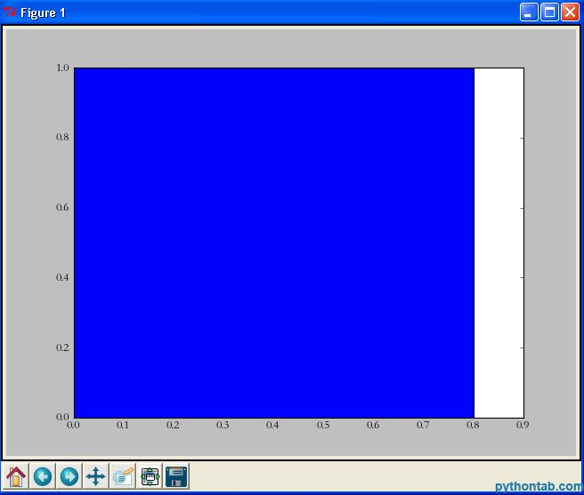 是的,三句话就可以了,是我见过最简单的绘图语句。首先我们import了matplotlib.pyplot ,然后直接调用其bar方法,最后用show显示图像。我解释一下bar中的两个参数:
left:柱形的左边缘的位置,如果我们指定1那么当前柱形的左边缘的x值就是1.0了
height:这是柱形的高度,也就是Y轴的值了
import matplotlib.pyplot as pltplt.bar(left = (0,1),height = (1,0.5))
plt.show()
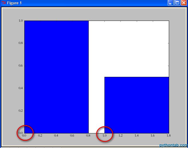 可以看到 left = (0,1)的意思就是总共有两个矩形,第一个的左边缘为0,第二个的左边缘为1。height参数同理。 当然,可能你还觉得这两个矩形“太胖”了。此时我们可以通过指定bar的width参数来设置它们的宽度。
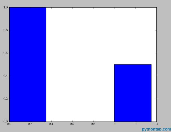
import matplotlib.pyplot as pltplt.bar(left = (0,1),height = (1,0.5),width = 0.35)
plt.show()
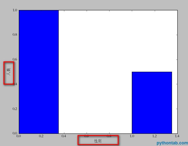
 此时又来需求了,我需要标明x,y轴的说明。比如x轴是性别,y轴是人数。实现也很简单,看代码:
 import matplotlib.pyplot as pltplt.xlabel(u"性别")
plt.ylabel(u"人数")
plt.bar(left = (0,1),height = (1,0.5),width = 0.35)
plt.show()
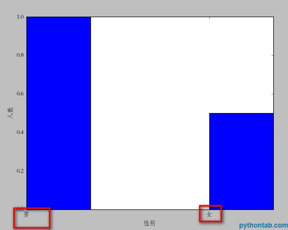
 注意这里的中文一定要用u(3.0以上好像不用,我用的2.7),因为matplotlib只支持unicode。接下来,让我们在x轴上的每个bar进行说明。比如第一个是“男”,第二个是“女”。
 import matplotlib.pyplot as pltplt.xlabel(u"性别")
plt.ylabel(u"人数")
plt.xticks((0,1),(u"男",u"女"))
plt.bar(left = (0,1),height = (1,0.5),width = 0.35)
plt.show()
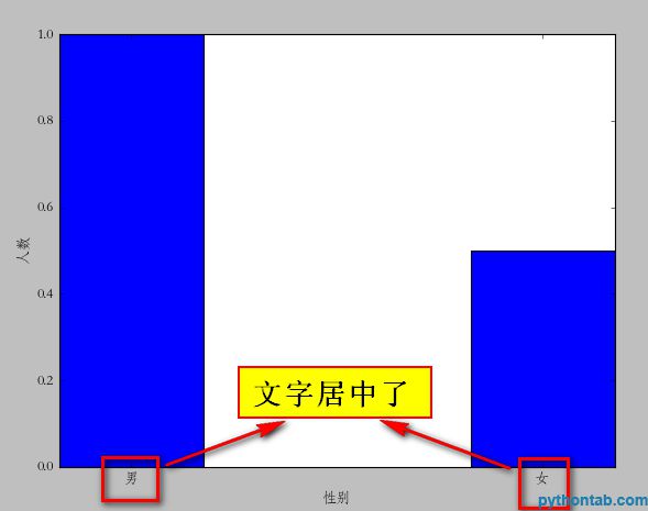
 plt.xticks的用法和我们前面说到的left,height的用法差不多。如果你有几个bar,那么就是几维的元组。第一个是文字的位置,第二个是具体的文字说明。不过这里有个问题,很显然我们指定的位置有些“偏移”,最理想的状态应该在每个矩形的中间。你可以更改(0,1)=>( (0+0.35)/2 ,(1+0.35)/2 )不过这样比较麻烦。我们可以通过直接指定bar方法里面的align="center"就可以让文字居中了。
import matplotlib.pyplot as pltplt.xlabel(u"性别")
plt.ylabel(u"人数")
plt.xticks((0,1),(u"男",u"女"))
plt.bar(left = (0,1),height = (1,0.5),width = 0.35,align="center")
plt.show()
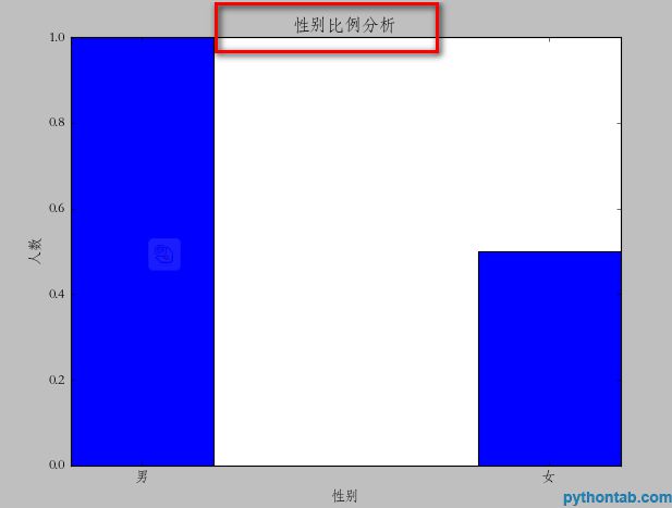
 接下来,我们还可以给图标加入标题。
plt.title(u"性别比例分析")
 当然,还有图例也少不掉:
import matplotlib.pyplot as pltplt.xlabel(u"性别")
plt.ylabel(u"人数")
plt.title(u"性别比例分析")
plt.xticks((0,1),(u"男",u"女"))
rect = plt.bar(left = (0,1),height = (1,0.5),width = 0.35,align="center")
plt.legend((rect,),(u"图例",))
plt.show()
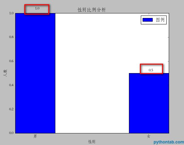
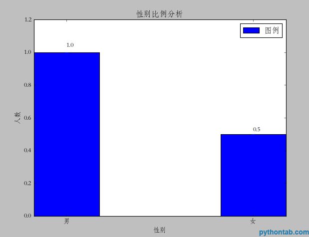
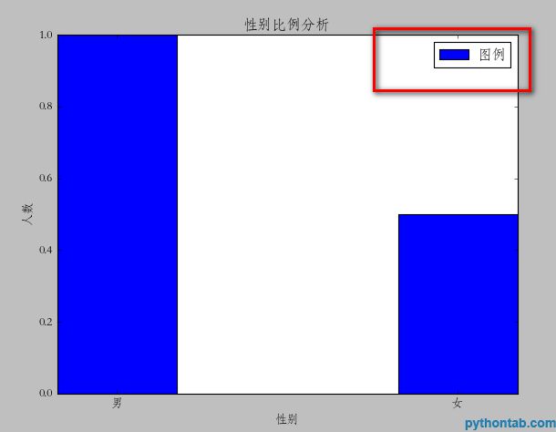 注意这里的legend方法,里面的参数必须是元组。即使你只有一个图例,不然显示不正确。 接下来,我们还可以在每个矩形的上面标注它具体点Y值。这里,我们需要用到一个通用的方法:
def autolabel(rects):其中plt.text的参数分别是:x坐标,y坐标,要显示的文字。所以,调用代码如下:for rect in rects:
height = rect.get_height()
plt.text(rect.get_x()+rect.get_width()/2., 1.03*height, "%s" % float(height))
import matplotlib.pyplot as pltdef autolabel(rects):
for rect in rects:
height = rect.get_height()
plt.text(rect.get_x()+rect.get_width()/2., 1.03*height, "%s" % float(height))
plt.xlabel(u"性别")
plt.ylabel(u"人数")
plt.title(u"性别比例分析")
plt.xticks((0,1),(u"男",u"女"))
rect = plt.bar(left = (0,1),height = (1,0.5),width = 0.35,align="center")
plt.legend((rect,),(u"图例",))
autolabel(rect)
plt.show()
 到这里这个图形已经基本完备了,不过可以看到你一个矩形紧靠这顶部,不是很好看。最好能够空出一段距离出来就好了。这个设置我没有找到具体的属性。不过,我还是通过一个小技巧来实现了。就是bar属性的yerr参数。一旦设置了这个参数,那么对应的矩形上面就会有一个竖着的线,我不知道他是干什么的。不过当我把这个值设置的很小的时候,上面的空白就自动空出来了。如图:
 rect = plt.bar(left = (0,1),height = (1,0.5),width = 0.35,align="center",yerr=0.000001)
 对于左右两边能否空出空白来暂时还没有找到(xerr参数不行)
以上是 python使用matplotlib绘图详解[python高级教程] 的全部内容, 来源链接: utcz.com/z/539995.html