vue组件开发之tab切换组件使用详解
本文实例为大家分享了vue组件开发之tab切换组件的具体使用代码,供大家参考,具体内容如下
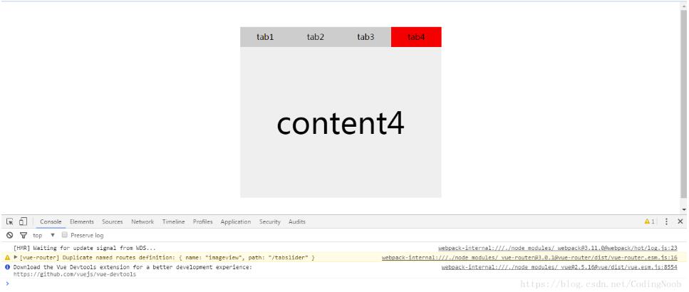
代码:
<template>
<div class="tab-slider">
<div class="tab">
<span v-for="(item, index) in items" v-bind:class="{active: actived == index}" @click="toggle(index)">{{item.tab}}</span>
</div>
<div class="tab-content">
<div class="wrapbox clearboth">
<div class="item" v-for="(item, index) in items">{{item.tabContent}}</div>
</div>
</div>
</div>
</template>
<script>
export default {
name: 'tabSlider',
data (){
return {
actived: 0,
items: [{
'tab': 'tab1',
'tabContent': 'content1'
},{
'tab': 'tab2',
'tabContent': 'content2'
},{
'tab': 'tab3',
'tabContent': 'content3'
},{
'tab': 'tab4',
'tabContent': 'content4'
}]
}
},
methods: {
//获取图片base64实现预览
toggle(index){
this.actived = index;
document.querySelector(".tab-content .wrapbox").style.webkitTransform = "translateX(-" + (this.actived * 400) + "px)";
}
}
}
</script>
<style scoped>
*{margin:0 auto;padding:0;font-family:"微软雅黑";}
.clearboth::after{
content:"";
display:block;
clear:both;
}
.tab-slider{
height:auto;
width:400px;
margin:50px auto;
}
.tab-slider .tab{
display:flex;
height:40px;
line-height:40px;
background:#ccc;
}
.tab-slider .tab span{
display:block;
width:100%;
text-align:center;
cursor:default;
}
.tab-slider .tab .active{
background:red;
}
.tab-slider .tab-content{
height:300px;
width:400px;
overflow:hidden;
}
.tab-slider .tab-content .item{
float:left;
height:300px;
width:400px;
line-height:300px;
text-align:center;
font-size:60px;
background:#eee;
}
.tab-slider .wrapbox{
width:2000px;
transition: all 1s;
}
</style>
本文已被整理到了《Vue.js前端组件学习教程》,欢迎大家学习阅读。
关于vue.js组件的教程,请大家点击专题vue.js组件学习教程进行学习。
以上就是本文的全部内容,希望对大家的学习有所帮助,也希望大家多多支持。
以上是 vue组件开发之tab切换组件使用详解 的全部内容, 来源链接: utcz.com/p/237935.html