element-ui 实现响应式导航栏的示例代码
开始之前
按照计划,前端使用Vue.js+Element UI,但在设计导航栏时,发现element没有提供传统意义上的页面顶部导航栏组件,只有一个可以用在很多需要选择tab场景的导航菜单,便决定在其基础上改造,由于我认为实现移动端良好的体验是必须的,所以便萌生了给其增加响应式功能的想法。
需求分析与拆解
假设我们的导航栏有logo和四个el-menu-item。
给window绑定监听事件,当宽度小于a时,四个链接全部放入右侧el-submenu的子菜单:
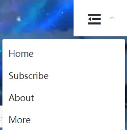
当宽度大于a时,右侧el-submenu不显示,左侧el-menu-item正常显示:

所以,先创建一个数组,存储所有所需的item:
navItems: [
{ name: "Home", indexPath: "/home", index: "1" },
{ name: "Subscribe", indexPath: "/subscribe", index: "2"},
{ name: "About", indexPath: "/about", index: "3" },
{ name: "More", indexPath: "/more", index: "4" }
]
监听宽度
很明显功能实现的关键是随时监听窗口的变化,根据对应的宽度做出响应,在data中,我使用screenWidth变量来存储窗口大小,保存初始打开页面时的宽度:
data() {
return {
screenWidth: document.body.clientWidth
......
}
}
接下来在mounted中绑定屏幕监听事件,将最新的可用屏幕宽度赋给screenWidth:
mounted() {
window.onresize = () => {
this.screenWidth = document.body.clientWidth
}
}
(关于document和window中N多的关于高度和宽度的属性,可以参考这篇文章。)
为了防止频繁触发resize函数导致页面卡顿,可以使用一个定时器,控制下screenWidth更新的频率:
watch: {
screenWidth(newValue) {
// 为了避免频繁触发resize函数导致页面卡顿,使用定时器
if (!this.timer) {
// 一旦监听到的screenWidth值改变,就将其重新赋给data里的screenWidth
this.screenWidth = newValue;
this.timer = true;
setTimeout(() => {
//console.log(this.screenWidth);
this.timer = false;
}, 400);
}
}
}
显示
有了屏幕宽度的实时数据后,就可以以computed的方式控制menuItem了。
computed: {
...
leftNavItems: function() {
return this.screenWidth >= 600 ? this.navItems : {};
},
rightNavItems: function() {
return this.screenWidth < 600 ? this.navItems : {};
}
},
通过简单的判断即可在窗口宽度变化时,将菜单里的内容放入预先设置的正常菜单或者当宽度小于600时显示的右侧下拉菜单,附上html部分代码:
<el-menu text-color="#2d2d2d" id="navid" class="nav" mode="horizontal" @select="handleSelect">
<el-menu-item class="logo" index="0" route="/home">
<img class="logoimg" src="../assets/img/logo.png" alt="logo" />
</el-menu-item>
<el-menu-item
:key="key"
v-for="(item,key) in leftNavItems"
:index="item.index"
:route="item.activeIndex"
>{{item.name}}</el-menu-item>
<el-submenu
style="float:right;"
class="right-item"
v-if="Object.keys(rightNavItems).length === 0?false:true"
index="10"
>
<template slot="title">
<i class="el-icon-s-fold" style="font-size:28px;color:#2d2d2d;"></i>
</template>
<el-menu-item
:key="key"
v-for="(item,key) in rightNavItems"
:index="item.index"
:route="item.activeIndex"
>{{item.name}}</el-menu-item>
</el-submenu>
</el-menu>
总结
总的来说,一个丐版就算完成了,这里只提供了一种可能的思路,如需实践可以增加更多判断规则及功能。(主要是已经转用Vuetify啦~)
到此这篇关于element-ui 实现响应式导航栏的示例代码的文章就介绍到这了,更多相关element 响应式导航栏内容请搜索以前的文章或继续浏览下面的相关文章希望大家以后多多支持!
以上是 element-ui 实现响应式导航栏的示例代码 的全部内容, 来源链接: utcz.com/p/237257.html