iCheck 美化复选框和单选按钮插件
iCheck 是一款美化复选框和单选按钮的 jQuery 插件,能高度定制自定义网页表单效果,具有多套可选皮肤替换方案,能兼容移动设备浏览器和桌面 PC 台式机浏览器效果,支持鼠标和键盘的操作,轻量级的插件,压缩版本只有1K大小,能支持 jQuery 和 Zepto 等 JavaScript 库。
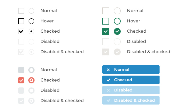
插件特点
- 在不同浏览器和设备上都有相同的表现 — 包括 桌面和移动设备
- 支持触摸设备 — iOS、Android、BlackBerry、Windows Phone
- 支持键盘导航 — Tab、Spacebar、Arrow up/down 和其它快捷键
- 方便定制 — 用HTML 和 CSS 即可为其设置样式 (试试 6 套针对Retina屏幕的皮肤吧)
- 支持 jQuery 和 Zepto JavaScript工具库
- 体积小巧 — gzip 压缩后只有1 kb
- 25 种参数 用来定制复选框(checkbox)和单选按钮(radio button)
- 8 个回调事件 用来监听输入框的状态
- 7 个方法 用来通过编程方式控制输入框的状态
- 能够将输入框的状态变化同步回原始输入框中, 支持所有选择器
浏览器支持
- iCheck已经在 Internet Explorer 6+、Firefox 2+、Opera 9+、Google Chrome 和 Safari 浏览器上被验证过,并且应该可以再更多浏览器上工作。
- 移动浏览器例如 Opera mini、 Chrome mobile、 Safari mobile 和其它浏览器 也被支持。
- 已经在 iOS (iPad、 iPhone、 iPod)、Android、BlackBerry 和 Windows Phone 设备上进行了测试。
如何工作
我的作品与复选框和单选按钮一样,构造函数。它将每个输入一个div,这可能是由您或使用一个定制的可用皮肤。你也可能在一些HTML代码或文本使用 insert 选项。 例如下面的HTML代码
<label><input type="checkbox" name="quux[1]" disabled>
Foo
</label>
<label for="baz[1]">Bar</label>
<input type="radio" name="quux[2]" id="baz[1]" checked>
<label for="baz[2]">Bar</label>
<input type="radio" name="quux[2]" id="baz[2]">
使用默认的选项你将获得近这:
<label><div class="icheckbox disabled">
<input type="checkbox" name="quux[1]" disabled>
</div>
Foo
</label>
<label for="baz[1]">Bar</label>
<div class="iradio checked">
<input type="radio" name="quux[2]" id="baz[1]" checked>
</div>
<label for="baz[2]">Bar</label>
<div class="iradio">
<input type="radio" name="quux[2]" id="baz[2]">
</div>
默认情况下,我不提供任何CSS样式(如果你不使用皮肤)。
选项
这些选项是默认的:
{ // 'checkbox' or 'radio' to style only checkboxes or radio buttons, both by default
handle: '',
// base class added to customized checkboxes
checkboxClass: 'icheckbox',
// base class added to customized radio buttons
radioClass: 'iradio',
// class added on checked state (input.checked = true)
checkedClass: 'checked',
// if not empty, used instead of 'checkedClass' option (input type specific)
checkedCheckboxClass: '',
checkedRadioClass: '',
// if not empty, added as class name on unchecked state (input.checked = false)
uncheckedClass: '',
// if not empty, used instead of 'uncheckedClass' option (input type specific)
uncheckedCheckboxClass: '',
uncheckedRadioClass: '',
// class added on disabled state (input.disabled = true)
disabledClass: 'disabled',
// if not empty, used instead of 'disabledClass' option (input type specific)
disabledCheckboxClass: '',
disabledRadioClass: '',
// if not empty, added as class name on enabled state (input.disabled = false)
enabledClass: '',
// if not empty, used instead of 'enabledClass' option (input type specific)
enabledCheckboxClass: '',
enabledRadioClass: '',
// class added on indeterminate state (input.indeterminate = true)
indeterminateClass: 'indeterminate',
// if not empty, used instead of 'indeterminateClass' option (input type specific)
indeterminateCheckboxClass: '',
indeterminateRadioClass: '',
// if not empty, added as class name on determinate state (input.indeterminate = false)
determinateClass: '',
// if not empty, used instead of 'determinateClass' option (input type specific)
determinateCheckboxClass: '',
determinateRadioClass: '',
// class added on hover state (pointer is moved onto input)
hoverClass: 'hover',
// class added on focus state (input has gained focus)
focusClass: 'focus',
// class added on active state (mouse button is pressed on input)
activeClass: 'active',
// adds hoverClass to customized input on label hover and labelHoverClass to label on input hover
labelHover: true,
// class added to label if labelHover set to true
labelHoverClass: 'hover',
// increase clickable area by given % (negative number to decrease)
increaseArea: '',
// true to set 'pointer' CSS cursor over enabled inputs and 'default' over disabled
cursor: false,
// set true to inherit original input's class name
inheritClass: false,
// if set to true, input's id is prefixed with 'iCheck-' and attached
inheritID: false,
// set true to activate ARIA support
aria: false,
// add HTML code or text inside customized input
insert: ''
}
不需要复制和粘贴所有的人,你可以说你需要的:
$('input').iCheck({ labelHover: false,
cursor: true
});
你可以选择任何一类名称和风格是你想要的。
初始化
在引入jQuery插件(或者 Zepto [polyfill, event, data])以后,只包括icheck.js 我支持任何选择,但只处理复选框和单选按钮:
// customize all inputs (will search for checkboxes and radio buttons)$('input').iCheck();
// handle inputs only inside $('.block')
$('.block input').iCheck();
// handle only checkboxes inside $('.test')
$('.test input').iCheck({
handle: 'checkbox'
});
// handle .vote class elements (will search inside the element, if it's not an input)
$('.vote').iCheck();
// you can also change options after inputs are customized
$('input.some').iCheck({
// different options
});
Indeterminate
HTML5允许指定Indeterminate(“部分”选中状态的复选框)。我支持这两个复选框和单选按钮。 你可以通过使用附加属性的HTML使输入不定(支持我)。都做同样的工作,但是indeterminate="true"不可能在某些浏览器(如IE7):
indeterminate="true"<input type="checkbox" indeterminate="true">
<input type="radio" indeterminate="true">
determinate="false"
<input type="checkbox" determinate="false">
<input type="radio" determinate="false">
回调函数
我提供了大量的回调函数,可以用来处理变化。
| Callback name | When used |
|---|---|
| ifClicked | user clicked on a customized input or an assigned label |
| ifChanged | input’s “checked”, “disabled” or “indeterminate” state is changed |
| ifChecked | input’s state is changed to “checked” |
| ifUnchecked | “checked” state is removed |
| ifToggled | input’s “checked” state is changed |
| ifDisabled | input’s state is changed to “disabled” |
| ifEnabled | “disabled” state is removed |
| ifIndeterminate | input’s state is changed to “indeterminate” |
| ifDeterminate | “indeterminate” state is removed |
| ifCreated | input is just customized |
| ifDestroyed | customization is just removed |
使用on()将它们绑定到输入法:
$('input').on('ifChecked', function(event){ alert(event.type + ' callback');
});
ifcreated回调应该绑定在插件初始化。
方法
这些方法可用于以编程方式更改(任何选择都可以用):
// change input's state to 'checked'$('input').iCheck('check');
// remove 'checked' state
$('input').iCheck('uncheck');
// toggle 'checked' state
$('input').iCheck('toggle');
// change input's state to 'disabled'
$('input').iCheck('disable');
// remove 'disabled' state
$('input').iCheck('enable');
// change input's state to 'indeterminate'
$('input').iCheck('indeterminate');
// remove 'indeterminate' state
$('input').iCheck('determinate');
// apply input changes, which were done outside the plugin
$('input').iCheck('update');
// remove all traces of iCheck
$('input').iCheck('destroy');
你也可以指定一些功能,将每个方法调用的执行:
$('input').iCheck('check', function(){ alert('Well done, Sir');
});
随时创建和提交拉请求或提交问题如果你找到的东西不工作。
比较
我是为了避免常规的重新发明轮子的工作时,复选框和单选按钮。它为浏览器的大量提供预期相同的结果,设备和版本。回调方法可以轻松处理和定制的输入变化。 有一些CSS3的方式可复选框和单选按钮的风格,喜欢这一个。你必须知道的一些类似方法的缺点:
- 输入键盘无法访问,因为
display: none和visibility: hidden用来隐藏 - 可怜的浏览器支持
- 移动设备上的多个错误
- 微妙的,难以维持CSS代码
- JavaScript仍然是需要解决的具体问题
虽然CSS3的方法是非常有限的解决方案,我是每天都更换覆盖了大部分的任务。
以上是 iCheck 美化复选框和单选按钮插件 的全部内容, 来源链接: utcz.com/p/231842.html