Vue + ts实现轮播插件的示例
背景
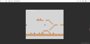
最近在学习 ts,打算用 ts 写一个练手项目,参照的网站内容是 wanandroid,这个接触过android开发的同学可能更i了解一些,其实一开始是打算后台全部都自己写的,不过奈何一个懒字,所以现在的打算就是自己实现登录注册简单的逻辑。这些都不重要,一开始实现轮播是打算在 vue 中引入轮播图 swiper.js,后来想想还是自己写算了。也当作熟悉 ts。先上效果图(这里没有动态图片,各位同学可以自己实现)
代码已经上传 git,进度比较慢,如果可以各位大佬点个 star。 github.com/jiwenjie/vu…
<!-- vue 实现轮播图 -->
<template>
<div id="swiperDIV" :style="{height: height + 'px'}" @mouseover="suspend" @mouseout="autoPlay" @blur="suspend"
@focus="autoPlay">
<!-- 淡入淡出效果 -->
<transition-group tag="ul" class="img-list" :name="animation">
<li v-for="(item, index) in bannerList" :key="item.id" v-show="curIndex === index">
<img :src="item[nameField]">
</li>
</transition-group>
<!-- 操作按钮部分(底部导航器) -->
<ul class="option-list" v-if="showPagination">
<li class="option-list-item" :class="curIndex === index ? 'cur-option-style':''"
v-for="(item, index) in bannerList" :key="item.id" @click="jump(item, index)"></li>
</ul>
<!-- 左侧右侧切换按钮 -->
<template v-if="showBtn">
<div class="common-btn-space pre-btn-space">
<span class="common-btn-span pre-btn-span"></span>
</div>
<div class="common-btn-space next-btn-space">
<span class="common-btn-span next-btn-span"></span>
</div>
</template>
</div>
</template>
<!-- ts 文件拆分 -->
<script lang="ts">
// 两种动画背景
import {
Component,
Prop,
Vue
} from 'vue-property-decorator'
import swiper from './ts/swiper'
@Component({
name: 'Swiper',
mixins: [swiper],
})
export default class extends Vue {}
</script>
<!-- 样式文件拆分 -->
<style lang="scss" scoped>
@import url("./css/swiper.scss");
</style>
ts文件
import {
Component,
Prop,
Vue
} from 'vue-property-decorator'
import { Banner } from '@/beans/index' // 首页banner图
@Component({
name: 'Swiper',
components: {},
})
export default class IndexPage extends Vue {
@Prop({ default: 6000 }) private timeout: number; // 默认的切换banner图的时长
@Prop({ default: 400 }) private height: number | string; // banner区域高度
@Prop({ default: () => [] }) private bannerList: Banner[]; // 传入的图片数组
@Prop({ default: 'imagePath' }) private nameField: string; // 图片地址对应的字段名
@Prop({ default: true }) private showPagination: boolean; // 是否显示底部原点分页器
@Prop({ default: false }) private showBtn: boolean; // 是否显示左右的切换按钮
@Prop({
default: 'fade', validator: function (value) {
let arr = ['fade', 'translate']
return arr.includes(value);
} }) private animation: string; // 是否显示左右的切换按钮
private timer: any;
private curIndex: number = 0;
created(): void {
this.autoPlay()
}
// lifecycle hook
mounted(): void {
}
// method
private handleSelect() {
}
// 自动播放图片
private autoPlay() {
clearInterval(this.timer)//还是一样,开启定时器之前需要先清除一下,防止bug
this.timer = setInterval(this.nextClick, this.timeout as number)
}
// 切换下一个 banner 图片
private nextClick() {
this.curIndex++;
if (this.curIndex >= this.bannerList.length) {
this.curIndex = 0;
}
}
// 切换上一个图片
private preClick() {
this.curIndex++;
if (this.curIndex >= this.bannerList.length) {
this.curIndex = 0;
}
}
// 暂停的方法
private suspend() {
clearInterval(this.timer)
}
// 点击底部原点按钮调整方法
private jump(bannerItem: Banner, index: number) {
this.curIndex = index;
}
// private animationMethodValidator(): string {
// }
}
css文件
#swiperDIV {
position: relative;
display: block;
width: 100%;
}
.img-list {
width: 100%;
height: 100%;
position: relative;
margin: 0;
padding: 0;
z-index: 9;
}
.img-list li {
position: absolute;
left: 0;
width: 100%;
height: 100%;
}
.img-list img {
width: 100%;
height: 100%;
}
.option-list {
position: absolute;
left: 0;
right: 0;
bottom: 10px;
height: 30px;
line-height: 30px;
z-index: 99;
text-align: center;
}
.option-list-item {
display: inline-block;
background-color: rgba(255, 255, 255, .4);
width: 10px;
height: 10px;
border-radius: 50%;
margin: 0 3px;
cursor: pointer;
}
.cur-option-style {
background-color: #fff;
}
.common-btn-space {
position: absolute;
top: 0;
bottom: 0;
z-index: 99;
width: 22px;
}
.pre-btn-space {
left: 20px;
}
.next-btn-space {
right: 20px;
}
.common-btn-span {
display: inline-block;
width: 22px;
height: 22px;
background-color: transparent;
cursor: pointer;
position: absolute;
top: 0;
bottom: 0;
margin: auto;
border-top: 2px solid transparent;
border-right: 2px solid transparent;
border-bottom: 2px solid red;
border-left: 2px solid red;
}
.pre-btn-span {
transform: rotate(45deg);
}
.next-btn-span {
transform: rotate(-135deg);
}
/* 实现动画的两组类(淡入淡出) */
.fade-enter-active,
.fade-leave-active {
transition: opacity .6s;
}
.fade-enter,
.fade-leave-to {
opacity: 0;
}
/* (滚动) */
.translate-enter {
transform: translateX(100%)
}
.translate-enter-to {
transition: all .6s ease;
transform: translateX(0);
}
.translate-leave {
transform: translateX(0)
}
.translate-leave-active {
transition: all .6s ease;
transform: translateX(-100%)
}
很多地方做了配置,包括底部的分页器,左右两侧的按钮。动画目前只实现了两种,一种是淡入淡出,一种是平滑滚动。
这里我把整个 vue 文件做了拆分。有多种原因,一个是我司做项目时整体就是这种拆分,不过我司用的就是正常的 vue 和 js。主要原因就是考虑到页面复杂和逻辑交互很多的时候,一个 vue 文件可能超过万行,所以做了拆分,这里我也延续了这种写法,基本思想其实就是使用 mixins 引入 ts。还有一个原因是 ts 在 vue 文件中会有很多莫名其妙的报错,明明代码没问题,但就是有错误警告。如果提到 ts 文件中就正常,这也是我拆分的一个原因。
其他的功能可以自己在加,如果有问题可以留言,有错误希望各位大佬指正。
以上就是Vue + ts实现轮播插件的示例的详细内容,更多关于Vue + ts 轮播插件的资料请关注其它相关文章!
以上是 Vue + ts实现轮播插件的示例 的全部内容, 来源链接: utcz.com/p/218668.html