JS+CSS实现过渡特效
最近在玩一个叫Baba is you的游戏,很羡慕里面的一个转场特效,所以试着做了一下。主要使用了JS和CSS,特效主要是用CSS实现的。
HTML代码
<!DOCTYPE html>
<html lang="en" dir="ltr">
<head>
<meta charset="utf-8">
<title>开始导航</title>
<link rel="stylesheet" href="style.css" >
</head>
<body>
<div class="text">
<p><a id="bottom">点击进入</a></p>
</div>
</body>
<script type="text/javascript">
//执行代码
window.onload=function(){
var bottom=document.getElementById("bottom");
bottom.onclick=function(){
action();
}
}
//获取网页长宽
var windowWidth=window.screen.width;
var windowHeight=window.screen.height;
function createSnow(){
topblack();
leftblack();
bottomblack();
rightblack();
function topblack(){
//随机创造1个div圆球
var left_random=Math.random()*windowWidth;
var top_random=Math.random()*50;
var div=document.createElement('div');
div.className='snow';
//定义缩放转换
div.style.transform='scale('+(Math.random()*3)+')'
//定义随机位置,在顶部50像素之内
div.style.left=left_random+'px';
div.style.top=top_random+'px';
//放在html外面,先用overflow:hidden隐藏掉
div.style.marginTop="-250px";
document.body.appendChild(div);
}
function leftblack(){
var left_random=Math.random()*50;
var top_random=Math.random()* windowHeight;
var div=document.createElement('div');
div.className='snow';
div.style.transform='scale('+(Math.random()*2)+')'
div.style.left= left_random+'px';
div.style.top=top_random+'px';
div.style.marginLeft="-250px";
document.body.appendChild(div);
}
function bottomblack(){
var left_random=Math.random()*windowWidth;
var bottom_random=Math.random()*50;
var div=document.createElement('div');
div.className='snow';
div.style.transform='scale('+(Math.random()*2)+')'
div.style.left=left_random+'px';
div.style.bottom=bottom_random+'px';
div.style.marginBottom="-250px";
document.body.appendChild(div);
}
function rightblack(){
var right_random=Math.random()*50;
var top_random=Math.random()* windowHeight;
var div=document.createElement('div');
div.className='snow';
div.style.transform='scale('+(Math.random()*2)+')'
div.style.right=right_random+'px';
div.style.top=top_random+'px';
div.style.marginRight="-250px";
document.body.appendChild(div);
}
}
function setblack(){
//各自创造100个圆球随机放在HTML顶部、底部、左右边,各自隐藏。
for(var i=0;i<100;i++){
createSnow()
}
}
//清除使用过后的云层与文字
function clearsnow(){
var snow=document.querySelectorAll(".snow");
var font=document.querySelector(".Fontarea");
for(var i=0;i<snow.length;i++){
document.body.removeChild(snow[i]);
}
document.body.removeChild(font);
}
//只是一个习惯,定义一个创建div的模板函数。你们可以用自己的方式。
function font(oCss){
var oBox=document.createElement("p");
oCss.parent.appendChild(oBox);
oBox.innerHTML=oCss.p;
oBox.className=oCss.c;
return oBox;
}
function create(oCss){
var oBox=document.createElement("div");
oCss.parent.appendChild(oBox);
oBox.style.width=oCss.w+"px";
oBox.style.height=oCss.h+"px";
oBox.style.position=oCss.p;
oBox.style.left=oCss.l+"px";
oBox.style.top=oCss.t+"px";
oBox.style.backgroundSize="100%";
return oBox;
}
//创建浮现的文字
function winthegame(){
var Fontarea=create({
"w":500,
"h":600,
"p":"absolute",
"parent":document.body,
"l":"400",
"t":"0"});
Fontarea.style.marginTop="200px";
Fontarea.className="Fontarea";
Fontarea.style.zIndex="31";
var titlep=font({ "parent":Fontarea,"p":"CONGRATULATION!","c":"font7"});
}
//执行创建云层与文字,封装起来是因为,如果文字出现多个不同的,就用不同的函数封装不同的场合。
function wintime(){
winthegame();
setblack();
}
//执行创建与清除,用setTimeout()来延迟清除。
function action(){
wintime();
setTimeout(clearsnow,5000);
}
</script>
</html>
css代码
body{
background-size: 100%;
overflow: hidden;
background-color: #000;
}
.text{
color: white;
text-align: center;
text-transform: uppercase;
margin: 300px 0;
font-size: 22px;
}
.text a{color:white;
text-decoration:none;
cursor: pointer;
}
.snow{
background: #15181f;
position: absolute;
width: 100px;
height: 100px;
border-radius: 50%;
z-index: 30;
animation: bganimation 5s 1;
}
.font7{
color:white;
text-align: center;
font-size: 60px;
}
.Fontarea{
opacity:0;
animation: beganfont 4s 1;
}
@keyframes bganimation {
0%{
width: 100px;
height: 100px;
}
50%{
width: 500px;
height: 500px;
}
100%{
width: 100px;
height: 100px;
}
}
@keyframes beganfont {
0%{
opacity:0;
}
50%{
opacity:1;
}
100%{
opacity:0;
}
}
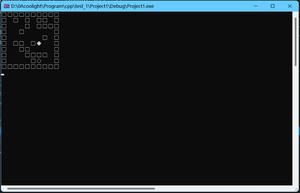
这是效果图,点击文字会执行效果一次。
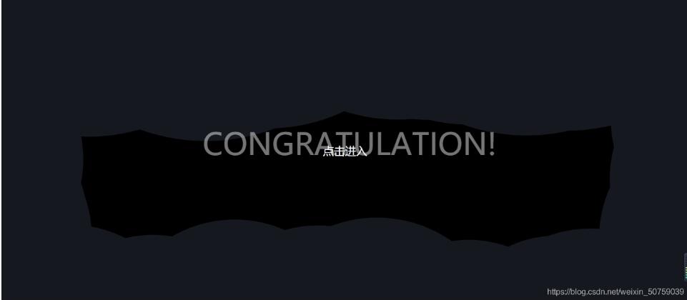
效果JS的解析都写在注释里了,CSS就是使用@keyframes来实现效果,也不是什么难懂的。
这种效果对于用于展示开场应该足够了,主要可以用来炫耀之类的,JS的代码或许比较粗糙,是从某个朋友的雪花特效那copy来改的。主要是用来做一个期末项目的,这个项目某些东西我以后也会慢慢总结的。
那么,就这样,可能我写的特效会跟别人的撞车,请多多包涵。如果感觉不是什么高大上的东西,也请多多包涵。
以上就是本文的全部内容,希望对大家的学习有所帮助,也希望大家多多支持。
以上是 JS+CSS实现过渡特效 的全部内容, 来源链接: utcz.com/p/219272.html