js+css3实现简单时钟特效
本文实例为大家分享了js+css3实现简单时钟的具体代码,供大家参考,具体内容如下
1.实现了时钟的特效,可以转动,时间准确,画面美观大气;
2.用到了css3的transform: rotate,transform-origin:,伪元素,border-radius,定位,z-index等等
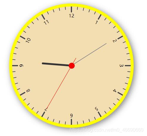
效果如图:
代码如下:
<!DOCTYPE html>
<html>
<head>
<meta charset="UTF-8">
<title>CSS3时钟特效</title>
<link rel="shortcut icon" type="image/x-icon" href="img/an.ico" />
<style>
/*表盘边框*/
.clock {
/* 设置大小 */
width: 400px;
height: 400px;
position: relative;
margin: 40px auto;
/*上边距*/
border-radius: 50%;
/*圆形*/
box-shadow: 5px 5px 20px rgba(0, 0, 0, 0.5);
/*表盘阴影*/
background: #F5DEB3;
border: 10px solid #FFFF00;
}
/*画刻度的面板*/
.box {
width: 100%;
height: 100%;
position: absolute;
top: 0;
left: 0;
}
/*用来装刻度和数字的div*/
.box div {
width: 0px;
height: 200px;
position: absolute;
left: 200px;
/*旋转*/
transform: rotate(0deg);
/*设置基点为右下角*/
transform-origin: bottom right;
background: rgba(255, 0, 0, 0.5);
}
/*数字*/
.box div i {
float: left;
margin-top: 20px;
margin-left: -10px;
font-style: normal;
width: 20px;
text-align: center;
font-style: 18px;
}
/*小刻度*/
.box div::after {
content: "";
position: absolute;
background: #484848;
width: 2px;
height: 10px;
left: -1px;
}
/*大刻度*/
.box div.five::after {
position: absolute;
content: "";
width: 4px;
height: 20px;
left: -2px;
top: 0;
background: #484848;
border-radius: 0 0 2px 2px;
}
/*秒针样式*/
.second {
width: 1px;
height: 200px;
background: red;
position: absolute;
left: 200px;
/*距离表盘宽度一半*/
margin-top: 30px;
z-index: 10;
transform: rotate(0deg);
transform-origin: center 170px;
/*定位旋转位置*/
}
/*圆心样式*/
.second::after {
content: "";
position: absolute;
width: 20px;
height: 20px;
background: red;
border-radius: 50%;
bottom: 20px;
left: -10px;
}
/*分针样式*/
.minute {
width: 2px;
height: 140px;
background: #8b8b8d;
position: absolute;
left: 199px;
margin-top: 60px;
z-index: 9;
transform-origin: center bottom;
transform: rotate(12deg);
animation: minute 60s linear infinite;
}
/*时针样式*/
.hour {
width: 6px;
height: 100px;
background: #333;
position: absolute;
left: 197px;
margin-top: 100px;
z-index: 8;
border-radius: 3px;
transform: rotate(2deg);
transform-origin: center bottom;
animation: minute 60s linear infinite;
}
</style>
</head>
<body>
<div class="clock">
<div class="box"></div>
<div class="second"></div>
<div class="minute"></div>
<div class="hour"></div>
</div>
<script>
var box = document.getElementsByClassName("box")[0];
var ssObj = document.getElementsByClassName("second")[0];
var mmObj = document.getElementsByClassName("minute")[0];
var hhObj = document.getElementsByClassName("hour")[0];
/*获取当前时间*/
var date = new Date();
var hh = date.getHours();
var mm = date.getMinutes();
var ss = date.getSeconds();
/*计算页面指针加载时的角度*/
hhDeg = 360 * (hh % 12) / 12;
mmDeg = 360 * mm / 60;
ssDeg = 360 * ss / 60;
hhObj.style.transform = "rotate(" + hhDeg + "deg)";
mmObj.style.transform = "rotate(" + mmDeg + "deg)";
ssObj.style.transform = "rotate(" + ssDeg + "deg)";
// 定义初始刻度的度数
var Deg = 0;
/*画刻度*/
for (var i = 0; i < 60; i++) {
var div1 = document.createElement("div"); //创建一个div
var hourNum = i / 5;
//当为5时
if (hourNum == 0) hourNum = 12;
if (i % 5 == 0) { //大刻度
div1.className = "five";
div1.innerHTML = "<i>" + hourNum + "</i>"
}
div1.style.transform = "rotate(" + Deg + "deg)";
box.appendChild(div1);
Deg += 6;// 每两个刻度之间是6度
}
/*指针转动的函数*/
function drawSS() {
// 秒针的度数
ssDeg = 360 * ss / 60;
// 分针的度数
mmDeg1 = 360 * mm / 60;
// 时针的度数
hhDeg1 = 360 * (hh % 12) / 12;
// 分针每秒走的位置
mmDeg = mmDeg1 + (6 * ss / 60);
// 时针每分钟走的位置
hhDeg = hhDeg1 + (30 * mm / 60);
hhObj.style.transform = "rotate(" + hhDeg + "deg)";
mmObj.style.transform = "rotate(" + mmDeg + "deg)";
ssObj.style.transform = "rotate(" + ssDeg + "deg)";
ss += 1;
if (ss > 60) {
ss = 1;
mm += 1;
}
if (mm == 60) {
mm = 0;
hh += 1;
}
setTimeout(function() {
drawSS();
}, 1000);
}
drawSS();
</script>
</body>
</html>
精简版:
<!DOCTYPE html>
<html>
<head>
<meta charset="UTF-8">
<title>CSS3时钟特效</title>
<link rel="shortcut icon" type="image/x-icon" href="img/an.ico" />
<style>
/*表盘边框*/
.clock {
/* 设置大小 */
width: 400px;
height: 400px;
position: relative;
margin: 40px auto;
/*上边距*/
border-radius: 50%;
/*圆形*/
box-shadow: 5px 5px 20px rgba(0, 0, 0, 0.5);
/*表盘阴影*/
background: #F5DEB3;
border: 10px solid #FFFF00;
}
/*画刻度的面板*/
.box {
width: 100%;
height: 100%;
position: absolute;
top: 0;
left: 0;
}
/*用来装刻度的div*/
.box div {
width: 0px;
height: 200px;
position: absolute;
left: 200px;
/*旋转*/
transform: rotate(0deg);
/*设置基点为右下角*/
transform-origin: bottom right;
background: rgba(255, 0, 0, 0.5);
}
/*小刻度*/
.box div:after {
content: "";
position: absolute;
background: #484848;
width: 2px;
height: 10px;
left: -1px;
}
/*大刻度*/
.box div.five:after {
position: absolute;
content: "";
width: 4px;
height: 20px;
left: -2px;
top: 0;
background: #484848;
border-radius: 0 0 2px 2px;
}
/*秒针样式*/
.second {
width: 1px;
height: 200px;
background: red;
position: absolute;
left: 200px;
/*距离表盘宽度一半*/
margin-top: 30px;
z-index: 10;
transform: rotate(0deg);
transform-origin: center 170px;
/*定位旋转位置*/
}
/*圆心样式*/
.second:after {
content: "";
position: absolute;
width: 20px;
height: 20px;
background: red;
border-radius: 50%;
bottom: 20px;
left: -10px;
}
/*分针样式*/
.minute {
width: 2px;
height: 140px;
background: #8b8b8d;
position: absolute;
left: 199px;
margin-top: 60px;
z-index: 9;
transform-origin: center bottom;
transform: rotate(12deg);
}
/*时针样式*/
.hour {
width: 6px;
height: 100px;
background: #333;
position: absolute;
left: 197px;
margin-top: 100px;
z-index: 8;
border-radius: 3px;
transform: rotate(2deg);
transform-origin: center bottom;
}
</style>
</head>
<body>
<div class="clock">
<div class="box"></div>
<div class="second"></div>
<div class="minute"></div>
<div class="hour"></div>
</div>
<script>
var box = document.getElementsByClassName("box")[0];
var ssObj = document.getElementsByClassName("second")[0];
var mmObj = document.getElementsByClassName("minute")[0];
var hhObj = document.getElementsByClassName("hour")[0];
/*获取当前时间*/
var date = new Date();
var hh = date.getHours();
var mm = date.getMinutes();
var ss = date.getSeconds();
/*计算页面指针加载时的角度*/
drawSS();
// 定义初始刻度的度数
var Deg = 0;
/*画刻度*/
for (var i = 0; i < 60; i++) {
var div1 = document.createElement("div"); //创建一个div
//当为5时
if (i % 5 == 0) { //大刻度
div1.className = "five";
}
div1.style.transform = "rotate(" + Deg + "deg)";
box.appendChild(div1);
Deg += 6;// 每两个刻度之间是6度
}
/*指针转动的函数*/
function drawSS() {
// 秒针的度数
ssDeg = 360 * ss / 60;
// 分针的度数
mmDeg = 360 * mm / 60 + (6 * ss / 60);
// 时针的度数
hhDeg = 360 * (hh % 12) / 12 + (30 * mm / 60);
// 旋转
hhObj.style.transform = "rotate(" + hhDeg + "deg)";
mmObj.style.transform = "rotate(" + mmDeg + "deg)";
ssObj.style.transform = "rotate(" + ssDeg + "deg)";
ss += 1;
// 每秒钟调用一次
setTimeout(function() {
drawSS();
}, 1000);
}
</script>
</body>
</html>
以上就是本文的全部内容,希望对大家的学习有所帮助,也希望大家多多支持。
以上是 js+css3实现简单时钟特效 的全部内容, 来源链接: utcz.com/p/217924.html