JS实现手风琴特效
本文实例为大家分享了JS实现手风琴特效的具体代码,供大家参考,具体内容如下
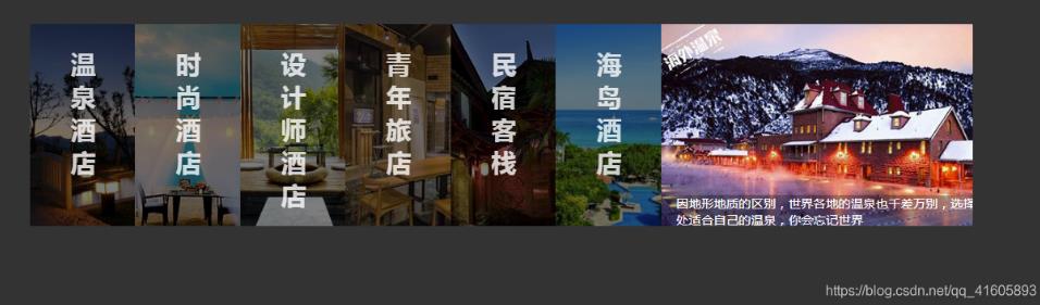
效果图
<!DOCTYPE html>
<html lang="en">
<head>
<meta charset="UTF-8">
<meta name="viewport" content="width=device-width, initial-scale=1.0">
<meta http-equiv="X-UA-Compatible" content="ie=edge">
<title>手风琴</title>
<link rel="stylesheet" href="index.css" rel="external nofollow" >
</head>
<body>
<div class="wrapper">
<ul class="wrapUl">
<li>
<div class="title">
<h1>温泉酒店</h1>
</div>
<div class="picBox picBox1"></div>
<div class="decration">有谁不爱泡温泉?浸入雾气蒸腾的泉水之中,把身体泡成一片茶叶,舒展轻盈。有比这更美妙的感觉吗?</div>
</li>
<li>
<div class="title">
<h1>时尚酒店</h1>
</div>
<div class="picBox picBox2"></div>
<div class="decration">浪漫,是香闺围笼,是灯火迷离,泪眼婆裟的唯美,是杨柳岸、晓风残月中的无语凝噎……</div>
</li>
<li>
<div class="title">
<h1>设计师酒店</h1>
</div>
<div class="picBox picBox3"></div>
<div class="decration">前卫的酒店设计理念,独具魅力的风格,优美的自然风光才能有这样顶级的酒店</div>
</li>
<li>
<div class="title">
<h1>青年旅店</h1>
</div>
<div class="picBox picBox4"></div>
<div class="decration">我为你煮一杯温茶,斟一杯美酒。让我们席地而坐,听你的梦想。用你的只言片语装点我们的梦想博物馆</div>
</li>
<li>
<div class="title">
<h1>民宿客栈</h1>
</div>
<div class="picBox picBox5"></div>
<div class="decration">在这里,你可以静静发呆,而不被人打扰;在这里,你能看见最美好的星星,能让你找到最深的感动</div>
</li>
<li>
<div class="title">
<h1>海岛酒店</h1>
</div>
<div class="picBox picBox6"></div>
<div class="decration">不想过冬,厌倦沉重,就飞去热带的岛屿游泳,卸下包袱,放下压力,在这碧海蓝天之中</div>
</li>
<li>
<div class="title">
<h1>海外酒店</h1>
</div>
<div class="picBox picBox7"></div>
<div class="decration">因地形地质的区别,世界各地的温泉也千差万别,选择一处适合自己的温泉,你会忘记世界</div>
</li>
</ul>
</div>
<script src="jquery.js"></script>
<script src="index.js"></script>
</body>
</html>
JS代码
var oUl = $('ul'),
oLi = $('li'),
len = oLi.length,
width = parseInt(oUl.css('width')),
gw = width / len,
ot = Math.floor((width - 400) / (len - 1));
flag = true;
function init(){
if(flag){
change($(oLi[len-1]));
}
}
function bindEvent(){
oLi.on('click',function(){
change($(this));
if(($(this).index() +1) == len){
flag = false;
}else{
flag = true;
}
});
oUl.on('mouseleave',function(){
init();
})
}
function change(event){
event.animate({
'width':'400px'
},300,'linear').siblings().animate({
'width':ot + 'px'
},300,'linear');
event.find('.title').css({
'display':'none'
})
event.siblings().find('.title').css({
'display':'block'
})
event.find('.decration').css({
'bottom':'0px'
})
event.siblings().find('.decration').css({
'bottom':'-50px'
})
}
init();
bindEvent();
CSS代码
*{
margin:0;
padding:0;
list-style:none;
}
body{
background-color:#333;
}
.wrapper{
width:80%;
margin:50px auto;
padding:40px;
}
.wrapper ul{
width:100%;
height:300px;
overflow: hidden;
}
.wrapper ul li{
float: left;
width:14.2;
height:260px;
position:relative;
overflow:hidden;
cursor:pointer;
}
.picBox{
width:100%;
height:100%;
}
.picBox1{
background:url(images/1.jpg) no-repeat center 0;
}
.picBox2{
background:url(images/2.jpg) no-repeat center 0;
}
.picBox3{
background:url(images/3.jpg) no-repeat center 0;
}
.picBox4{
background:url(images/4.jpg) no-repeat center 0;
}
.picBox5{
background:url(images/5.jpg) no-repeat center 0;
}
.picBox6{
background:url(images/6.jpg) no-repeat center 0;
}
.picBox7{
background:url(images/7.jpg) no-repeat center 0;
}
.wrapper ul li .title{
position:absolute;
overflow:hidden;
width:100%;
height:100%;
left:0;
top:0;
background:rgba(0,0,0,0.5);
}
.wrapper ul li .title h1{
color:#fff;
width:30px;
margin:0 auto;
display:block;
font:20px;
padding-top:30px;
opacity:0.8;
}
.wrapper ul li .decration{
width:400px;
height:40px;
padding-left:20px;
padding-right:30px;
position:absolute;
left:0;
bottom:-50px;
background:rgba(0,0,0,0.3);
color:#FFF;
}
以上就是本文的全部内容,希望对大家的学习有所帮助,也希望大家多多支持。
以上是 JS实现手风琴特效 的全部内容, 来源链接: utcz.com/p/218631.html