vue 实现一个简单的全局调用弹窗案例
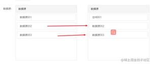
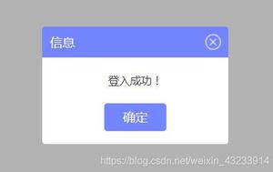
1.实现效果图
2.第一步,新建一个.vue文件 定义一个弹框的基本模板
style样式放在了文章的最底部,如果需要看效果,需要将样式放入这个vue文件里,样式是用less写的,需要你的项目引入less
注意:我这里的组件右上角关闭是一张图片 需要换成你自己本地的路径
<template>
<div id="tip_alertModal">
<div class="t-alert-mask"></div>
<div class="t-alert-container">
<div class="t-alert-title">
<span>
{{title}}
</span>
<img @click="close" src="../../../static/images/alert/guanbi.png" alt="">
</div>
<div class="t-alert-content">
<span class="content-text">
{{content}}
</span>
</div>
<div class="t-alert-confirm">
<button @click="confirm">确定</button>
<!-- 默认是没有取消按钮的,data定义默认true false -->
<button class="cancel-btn" v-show="cancelBtn" @click="cancel">取消</button>
</div>
</div>
</div>
</template>
<script>
export default {
data() {
return {
show: true, // 通过这个属性,控制是否移除dom元素
title:'', // 顶部标题
content:'', // 内容
cancelBtn: false // 取消按钮
};
},
methods: {
close() {
// 右上角关闭
this.a_close && this.a_close();
this.show = false;
// 删除判断增加的window属性
delete window.alertIsShow;
},
confirm() {
// 确定
this.a_confirm && this.a_confirm();
this.show = false;
// 删除判断增加的window属性
delete window.alertIsShow;
},
cancel() {
// 取消
this.a_cancel && this.a_cancel();
this.show = false;
// 删除判断增加的window属性
delete window.alertIsShow;
}
},
watch: {
show(cur, old) {
// 通过监控data里的show属性 弹框有三个事件(右上角取消 确定按钮 取消按钮)
// 每个事件写了 this.show = false
// 当弹框出现的时候 点击任何一个事件 都会触发这里的监控事件 将页面上的弹框Dom移除
if (cur === false) {
let tip_alert = document.getElementById('tip_alertModal');
tip_alert.parentNode.removeChild(tip_alert);
}
}
}
}
</script>
3.定义一个js文件
import Vue from 'vue';
import Alert from '@/components/public/alertModal'; //引入刚才写的弹框组件
let AlertConstructor = Vue.extend(Alert); // 返回一个“扩展实例构造器”
let AlertModal = (o) => {
let alertDom = new AlertConstructor({
el: document.createElement('div'); //将Alert组件挂载到新创建的div上
})
document.body.appendChild(alertDom.$el); //把Alert组件的dom添加到body里
// 标题
alertDom.title = o.title || '信息';
// 单条内容
alertDom.content = o.content;
// 关闭按钮
alertDom.cancelBtn = o.cancelBtn;
// 弹框三个事件 右上角关闭 确定 取消
alertDom.a_close = o.close || null;
alertDom.a_confirm = o.confirm || null;
alertDom.a_cancel = o.cancel || null;
}
export default AlertModal;
4.mian.js
import alert from '@/common/alertModal' //这里引入的是js文件
Vue.prototype.$alert = alert;
5.在任意组件调用
<template>
<div>
<button @click="operate">点击调用弹框</button>
</div>
</template>
<script>
export default {
methods: {
operate() {
this.$alert({
title: '信息',
content: '登入成功!',
cancelBtn: true, //这个是启用取消按钮,
close() {
// 这里执行点击右上角需要做的事,默认执行关闭弹框
},
confirm() {
// 这里执行点击确定按钮需要做的事,默认执行关闭弹框
},
cancel() {
// 这里执行点击取消按钮需要做的事,默认执行关闭弹框
}
})
}
}
}
</script>
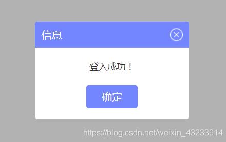
取消按钮开启

调用之后是往body添加元素
5.通过window.alertIsShow,给window增加一个属性,来控制一个页面只会出现一个弹框
methods: {
operate () {
if (!window.alertIsShow) {
// 弹框模板有个 delete window.alertIsShow 是为了弹框关闭之后能再次显示
this.$alert({
title: '信息',
content: '登入成功!',
cancelBtn: true,
close () {
// 这里执行点击右上角需要做的事,默认执行关闭弹框
},
confirm () {
// 这里执行点击确定按钮需要做的事,默认执行关闭弹框
},
cancel () {
// 这里执行点击取消按钮需要做的事,默认执行关闭弹框
}
})
window.alertIsShow = true;
}
}
}
6.最后是弹框组件的less样式
<style lang="less" scoped>
#tip_alertModal {
position: fixed;
left: 0;
top: 0;
z-index: 100;
width: 100%;
height: 100%;
.t-alert-mask {
position: absolute;
top: 0;
left: 0;
width: 100%;
height: 100%;
background-color: rgba(0, 0, 0, .3);
}
.t-alert-container {
position: absolute;
top: 50%;
left: 50%;
min-width: 240px;
max-width: 400px;
height: auto;
background-color: #fff;
transform: translate(-50%, -50%);
border-radius: 4px;
.t-alert-title {
position: relative;
width: 100%;
height: 40px;
line-height: 40px;
background-color: rgba(115, 134, 255, 1);
border-radius: 4px 4px 0px 0px;
span {
position: absolute;
top: 50%;
left: 10px;
font-weight: 500;
font-size: 16px;
color: #fff;
transform: translate(0, -50%);
}
img {
position: absolute;
top: 50%;
right: 10px;
transform: translate(0, -50%);
cursor: pointer;
}
}
.t-alert-content {
text-align: center;
span {
font-family: PingFangSC-Regular;
font-weight: 400;
font-size: 14px;
color: rgba(51,51,51,1);
}
span.content-text {
display: inline-block;
width: 100%;
height: auto;
font-weight: 400;
font-size: 14px;
color: #333;
padding: 20px 18px;
}
.t-content-list {
min-width: 320px;
height: auto;
text-align: left;
.list-title {
position: relative;
padding: 10px 0 10px 10px;
img {
display: inline-block;
position: absolute;
width: 20px;
margin-right: 10px;
}
span {
display: inline-block;
vertical-align: middle;
padding-left: 31px;
}
}
.list-content {
width: 100%;
height: auto;
ul {
padding-bottom: 10px;
li {
width: 100%;
height: auto;
padding-bottom: 10px;
span {
vertical-align: top;
}
span.title {
display: inline-block;
padding-left: 41px;
padding-right: 3px;
text-align: left;
}
}
}
}
}
}
.t-alert-confirm {
width: 100%;
padding-bottom: 17px;
text-align: center;
button {
display: inline-block;
width: 80px;
height: 36px;
border: none;
background: rgba(115, 134, 255, 1);
font-weight: 400;
font-size: 16px;
color: #fff;
border-radius: 4px;
outline: none;
cursor: pointer;
}
.cancel-btn {
margin-left:20px;
background:rgba(151,193,234,1);
font-family: PingFangSC-Regular;
font-weight: 400;
font-size: 16px;
color: rgba(255,255,255,1);
}
}
}
}
</style>
如果本篇文章对你有帮助的话,很高兴能够帮助上你。
补充知识:Vue注册全局组件-弹窗组件
在src目录下新建components文件夹
1.新建module文件夹,然后新建v-alert.vue
<template>
<transition name="fade">
<div
class="v-alert g-center"
:style="{zIndex}">
<div
class="v-cont"
:class="{shadow:!hideCont}"
:style="[innerWidth]">
<div
v-if="title.trim()"
:style="[{backgroundColor:bgColorTit,color:cancelCol},titleStyle]"
class="title g-font18">
{{title}}
<span class="title-data">{{titleData}}</span>
</div>
<div
v-if="isCancel"
class="v-cancel">
<div
class="cancel-icon"
:style="{color:cancelCol}"
@click="cancel">
</div>
</div>
<slot name="slot3"></slot>
<div
v-if="!hideCont"
:style="styles"
class="content">
<slot></slot>
</div>
<slot name="slot2"></slot>
</div>
<div
class="g-fixed alert-wrap"
@click="$emit('cancel')"
:style="{backgroundColor:bgWrapColor}"></div>
</div>
</transition>
</template>
<script>
export default {
name: "v-alert",
props: {
title: {default: ""},
// titFontSize:{default: '16'},
bgColorTit: {default: "#40404C"},
bgColor: {default: "#fff"}, // 背景色
bgWrapColor: {default: "rgba(42, 47, 59, 0.6)"}, //外套背景色
cancelCol: {default: "#fff"}, //按钮颜色
width: {required: true, type: Number}, //宽度
minWidth: {type: Number, default: 0},
isCancel: {type: Boolean, default: true}, //是否显示关闭按钮
titleData: {default: ""},
hideCont: {type: Boolean, default: false}, //是否隐藏cont
zIndex: {default: 2000},
styles: {
default() {
return {};
},
type: Object
},
titleStyle: {
default() {
return {};
},
type: Object
},
},
components: {},
computed: {
innerWidth() {
let dfu = {
backgroundColor: this.bgColor
};
this.minWidth > 0
? dfu.minWidth = `${this.minWidth}px`
: dfu.width = `${this.width}px`;
return dfu;
}
},
methods: {
cancel() {
this.$emit("cancel");
}
},
mounted() {
document.addEventListener(
"keydown",
event => {
let keyCode = this.$_lib.getKeycode(event);
if (keyCode === 'Escape' || keyCode === 27) this.$emit("cancel");
},
false
);
}
};
</script>
<style lang="scss"
rel="stylesheet/scss"
scoped>
.v-alert {
position: fixed;
top: 0;
left: 0;
width: 100%;
height: 100%;
z-index: 2000;
.alert-wrap {
top: 0;
left: 0;
width: 100%;
height: 100%;
/*z-index: 2000;*/
}
.v-cont {
min-width: 100px;
min-height: 100px;
background-color: #ffffff;
position: relative;
border-radius: 2px;
.shadow {
box-shadow: 0 2px 30px rgba(42, 47, 59, 0.2);
}
z-index: 2001;
.title {
width: 100%;
line-height: 70px;
color: #ffffff;
padding-left: 30px;
}
.title-data {
color: #f8e19a;
}
.content {
padding: 40px;
/*padding: 60px 40px 50px 40px;*/
word-wrap: break-word;
text-align: left;
}
}
.v-cancel {
position: absolute;
top: 0;
right: 0;
width: 100%;
height: 70px;
}
.cancel-icon {
position: absolute;
text-align: center;
width: 20px;
height: 20px;
line-height: 20px;
right: 20px;
top: 50%;
margin-top: -10px;
color: #ffffff;
cursor: pointer;
transition: 200ms;
&:hover {
-webkit-transform: rotate(90deg);
-moz-transform: rotate(90deg);
-ms-transform: rotate(90deg);
-o-transform: rotate(90deg);
transform: rotate(90deg);
}
}
}
</style>
2.在nodule同级目录新建vue-component.js
import VAlert from './v-alert'; //弹窗
export default {
install(Vue) {
Vue.component('VAlert', VAlert);
}
};
3.在main.js中注册为全局组件
import vueComponent from "./components/vue-component";
Vue.use(vueComponent);
4.在其他组件可以直接用了,无需import
<template>
<v-alert
v-if="is_alert"
@cancel="is_alert=false"
bg-color-tit="#40404C"
cancel-col="#fff"
:title="提示"
:width="680">
<div></div>
</v-alert>
</template>
以上这篇vue 实现一个简单的全局调用弹窗案例就是小编分享给大家的全部内容了,希望能给大家一个参考,也希望大家多多支持。
以上是 vue 实现一个简单的全局调用弹窗案例 的全部内容, 来源链接: utcz.com/p/217884.html