Vue自定义多选组件使用详解
本文实例为大家分享了Vue自定义多选组件使用的具体代码,供大家参考,具体内容如下
子组件(选项卡)
checkBoxCard.vue
<template>
<div class="checkBoxCard">
<div :class="`box ${check && 'boxCheck'}`" @click="checked(), updateData()">
{{ name }}
</div>
</div>
</template>
<script>
export default {
name: "checkBoxCard",
props: {
name: String,
checkIndex: {
type: Number,
default: null,
},
},
data() {
return {
radio: 0,
check: false,
radioName: "",
list: [],
};
},
methods: {
checked() {
if (this.radio == 1) {
this.check = false;
this.radio = 0;
} else if (this.radio == 0) {
this.check = true;
this.radio = 1;
}
},
updateData() {
if (this.radio == 1) {
this.radioName = this.name;
} else if (this.radio == 0) {
this.radioName = "";
}
this.$emit("updateSurveyData", this.radioName, this.checkIndex);
},
},
mounted() {},
created() {},
};
</script>
<style lang="scss" scoped>
.checkBoxCard {
margin-right: 15px;
display: inline-block;
margin-top: 10px;
}
.boxCheck {
color: rgba(183, 37, 37, 1);
background: bisque;
}
.box {
border: 0.55px solid #eee;
padding: 5px 10px;
font-size: 3.73333vw;
border-radius: 10px;
}
</style>
父组件
checkBox.vue
<template>
<div class="checkBox">
<div class="title">
选择
</div>
<div class="card">
<CheckBoxCard
v-for="item in list"
:key="item.value"
:name="item.name"
:checkIndex="item.value"
@updateSurveyData="updateSurveyData"
/>
</div>
</div>
</template>
<script>
import CheckBoxCard from "./checkBoxCard";
export default {
name: "checkBox",
components: {
CheckBoxCard,
},
data: function () {
return {
list: [
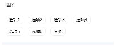
{ value: 0, name: "选项1" },
{ value: 1, name: "选项2" },
{ value: 2, name: "选项3" },
{ value: 3, name: "选项4" },
{ value: 4, name: "选项5" },
{ value: 5, name: "选项6" },
{ value: 6, name: "其他" },
],
name: "",
checkList: [],
};
},
methods: {
updateSurveyData(question, index) {
this.checkList[index] = question;
console.log(this.checkList.filter((x) => x != ""));
console.log(this.checkList.filter((x) => x != "").join());
},
},
created() {},
};
</script>
<style scoped>
.checkBox {
padding: 5.33333vw 4vw;
border-bottom: 0.55px solid #eee;
background: white;
}
.title {
text-align: left;
color: #323233;
font-size: 3.73333vw;
padding-bottom: 10px;
line-height: 30px;
}
</style>
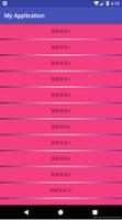
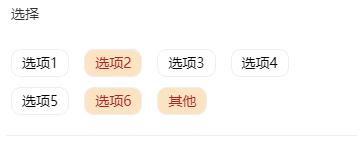
效果图

以上就是本文的全部内容,希望对大家的学习有所帮助,也希望大家多多支持。
以上是 Vue自定义多选组件使用详解 的全部内容, 来源链接: utcz.com/p/217838.html