Vue自定义全局弹窗组件操作
写在前面
页面中会有很多时候需要弹窗提示,我们可以写一个弹窗组件,但是如果每个页面都引入这个组件,太麻烦了,所以我们将它变成全局组件,需要用的时候直接通过JS调用即可,不需要在每个页面引入了
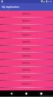
效果图

弹窗组件
新建一个弹窗的组件——popup.vue
<template>
<transition name='fade'>
<!-- 蒙版 -->
<div class="mask" v-if="show" @touchmove.prevent>
<div class="window">
<img class="shadow" :src="imgUrl" alt="">
<h1>{{title}}</h1>
<p>{{content}}</p>
<button @click="btnClick">{{btnText}}</button>
</div>
<img @click="show = false" v-fb class="close" src="../../../pages/signin/dialog/images/关闭.png" alt="">
</div>
</transition>
</template>
<script>
export default {
name: 'app',
data () {
return {
show: false,
imgUrl: '',
title: '',
content: '',
btnText: '',
click: ''
}
},
created () {
},
methods: {
btnClick () {
this.click()
this.show = false
}
}
}
</script>
<style lang="less" scoped>
@import "../../../assets/css/minx/minx";
@import "../../../assets/css/pixel/pixel";
// 渐变过渡
.fade-enter,
.fade-leave-active {
opacity: 0;
}
.fade-enter-active,
.fade-leave-active {
transition: opacity .35s;
}
// 全局弹窗
.mask {
.fixed;
z-index: 10;
background:rgba(0,0,0,0.65);
display: flex;
flex-direction: column;
justify-content: center;
align-items: center;
padding: 75/75rem;
.window{
height: 400/75rem;
width: 100%;
background: #fff;
border-radius:8px;
text-align: center;
.shadow{
width: 270/75rem;
margin-top: -90/75rem;
}
h1{
margin-top: 32/75rem;
font-size:32/75rem;
color:#f1300b;
line-height:32/75rem;
font-weight: 600;
}
p{
margin-top: 32/75rem;
font-size:28/75rem;
color:#222222;
line-height:40/75rem;
}
button{
margin-top: 34/75rem;
background:#f95644;
border-radius:10px;
width:23/75remx;
height:64/75rem;
font-size:28/75rem;
color:#ffffff;
}
}
.close{
width:60/75rem;
height:60/75rem;
margin-top: 40/75rem;
}
}
</style>
popup.js文件
新建一个popup.js文件,写方法
import Vue from 'vue'
import Popup from './popup.vue'
const PopupBox = Vue.extend(Popup)
Popup.install = function (data) {
let instance = new PopupBox({
data
}).$mount()
document.body.appendChild(instance.$el)
Vue.nextTick(() => {
instance.show = true
// show 和弹窗组件里的show对应,用于控制显隐
})
}
export default Popup
main.js引入popup.js
// 自定义全局弹窗组件
import Vue from 'vue'
import Popup from './components/dialog/popup'
Vue.prototype.$popup = Popup.install
组件中使用方法
methods: {
btnClick () {
this.$popup({
imgUrl: require('../../../static/images/shadow.png'), // 顶部图片
title: '我是标题',
content: '我是内容',
btnText: '我是按钮',
click: () => {
// 点击按钮事件
this.$router.push('……')
}
})
}
}
方便以后自己使用,大家也可以参考哦,也希望大家多多支持,谢谢~~
以上是 Vue自定义全局弹窗组件操作 的全部内容, 来源链接: utcz.com/p/217456.html