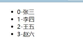
Vue中slot内容分发

<slot>元素是一个内容分发API,使用多个内容插槽时可指定name属性
<!DOCTYPE html><html>
<head>
<meta charset="UTF-8">
<title></title>
<!-- <link rel="stylesheet" href="fonts/iconfont.css" /> -->
<style>
* {
font-family: simhei, Helvetica, Arial, sans-serif;
}
#dialog-template{
display: none;
}
button {
display: inline-block;
border: 0;
box-sizing: border-box;
color: #fff;
font-size: 1em;
border-radius: .1em;
line-height: 2em;
padding: 0 1em;
transition: .4s ease-out;
outline: 0;
text-decoration: none;
}
button:hover,
button:focus {
opacity: 0.5;
cursor: pointer;
transition: .15s ease-in;
}
.btn-group{
margin: 200px auto;
width: 640px;
}
.btn-info{
background: blue;
}
.btn-success{
background: gray;
}
.btn-warning{
background: green;
}
.btn-error{
background: coral;
}
.dialog {
width: 480px;
position: fixed;
left: 50%;
top: 2em;
transform: translateX(-50%);
z-index: 2000;
visibility: hidden;
backface-visibility: hidden;
perspective: 1300px;
}
.dialog-active {
visibility: visible;
}
.dialog-active .dialog-content {
position: relative;
opacity: 1;
transform: rotateY(0);
}
.dialog-active ~ .dialog-overlay {
opacity: 1;
visibility: visible;
}
.dialog-content {
border-radius: 3px;
background: #fff;
overflow: hidden;
box-shadow: 0 10px 20px rgba(0, 0, 0, 0.1);
transition: .5s ease-in-out;
opacity: 0;
transform-style: preserve-3d;
transform: rotateY(-70deg);
}
.dialog-header {
color: #fff;
}
.dialog-title {
margin: 0;
font-size: 2em;
text-align: center;
font-weight: 200;
line-height: 2em;
}
.dialog-body {
padding: 2em;
}
.dialog-footer {
margin: 0 2em;
padding: 2em 0;
text-align: right;
border-top: 1px solid rgba(0, 0, 0, 0.1);
}
.dialog-overlay {
content: "";
position: fixed;
visibility: hidden;
top: 0;
left: 0;
right: 0;
bottom: 0;
z-index: 1000;
opacity: 0;
background: rgba(0, 0, 0, 0.5);
transition: all .6s;
}
.dialog-info .dialog-header,.dialog-info button {
background-color: lightblue;
}
.dialog-success .dialog-header,.dialog-success button {
background-color: lightgray;
}
.dialog-warning .dialog-header,.dialog-warning button {
background-color: lightgreen;
}
.dialog-error .dialog-header,.dialog-error button {
background-color: lightcoral;
}
.close {
display: inline-block;
width: 2rem;
height: 2rem;
position: absolute;
top: .5rem;
right: .5rem;
transition: .8s ease all;
-moz-transition: .8s ease all;
-webkit-transition: .8s ease all;
border: none;
border-radius: 3px;
color: #333;
text-decoration: none;
box-sizing: border-box;
-webkit-box-sizing: border-box;
}
.close:hover {
transition: .8s ease all;
-moz-transition: .8s ease all;
-webkit-transition: .8s ease all;
}
.close .iconfont {
font-size: 2rem;
color: #fff;
}
.rotate {
cursor: pointer;
}
.rotate:hover {
transform: rotate(360deg);
-moz-transform: rotate(360deg);
-webkit-transform: rotate(360deg);
transition: transform 1.0s ease all;
-moz-transition: -moz-transform 1.0s ease all;
-webkit-transition: -webkit-transform 1.0s ease all;
}
</style>
</head>
<body>
<div id="app">
<modal-dialog v-bind:show.sync="show" v-bind:class="dialogClass">
<header class="dialog-header" slot="header">
<h1 class="dialog-title">infomation</h1>
</header>
<div class="dialog-body" slot="body">
<p>contents of dialog box</p>
<p>para ,forms ,or pics</p>
</div>
<footer class="dialog-footer" slot="footer">
<button @click="closeDialog">close</button>
</footer>
</modal-dialog>
<div class="btn-group">
<button class="btn-info" @click="openDialog('dialog-info')">Info dialog</button>
<button class="btn-success" @click="openDialog('dialog-success')">Success dialog</button>
<button class="btn-warning" @click="openDialog('dialog-warning')">warning dialog</button>
<button class="btn-error" @click="openDialog('dialog-error')">error dialog</button>
</div>
</div>
<template id="dialog-template">
<div class="dialogs">
<div class="dialog" v-bind:class="{ 'dialog-active': show }">
<div class="dialog-content">
<div class="close rotate">
<span class="iconfont icon-close" @click="close"></span>
</div>
<slot name="header"></slot>
<slot name="body"></slot>
<slot name="footer"></slot>
</div>
</div>
<div class="dialog-overlay"></div>
</div>
</template>
<script src="js/vue.js"></script>
<script>
Vue.component('modal-dialog', {
template: '#dialog-template',
props: ['show'],
methods: {
close: function() {
this.show = false
}
}
})
new Vue({
el: '#app',
data: {
show: false,
dialogClass: 'dialog-info'
},
methods: {
openDialog: function(dialogClass) {
this.show = true
this.dialogClass = dialogClass
},
closeDialog: function() {
this.show = false
}
}
})
</script>
</body>
</html>
以上是 Vue中slot内容分发 的全部内容, 来源链接: utcz.com/z/376592.html