微信小程序实现手势滑动卡片效果
最近工作中有项目要使用微信小程序技术进行开发,其中一项功能困扰了我很久,卡片滑动动效以及手势识别。经过一番研究和参考,现在把成果展示。记录自己踩到的坑,如果大家有需要,也可以帮助到大家。
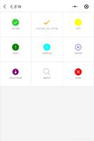
效果图:
首先是卡片布局的实现:
图片(一)
如图所示,我采用绝对定位absolute的方式,辅助index,可以实现卡片的层叠效果。注意:三张卡片一定都是相同的定位,否则index可能不起作用。
代码:
//设置position: absolute; left:50%;后,再 margin-left:负(一半的width);可以实现水平居中
//同理,设置top:50%;margin-top:负(一半height);可以实现垂直居中
.body-swiper {
width: 680rpx;//rpx是为了适应屏幕
height: 900rpx;
left: 50%;
position: absolute;
margin-left: -340rpx;
z-index: 3;
box-sizing: border-box;
-webkit-box-shadow: 0 1px 4px rgba(0, 0, 0, 0.62), 0 0 60px rgba(0, 0, 0, 0.06) inset;
-moz-box-shadow: 0 1px 4px rgba(0, 0, 0, 0.62), 0 0 40px rgba(0, 0, 0, 0.06) inset;
box-shadow: 0 1px 4px rgba(0, 0, 0, 0.62), 0 0 40px rgba(0, 0, 0, 0.06) inset;
border-radius: 12px;
}
.body-swiper2 {
width: 640rpx;
height: 900rpx;
left: 50%;
position: absolute;
margin-left: -320rpx;
z-index: 2;
box-sizing: border-box;
-webkit-box-shadow: 0 1px 4px rgba(0, 0, 0, 0.62), 0 0 60px rgba(0, 0, 0, 0.06) inset;
-moz-box-shadow: 0 1px 4px rgba(0, 0, 0, 0.62), 0 0 40px rgba(0, 0, 0, 0.06) inset;
box-shadow: 0 1px 4px rgba(0, 0, 0, 0.62), 0 0 40px rgba(0, 0, 0, 0.06) inset;
border-radius: 12px;
}
.body-swiper3 {
width: 605rpx;
height: 900rpx;
left: 50%;
position: absolute;
margin-left: -302.5rpx;
z-index: 1;
box-sizing: border-box;
-webkit-box-shadow: 0 1px 4px rgba(0, 0, 0, 0.62), 0 0 60px rgba(0, 0, 0, 0.06) inset;
-moz-box-shadow: 0 1px 4px rgba(0, 0, 0, 0.62), 0 0 40px rgba(0, 0, 0, 0.06) inset;
box-shadow: 0 1px 4px rgba(0, 0, 0, 0.62), 0 0 40px rgba(0, 0, 0, 0.06) inset;
border-radius: 12px;
}
接下来,是卡片手势的实现;
上代码:
/**
* 卡片1手势
*/
touchstart1: function (event) {
touchDotX = event.touches[0].pageX; // 获取触摸时的原点
touchDotY = event.touches[0].pageY;
console.log("起始点的坐标X:" + touchDotX);
console.log("起始点的坐标Y:" + touchDotY);
},
// 移动结束处理动画
touchend1: function (event) {
// 手指离开屏幕时记录的坐标
let touchMoveX = event.changedTouches[0].pageX;
let touchMoveY = event.changedTouches[0].pageY;
// 起始点的坐标(x0,y0)和手指离开时的坐标(x1,y1)之差
let tmX = touchMoveX - touchDotX;
let tmY = touchMoveY - touchDotY;
// 两点横纵坐标差的绝对值
let absX = Math.abs(tmX);
let absY = Math.abs(tmY);
//起始点的坐标(x0,y0)和手指离开时的坐标(x1,y1)之间的距离
let delta = Math.sqrt(absX * absX + absY * absY);
console.log('起始点和离开点距离:' + delta + 'px');
// 如果delta超过60px(可以视情况自己微调),判定为手势触发
if (delta >= 60) {
// 如果 |x0-x1|>|y0-y1|,即absX>abxY,判定为左右滑动
if (absX > absY) {
// 如更tmX<0,即(离开点的X)-(起始点X)小于0 ,判定为左滑
if (tmX < 0) {
console.log("左滑=====");
// 执行左滑动画
this.Animation1(-500);
// 如更tmX>0,即(离开点的X)-(起始点X)大于0 ,判定为右滑
} else {
console.log("右滑=====");
// 执行右滑动画
this.Animation1(500);
}
// 如果 |x0-x1|<|y0-y1|,即absX<abxY,判定为上下滑动
} else {
// 如更tmY<0,即(离开点的Y)-(起始点Y)小于0 ,判定为上滑
if (tmY < 0) {
console.log("上滑动=====");
this.setData({
isFront1: !this.data.isFront1
});
// 如更tmY>0,即(离开点的Y)-(起始点Y)大于0 ,判定为下滑
} else {
console.log("下滑动=====");
this.setData({
isFront1: !this.data.isFront1
});
}
}
} else {
console.log("手势未触发=====");
}
// 让上一张卡片展现正面(如果之前翻转过的话)
this.setData({
isFront3: true,
});
}
为了更直观的看到手势触发的条件,我画了一张图:
图片(二)
最后是动画的编写;
上代码:
/**
* 卡片1:
* 左滑动右滑动动画
*/
Animation1: function (translateXX) {
let animation = wx.createAnimation({
duration: 680,
timingFunction: "ease",
});
this.animation = animation;
// 如果大于0,判定是右滑动画,否则左滑
if (translateXX > 0) {
this.animation.translateY(0).rotate(20).translateX(translateXX).opacity(0).step();
} else {
this.animation.translateY(0).rotate(-20).translateX(translateXX).opacity(0).step();
}
// 设置10ms,视觉欺骗,直接归位到原来位置
this.animation.translateY(0).translateX(0).opacity(1).rotate(0).step({
duration: 10
});
this.setData({
animationData1: this.animation.export(),
});
// 动画结束后重拍三张卡片
setTimeout(() => {
this.setData({
ballTop1: 220,
ballLeft1: -302.5,
ballWidth1: 605,
index1: 1,
ballTop2: 240,
ballLeft2: -340,
ballWidth2: 680,
index2: 3,
ballTop3: 230,
ballLeft3: -320,
ballWidth3: 640,
index3: 2,
})
}, 500);
}
如此一来,大功告成,我自己测试了几次,暂时没有发现什么大问题。如果你有更好的实现方法,欢迎留言。
代码已上传到github
以上是 微信小程序实现手势滑动卡片效果 的全部内容, 来源链接: utcz.com/z/360379.html