微信小程序 轮播图swiper详解及实例(源码下载)
前言:
1.更新了v0.12的版本后,每次保存都弹出来一个打开文件窗口。
2.swiper组件的属性indicator-dots,值为false时,面板指示点还是显示。要把indicator-dots属性直接删掉。
下面进入正题:默认的swiper面板指示点都是小圆点黑灰的,但这满足不了广大小伙伴需求,比如其他颜色的,椭圆形的,方形的等等。。。。
首先当然是要禁用掉(直接删掉)swiper属性indicator-dots,再用view组件模拟dots,对应的代码如下:
<view class="swiper-container">
<swiper autoplay="auto" interval="5000" duration="500" current="{{swiperCurrent}}" bindchange="swiperChange" class="swiper">
<block wx:for="{{slider}}" wx:key="unique">
<swiper-item>
<image src="{{item.picUrl}}" class="img"></image>
</swiper-item>
</block>
</swiper>
<view class="dots">
<block wx:for="{{slider}}" wx:key="unique">
<view class="dot{{index == swiperCurrent ? ' active' : ''}}"></view>
</block>
</view>
</view>
然后是wxss代码:
.swiper-container{
position: relative;
}
.swiper-container .swiper{
height: 300rpx;
}
.swiper-container .swiper .img{
width: 100%;
height: 100%;
}
.swiper-container .dots{
position: absolute;
left: 0;
right: 0;
bottom: 20rpx;
display: flex;
justify-content: center;
}
.swiper-container .dots .dot{
margin: 0 8rpx;
width: 14rpx;
height: 14rpx;
background: #fff;
border-radius: 8rpx;
transition: all .6s;
}
.swiper-container .dots .dot.active{
width: 24rpx;
background: #f80;
}
再对swiper的bindchange属性绑定对应的事件:
Page({
data: {
slider: [
{picUrl: 'http://y.gtimg.cn/music/photo_new/T003R720x288M000000rVobR3xG73f.jpg'},
{picUrl: 'http://y.gtimg.cn/music/photo_new/T003R720x288M000000j6Tax0WLWhD.jpg'},
{picUrl: 'http://y.gtimg.cn/music/photo_new/T003R720x288M000000a4LLK2VXxvj.jpg'},
......
],
swiperCurrent: 0,
},
swiperChange: function(e){
this.setData({
swiperCurrent: e.detail.current
})
}
})
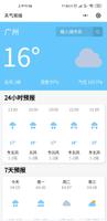
效果预览:
项目地址:http://xiazai.jb51.net/201701/yuanma/wx_qqmusic-master(jb51.net).rar
感谢阅读,希望能帮助到大家,谢谢大家对本站的支持!
以上是 微信小程序 轮播图swiper详解及实例(源码下载) 的全部内容, 来源链接: utcz.com/z/351172.html