基于element-ui组件手动实现单选和上传功能
前言
在用户使用过程中提出一键导入的功能,需求如下:点击导入按钮显示提示框,然后是单选框以及上传按钮。pc端常使用element-ui组件,但是这个项目是vue1的老项目,并且没有element-ui组件。所以需要自己动手实现单选功能和上传功能。
radio 属性及方法
name: 用于定义同一类型的 radio 同一 name 的 radio 只能选中一个(单选实现)
- id: 用于和 label 标签关联起来 实现点击 label 标签内的元素也能选中 radio
- value:单选按钮的值,选中某个单选按钮相当于拿到 value 值 tip:用于识别组中的哪个单选按钮被选中。
- checked 用于设置默认选中的 radio
- v-model 创建双向数据绑定。 会忽略所有表单元素的 value、checked、selected 特性的初始值而总是将 Vue 实例的数据作为数据来源。
// html
<div v-for="day in weekSelectList"
:key="day.id"
class="select__day">
<input type="radio"
name="week"
:id="day.label"
:value="day.value"
v-model="selectedDay">
<label :for="day.label">{{day.label}}({{day.value}})</label>
</div>
// 暂定的数据
data(){
return {
weekSelectList: [
{ label: '周一', value: '2018-12', id: 1 },
{ label: '周二', value: '2018-13', id: 2 },
{ label: '周三', value: '2018-14', id: 3 },
{ label: '周四', value: '2018-15', id: 4 },
{ label: '周五', value: '2018-16', id: 5 }
]
},
selectedDay: '2018-12',
}
通过 v-model 绑定 selectedDay,匹配到相同的值会将该 radio 选中,当改变 radio 的选择,selectedDay 也会动态的变更成选中的 radio 的 value
上传文件
属性
accept 属性接受一个(多个值时)逗号分隔的字符串 如:accept="image/png, image/jpeg"
- id
- name
- 注意:accept 属性并不会验证选中文件的类型只是在用户浏览时只显示指定文件类型
缺点
- 在未上传文件时,显示"未选择文件",用户界面不友好,不可配置
- 同一个文件名即使内容改变了,重新上传也不会触发 change 事件
- 用户如果在上传过程中点击了“取消”,已经上传的文件会被移除
解决方式
<div class="upload__button"
:class="{'upload__button--uploaded':isUploaded}"
@click="onUploadClick">点击上传</div>
<input type="file"
class="upload__file"
v-el:upload
accept="application/vnd.openxmlformats-officedocument.spreadsheetml.sheet, application/vnd.ms-excel"
@change="onFileChange" />
methods:{
onUploadClick() {
if (!this.isUploaded) {
this.$els.upload.click()
}
},
onFileChange(e) {
const file = e.target.files[0]
if (file === undefined) {
return
}
this.fileName = file.name
const result = /[xls|xlsx]$/.test(this.fileName)
if (result) {
this.isUploaded = true
this.showAlert('上传成功')
this.$els.upload.value = null
} else {
this.showAlert('文件格式错误,请确认后重试。')
}
},
}
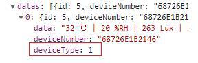
当点击上传按钮触发 onUploadClick 事件后,获取到 upload 绑定的 DOM (由于是老的项目使用的是$els,vue2 使用 ref)手动触发 click 事件并且可以在change事件中默认接收一个文件信息对象其中target.files[0]包含文件的更多信息,如下图:
判断文件类型
可以看到 change 事件的返回值包含着文件属性,这里我们需要判断是文件名是否为 excel,使用正则的 test 方法。
重置change事件
在最后 this.$refs.uploadFile.value = null; 移除文件,可以保证上传同样的文件时,也会触发 change 事件
优化样式
至此关于表单方面的功能都已经实现了,由于原始的radio样式比较丑,而且不能更改。下面我们就想办法将它做的漂亮些。
// template
<label v-for="(item,index) in radioList"
:key="item.value"
:for="item.linkLabel"
:accesskey="index">
<span class="content__input">
<span class="radio__replace"
:class="{'radio__replace--checked':selectedRadio===item.value,'radio__replace--disable':item.isDisabled}">
</span>
<input v-model="selectedRadio"
type="radio"
class="radio__button"
name="radio"
:id="item.linkLabel"
:tabindex="index"
:value="item.value"
:disabled="item.isDisabled"
@focus="item.isFocus = true"
@blur="item.isFocus = false" />
</span>
<span class="content__text">{{item.label}}</span>
</label>
// data
data() {
return {
radioList: [
{
linkLabel: 'label1',
value: '1',
isDisabled: false,
isFocus: false,
label: '标签1'
},
{
linkLabel: 'label2',
value: '2',
isDisabled: false,
isFocus: false,
label: '标签2'
},
{
linkLabel: 'label3',
value: '3',
isDisabled: true,
isFocus: false,
label: '标签3'
}
],
selectedRadio: '1'
}
- 这里使用遍历的方式在data中定义多个radio,在前面我们讲到过radio的基本用法,使用label的for属性和input的for属性实现关联起来。(这里我将input放在label内,这样点击整个label都会选中,没有label和radio元素之间的间隙)。
- name相同的radio会实现单选效果,tabindex代表使用"Tab"键的遍历顺序 ,value是选中时v-model绑定的selectedRadio也就会跟着变更
- 实现个性化样式的关键在于结构就是用一个类名content__input标签将类名radio__replace和radio包起来。设置定位层级(相当于radio被覆盖了,然而只要点击到labelradio就会被选中)
- 通过selectedRadio选中的值和当前radio值做对比,以及isDisabled这些Boolean值来动态绑定class实现我们自定义的radio样式切换
效果如下:
其实radio__replace类名对应的标签就是我们自定义的radio,其中的白色原点是通过伪类生成的css代码放在最后,感兴趣可以看下
伪类样式修改
如果想通过类名来改变白色原点的样式,可以通过权重来改变。如下通过isShow来给外层添加test类名 而起始的时候设置的权重为两层,之后添加一层可以起到修改样式的效果。(ps:伪类不能通过预先设定好的类名来修改样式)
例子代码如下:
<div :class="{test:isShow}"
@click="onRedClick">
<div class="text__item"></div>
</div>
.text__item {
&:after {
content: '';
width: 30px;
height: 30px;
background-color: #f00;
position: absolute;
bottom: 20px;
}
}
.test {
.text__item {
&:after {
background-color: #ff0;
}
}
}
// css
.radio {
&__replace {
border: 1px solid #dcdfe6;
border-radius: 100%;
width: 14px;
height: 14px;
background-color: #fff;
position: relative;
cursor: pointer;
display: inline-block;
box-sizing: border-box;
z-index: 999;
transition: 0.15s ease-in;
&--checked {
border-color: #409eff;
background-color: #409eff;
}
&--disable {
cursor: not-allowed;
}
&:after {
width: 4px;
height: 4px;
border-radius: 100%;
background-color: #fff;
content: '';
position: absolute;
left: 50%;
top: 50%;
transform: translate(-50%, -50%);
}
}
&__button {
opacity: 0;
outline: none;
position: absolute;
z-index: -1;
top: 0;
left: 0;
right: 0;
bottom: 0;
margin: 0;
}
}
总结
- 介绍了radio基本属性,使用案例并优化了radio的样式
- 原始上传文件元素的缺点以及改善方法
以上所述是小编给大家介绍的基于element-ui组件手动实现单选和上传功能,希望对大家有所帮助,如果大家有任何疑问请给我留言,小编会及时回复大家的。在此也非常感谢大家对网站的支持!
以上是 基于element-ui组件手动实现单选和上传功能 的全部内容, 来源链接: utcz.com/z/344458.html