vue自定义底部导航栏Tabbar的实现代码
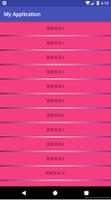
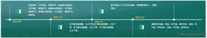
如图所示,要完成类似的一个底部导航切换。
首先。我们需要分为5个大的VUE文件。可以根据自己的习惯来放在不同的位置。
我将5个主要的vue文件放在了5个不同的文件夹
然后,在components文件夹里新建Tabbar.vue/以及Item.vue文件
Item.vue文件如下
<template>
<div class="itemWarp flex_mid" @click='changePage'>
<span v-show='!bol'>
<slot name='normalImg'></slot>
</span>
<span v-show='bol'>
<slot name='activeImg'></slot>
</span>
<span v-text='txt'></span>
</div>
</template>
<script type="text/javascript">
export default{
name: 'Item',
props:{
txt:{
type:String
},
page:{
type:String
},
sel:{
type:String
}
},
computed:{
bol: function(){
if(this.sel == this.page){
return true;
}
return false;
}
},
methods:{
changePage:function(){
//点击跳转对应的页面
this.$router.push('/'+this.page);
this.$emit('change',this.page)
}
}
}
</script>
<style type="text/css">
.itemWarp{
flex-grow: 1;
display: flex;
align-items: center;
justify-content: center;
flex-direction: column;
}
.itemWarp span{
font-size: 12px;
}
</style>
Tabbar.vue文件如下
<template>
<div class="tabberWarp" >
<div class="warp">
<Item :txt='item.txt' :page='item.page' @change='getVal' v-for='item in tabbarDes':sel='selected'>
<img :src="item.normalImg" slot='normalImg'>
<img :src="item.activeImg" slot='activeImg'>
</Item>
</div>
</div>
</template>
<script type="text/javascript">
import Item from './Item.vue'
export default{
components:{
Item
},
data:function(){
return{
selected:'skin',
tabbarDes:[
{
txt:'表情',
page:'skin',
normalImg:require('../assets/images/zz_07.jpg'),
activeImg:require('../assets/images/22_03.jpg')
},
{
txt:'皮肤',
page:'phiz',
normalImg:require('../assets/images/download_skin_ic.png'),
activeImg:require('../assets/images/112_26.jpg')
},
{
txt:'词库',
page:'thesaurus',
normalImg:require('../assets/images/zz_09.jpg'),
activeImg:require('../assets/images/icon2_03.jpg')
},
{
txt:'账号',
page:'account',
normalImg:require('../assets/images/zz_11.jpg'),
activeImg:require('../assets/images/cion_03.jpg')
},
{
txt:'设置',
page:'setup',
normalImg:require('../assets/images/zz_13.jpg'),
activeImg:require('../assets/images/22_03.jpg')
}
]
}
},
methods:{
getVal:function(res){
this.selected = res;
}
}
}
</script>
<style type="text/css">
.warp{
width: 100%;
border-top: 1px solid #eee;
background: #fff;
display: flex;
align-items: center;
justify-content: space-around;
font-size: 0;
}
.warp img{
width: 20px;
height: 20px;
}
.tabberWarp img{
margin-top: 10px;
margin-bottom: 5px;
}
.tabberWarp{
position: fixed;
bottom: 0;
left: 0;
width: 100%;
padding-bottom: 5px;
background: #fff;
}
</style>
Tabbar.vue文件和Item.vue的关系为父子关系.
Tabbar.vue组件 通过v-for循环tabbarDes里面的数据.再通过 props 向下传递数据给子组件.Item.vue能接受到父组件传递的数据.
Item.vue组件绑定点击事件.
this.$router.push('/'+this.page);为跳转到对应的page
this.$emit('change',this.page)为使用$emit 触发父组件的自定义事件 change,将this.page作为参数传递到父组件中.父组件点击获取到传递过来的参数.再通过props传递给item.vue.在computed计算属性中.返回不同的布尔值.来做底部图片的显示隐藏.
最后仅需要在App.vue中引入Tabbar组件即可.
<template>
<div id="app">
<router-view></router-view>
<Tabbar></Tabbar>
<div class="empty"></div>
</div>
</template>
<script>
import Tabbar from'./components/tabbar'
export default {
name: 'app',
created:function(){
this.$router.push('/')
},
components:{
Tabbar
}
}
</script>
总结
以上所述是小编给大家介绍的vue自定义底部导航栏Tabbar的实现代码,希望对大家有所帮助,如果大家有任何疑问请给我留言,小编会及时回复大家的。在此也非常感谢大家对网站的支持!
以上是 vue自定义底部导航栏Tabbar的实现代码 的全部内容, 来源链接: utcz.com/z/339673.html