Flutter 组件介绍
https://flutter.dev/docs/development/ui/widgets-intro
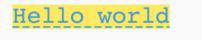
HelloWorld
import 'package:flutter/material.dart';void main() {
runApp(
Center(
child: Text(
'Hello, world!',
textDirection: TextDirection.ltr,
),
),
);
}
- runApp() 将传入的Widget作为app的根
- Center和Text是两个提供的组件
- TextDirection.ltr表示书写的方向
StatelessWidget 和 StatefulWidget
书写组件的时候通常继承自StatelessWidget 和 StatefulWidget。组件的书写时通过build函数,描述一个组件的树形结构。
Basic widgets
常用的组件有:
- Text:可以创建有样式的文本
- Row, Column:创建灵活的水平和垂直布局,根Web中的flexbox一样
- Stack:用于创建层层遮盖的组件容器,通过在容器中使用Positioned组件,可以创建类似Web中的绝对定位
- Container:可以用于创建方形的可视区域,然后用 BoxDecoration 来配置样式(边框、背景、阴影),同样它可以设置margin、padding、宽度限制等,更进一步可以对容器进行tranform。
疑问点:
const EdgeInsets为什么要加 constMyAppBar({this.title});是什么意思
Using Material Components
import 'package:flutter/material.dart';void main() {
runApp(MaterialApp(
title: 'Flutter Tutorial',
home: TutorialHome(),
));
}
class TutorialHome extends StatelessWidget {
@override
Widget build(BuildContext context) {
// Scaffold is a layout for the major Material Components.
return Scaffold(
appBar: AppBar(
leading: IconButton(
icon: Icon(Icons.menu),
tooltip: 'Navigation menu',
onPressed: null,
),
title: Text('Example title'),
actions: <Widget>[
IconButton(
icon: Icon(Icons.search),
tooltip: 'Search',
onPressed: null,
),
],
),
// body is the majority of the screen.
body: Center(
child: Text('Hello, world!'),
),
floatingActionButton: FloatingActionButton(
tooltip: 'Add', // used by assistive technologies
child: Icon(Icons.add),
onPressed: null,
),
);
}
}
疑问点:floatingActionButton 居然不是随意命名的?
Handling gestures
class MyButton extends StatelessWidget { @override
Widget build(BuildContext context) {
return GestureDetector(
onTap: () {
print('MyButton was tapped!');
},
child: Container(
height: 36.0,
padding: const EdgeInsets.all(8.0),
margin: const EdgeInsets.symmetric(horizontal: 8.0),
decoration: BoxDecoration(
borderRadius: BorderRadius.circular(5.0),
color: Colors.lightGreen[500],
),
child: Center(
child: Text('Engage'),
),
),
);
}
}
一个可以处理手势的抽象概念,可以用于包裹按钮等可操作性的组件。
Changing widgets in response to input
关于 StatelessWidget StatefulWidget State 的关系,自己看例子吧:
import 'package:flutter/material.dart';class CounterDisplay extends StatelessWidget {
CounterDisplay({this.count});
final int count;
@override
Widget build(BuildContext context) {
return Text('Count: $count');
}
}
class CounterIncrementor extends StatelessWidget {
CounterIncrementor({this.onPressed});
final VoidCallback onPressed;
@override
Widget build(BuildContext context) {
return RaisedButton(
onPressed: onPressed,
child: Text('Increment')
);
}
}
class Counter extends StatefulWidget {
@override
_CounterState createState() => _CounterState();
}
class _CounterState extends State<Counter> {
int _counter = 0;
void _increment() {
setState(() {
++ _counter;
});
}
@override
Widget build(BuildContext context) {
return Row(children: <Widget> [
CounterIncrementor(onPressed: _increment),
CounterDisplay(count: _counter)
]);
}
}
void main() {
runApp(MaterialApp(
home: Counter()
));
}
Bringing it all together
略微复杂的例子,混合了 StatelessWidget StatefulWidget State,并且包含 List 和 Item 这种组织关系。总而言之,自己开始写的时候,模仿例子来改即可。
import 'package:flutter/material.dart';class Product {
const Product({this.name});
final String name;
}
typedef void CartChangedCallback(Product product, bool inCart);
class ShoppingListItem extends StatelessWidget {
ShoppingListItem({Product product, this.inCart, this.onCartChanged})
: product = product,
super(key: ObjectKey(product));
final Product product;
final bool inCart;
final CartChangedCallback onCartChanged;
Color _getColor(BuildContext context) {
// The theme depends on the BuildContext because different parts of the tree
// can have different themes. The BuildContext indicates where the build is
// taking place and therefore which theme to use.
return inCart ? Colors.black54 : Theme.of(context).primaryColor;
}
TextStyle _getTextStyle(BuildContext context) {
if (!inCart) return null;
return TextStyle(
color: Colors.black54,
decoration: TextDecoration.lineThrough,
);
}
@override
Widget build(BuildContext context) {
return ListTile(
onTap: () {
onCartChanged(product, inCart);
},
leading: CircleAvatar(
backgroundColor: _getColor(context),
child: Text(product.name[0]),
),
title: Text(product.name, style: _getTextStyle(context)),
);
}
}
class ShoppingList extends StatefulWidget {
ShoppingList({Key key, this.products}) : super(key: key);
final List<Product> products;
// The framework calls createState the first time a widget appears at a given
// location in the tree. If the parent rebuilds and uses the same type of
// widget (with the same key), the framework re-uses the State object
// instead of creating a new State object.
@override
_ShoppingListState createState() => _ShoppingListState();
}
class _ShoppingListState extends State<ShoppingList> {
Set<Product> _shoppingCart = Set<Product>();
void _handleCartChanged(Product product, bool inCart) {
setState(() {
// When a user changes what's in the cart, you need to change
//_shoppingCart inside a setState call to trigger a rebuild.
// The framework then calls // build, below,
// which updates the visual appearance of the app.
if (!inCart)
_shoppingCart.add(product);
else
_shoppingCart.remove(product);
});
}
@override
Widget build(BuildContext context) {
return Scaffold(
appBar: AppBar(
title: Text('Shopping List'),
),
body: ListView(
padding: EdgeInsets.symmetric(vertical: 8.0),
children: widget.products.map((Product product) {
return ShoppingListItem(
product: product,
inCart: _shoppingCart.contains(product),
onCartChanged: _handleCartChanged,
);
}).toList(),
),
);
}
}
void main() {
runApp(MaterialApp(
title: 'Shopping App',
home: ShoppingList(
products: <Product>[
Product(name: 'Eggs'),
Product(name: 'Flour'),
Product(name: 'Chocolate chips'),
],
),
));
}
Responding to widget lifecycle events
介绍了用于初始化 State 的方法:initState 和 dispose。
Global Keys
用于全局唯一表示 Widget。
以上是 Flutter 组件介绍 的全部内容, 来源链接: utcz.com/z/264139.html