基于Python Dash库制作酷炫的可视化大屏
介绍
大家好,我是小F~
在数据时代,我们每个人既是数据的生产者,也是数据的使用者,然而初次获取和存储的原始数据杂乱无章、信息冗余、价值较低。
要想数据达到生动有趣、让人一目了然、豁然开朗的效果,就需要借助数据可视化。
以前给大家介绍过使用Streamlit库制作大屏,今天给大家带来一个新方法。
通过Python的Dash库,来制作一个酷炫的可视化大屏!
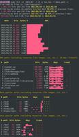
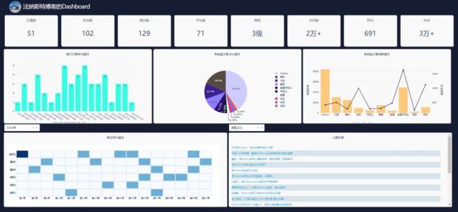
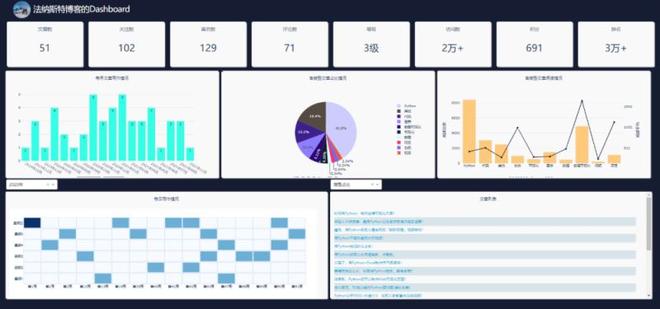
先来看一下整体效果,好像还不错哦。
主要使用Python的Dash库、Plotly库、Requests库。
其中Requests爬取数据,Plotly制作可视化图表,Dash搭建可视化页面。
原始数据是小F的博客数据,数据存储在MySqL数据库中。
如此看来,和Streamlit库的搭建流程,所差不多。
关于Dash库,网上的资料不是很多,基本上只能看官方文档和案例,下面小F简单介绍一下。
Dash是一个用于构建Web应用程序的高效Python框架,特别适合使用Python进行数据分析的人。
Dash是建立在Flask,Plotly.js和React.js之上,非常适合在纯Python中,使用高度自定义的用户界面,构建数据可视化应用程序。
相关文档
说明:https://dash.plotly.com/introduction
案例:https://dash.gallery/Portal/
源码:https://github.com/plotly/dash-sample-apps/
具体的大家可以去看文档学习,多动手练习。
下面就给大家讲解下如何通过Dash搭建可视化大屏~
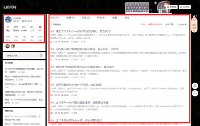
数据
使用的数据是博客数据,主要是下方两处红框的信息。
通过爬虫代码爬取下来,存储在MySQL数据库中。
其中MySQL的安装,大家可以自行百度,都挺简单的。
安装好后,进行启用,以及创建数据库。
# 启动MySQL, 输入密码
mysql -u root -p
# 创建名为my_database的数据库
create database my_database;
其它相关的操作命令如下所示。
# 显示MySQL中所有的数据库
show databases;
# 选择my_database数据库
use my_database;
# 显示my_database数据库中所有的表
show tables;
# 删除表
drop table info;
drop table `2021-12-26`;
# 显示表中的内容, 执行SQL查询语句
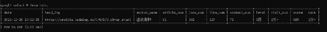
select * from info;
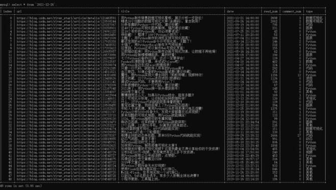
select * from `2021-12-26`;
搞定上面的步骤后,就可以运行爬虫代码。
数据爬取代码如下。这里使用到了pymysql这个库,需要pip安装下。
import requests
import re
from bs4 import BeautifulSoup
import time
import random
import pandas as pd
from sqlalchemy import create_engine
import datetime as dt
def get_info():
"""获取大屏第一列信息数据"""
headers = {
'User-Agent': 'Mozilla/5.0 (MSIE 10.0; Windows NT 6.1; Trident/5.0)',
'referer': 'https: // passport.csdn.net / login',
}
# 我的博客地址
url = 'https://blog.csdn.net/river_star1/article/details/121463591'
try:
resp = requests.get(url, headers=headers)
now = dt.datetime.now().strftime("%Y-%m-%d %X")
soup = BeautifulSoup(resp.text, 'lxml')
author_name = soup.find('div', class_='user-info d-flex flex-column profile-intro-name-box').find('a').get_text(strip=True)
head_img = soup.find('div', class_='avatar-box d-flex justify-content-center flex-column').find('a').find('img')['src']
row1_nums = soup.find_all('div', class_='data-info d-flex item-tiling')[0].find_all('span', class_='count')
row2_nums = soup.find_all('div', class_='data-info d-flex item-tiling')[1].find_all('span', class_='count')
level_mes = soup.find_all('div', class_='data-info d-flex item-tiling')[0].find_all('dl')[-1]['title'].split(',')[0]
rank = soup.find('div', class_='data-info d-flex item-tiling').find_all('dl')[-1]['title']
info = {
'date': now,#时间
'head_img': head_img,#头像
'author_name': author_name,#用户名
'article_num': str(row1_nums[0].get_text()),#文章数
'fans_num': str(row2_nums[1].get_text()),#粉丝数
'like_num': str(row2_nums[2].get_text()),#喜欢数
'comment_num': str(row2_nums[3].get_text()),#评论数
'level': level_mes,#等级
'visit_num': str(row1_nums[3].get_text()),#访问数
'score': str(row2_nums[0].get_text()),#积分
'rank': str(row1_nums[2].get_text()),#排名
}
df_info = pd.DataFrame([info.values()], columns=info.keys())
return df_info
except Exception as e:
print(e)
return get_info()
def get_type(title):
"""设置文章类型(依据文章名称)"""
the_type = '其他'
article_types = ['项目', '数据可视化', '代码', '图表', 'Python', '可视化', '数据', '面试', '视频', '动态', '下载']
for article_type in article_types:
if article_type in title:
the_type = article_type
break
return the_type
def get_blog():
"""获取大屏第二、三列信息数据"""
headers = {
'User-Agent': 'Mozilla/5.0 (MSIE 10.0; Windows NT 6.1; Trident/5.0)',
'referer': 'https: // passport.csdn.net / login',
}
base_url = 'https://blog.csdn.net/river_star1/article/list/'
resp = requests.get(base_url+"1", headers=headers, timeout=3)
max_page = int(re.findall(r'var listTotal = (\d+);', resp.text)[0])//40+1
df = pd.DataFrame(columns=['url', 'title', 'date', 'read_num', 'comment_num', 'type'])
count = 0
for i in range(1, max_page+1):
url = base_url + str(i)
resp = requests.get(url, headers=headers)
soup = BeautifulSoup(resp.text, 'lxml')
articles = soup.find("div", class_='article-list').find_all('div', class_='article-item-box csdn-tracking-statistics')
for article in articles[1:]:
a_url = article.find('h4').find('a')['href']
title = article.find('h4').find('a').get_text(strip=True)[2:]
issuing_time = article.find('span', class_="date").get_text(strip=True)
num_list = article.find_all('span', class_="read-num")
read_num = num_list[0].get_text(strip=True)
if len(num_list) > 1:
comment_num = num_list[1].get_text(strip=True)
else:
comment_num = 0
the_type = get_type(title)
df.loc[count] = [a_url, title, issuing_time, int(read_num), int(comment_num), the_type]
count += 1
time.sleep(random.choice([1, 1.1, 1.3]))
return df
if __name__ == '__main__':
# 今天的时间
today = dt.datetime.today().strftime("%Y-%m-%d")
# 连接mysql数据库
engine = create_engine('mysql+pymysql://root:123456@localhost/my_database?charset=utf8')
# 获取大屏第一列信息数据, 并写入my_database数据库的info表中, 如若表已存在, 删除覆盖
df_info = get_info()
print(df_info)
df_info.to_sql("info", con=engine, if_exists='replace', index=False)
# 获取大屏第二、三列信息数据, 并写入my_database数据库的日期表中, 如若表已存在, 删除覆盖
df_article = get_blog()
print(df_article)
df_article.to_sql(today, con=engine, if_exists='replace', index=True)
运行成功后,就可以去数据库查询信息了。
info表,包含日期、头图、博客名、文章数、粉丝数、点赞数、评论数、等级数、访问数、积分数、排名数。
日期表,包含文章地址、标题、日期、阅读数、评论数、类型。
其中爬虫代码可设置定时运行,info表为60秒,日期表为60分钟。
尽量不要太频繁,容易被封IP,或者选择使用代理池。
这样便可以做到数据实时更新。
既然数据已经有了,下面就可以来编写页面了。
大屏搭建
导入相关的Python库,同样可以通过pip进行安装。
from spider_py import get_info, get_blog
from dash import dcc
import dash
from dash import html
import pandas as pd
import plotly.graph_objs as go
from dash.dependencies import Input, Output
import datetime as dt
from sqlalchemy import create_engine
from flask_caching import Cache
import numpy as np
设置一些基本的配置参数,如数据库连接、网页样式、Dash实例、图表颜色。
# 今天的时间
today = dt.datetime.today().strftime("%Y-%m-%d")
# 连接数据库
engine = create_engine('mysql+pymysql://root:123456@localhost/my_database?charset=utf8')
# 导入css样式
external_css = [
"https://stackpath.bootstrapcdn.com/bootstrap/4.1.3/css/bootstrap.min.css",
"https://cdnjs.cloudflare.com/ajax/libs/skeleton/2.0.4/skeleton.min.css"
]
# 创建一个实例
app = dash.Dash(__name__, external_stylesheets=external_css)
server = app.server
# 可以选择使用缓存, 减少频繁的数据请求
# cache = Cache(app.server, config={
# 'CACHE_TYPE': 'filesystem',
# 'CACHE_DIR': 'cache-directory'
# })
# 读取info表的数据
info = pd.read_sql('info', con=engine)
# 图表颜色
color_scale = ['#2c0772', '#3d208e', '#8D7DFF', '#CDCCFF', '#C7FFFB', '#ff2c6d', '#564b43', '#161d33']
这里将缓存代码注释掉了,如有频繁的页面刷新请求,就可以选择使用。
def indicator(text, id_value):
"""第一列的文字及数字信息显示"""
return html.Div([
html.P(text, className="twelve columns indicator_text"),
html.P(id=id_value, className="indicator_value"),
], className="col indicator")
def get_news_table(data):
"""获取文章列表, 根据阅读排序"""
df = data.copy()
df.sort_values('read_num', inplace=True, ascending=False)
titles = df['title'].tolist()
urls = df['url'].tolist()
return html.Table([html.Tbody([
html.Tr([
html.Td(
html.A(titles[i], href=urls[i], target="_blank",))
], style={'height': '30px', 'fontSize': '16'})for i in range(min(len(df), 100))
])], style={"height": "90%", "width": "98%"})
# @cache.memoize(timeout=3590), 可选择设置缓存, 我没使用
def get_df():
"""获取当日最新的文章数据"""
df = pd.read_sql(today, con=engine)
df['date_day'] = df['date'].apply(lambda x: x.split(' ')[0]).astype('datetime64[ns]')
df['date_month'] = df['date'].apply(lambda x: x[:7].split('-')[0] + "年" + x[:7].split('-')[-1] + "月")
df['weekday'] = df['date_day'].dt.weekday
df['year'] = df['date_day'].dt.year
df['month'] = df['date_day'].dt.month
df['week'] = df['date_day'].dt.isocalendar().week
return df
# 导航栏的图片及标题
head = html.Div([
html.Div(html.Img(src='./assets/img.jpg', height="100%"), style={"float": "left", "height": "90%", "margin-top": "5px", "border-radius": "50%", "overflow": "hidden"}),
html.Span("{}博客的Dashboard".format(info['author_name'][0]), className='app-title'),
], className="row header")
# 第一列的文字及数字信息
columns = info.columns[3:]
col_name = ['文章数', '关注数', '喜欢数', '评论数', '等级', '访问数', '积分', '排名']
row1 = html.Div([
indicator(col_name[i], col) for i, col in enumerate(columns)
], className='row')
# 第二列
row2 = html.Div([
html.Div([
html.P("每月文章写作情况"),
dcc.Graph(id="bar", style={"height": "90%", "width": "98%"}, config=dict(displayModeBar=False),)
], className="col-4 chart_div",),
html.Div([
html.P("各类型文章占比情况"),
dcc.Graph(id="pie", style={"height": "90%", "width": "98%"}, config=dict(displayModeBar=False),)
], className="col-4 chart_div"),
html.Div([
html.P("各类型文章阅读情况"),
dcc.Graph(id="mix", style={"height": "90%", "width": "98%"}, config=dict(displayModeBar=False),)
], className="col-4 chart_div",)
], className='row')
# 年数统计, 我的是2019 2020 2021
years = get_df()['year'].unique()
select_list = ['每月文章', '类型占比', '类型阅读量', '每日情况']
# 两个可交互的下拉选项
dropDowm1 = html.Div([
html.Div([
dcc.Dropdown(id='dropdown1',
options=[{'label': '{}年'.format(year), 'value': year} for year in years],
value=years[1], style={'width': '40%'})
], className='col-6', style={'padding': '2px', 'margin': '0px 5px 0px'}),
html.Div([
dcc.Dropdown(id='dropdown2',
options=[{'label': select_list[i], 'value': item} for i, item in enumerate(['bar', 'pie', 'mix', 'heatmap'])],
value='heatmap', style={'width': '40%'})
], className='col-6', style={'padding': '2px', 'margin': '0px 5px 0px'})
], className='row')
# 第三列
row3 = html.Div([
html.Div([
html.P("每日写作情况"),
dcc.Graph(id="heatmap", style={"height": "90%", "width": "98%"}, config=dict(displayModeBar=False),)
], className="col-6 chart_div",),
html.Div([
html.P("文章列表"),
html.Div(get_news_table(get_df()), id='click-data'),
], className="col-6 chart_div", style={"overflowY": "scroll"})
], className='row')
# 总体情况
app.layout = html.Div([
# 定时器
dcc.Interval(id="stream", interval=1000*60, n_intervals=0),
dcc.Interval(id="river", interval=1000*60*60, n_intervals=0),
html.Div(id="load_info", style={"display": "none"},),
html.Div(id="load_click_data", style={"display": "none"},),
head,
html.Div([
row1,
row2,
dropDowm1,
row3,
], style={'margin': '0% 30px'}),
])
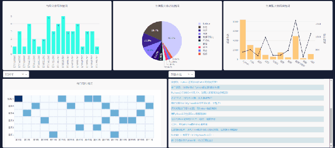
上面的代码,就是网页的布局,效果如下。
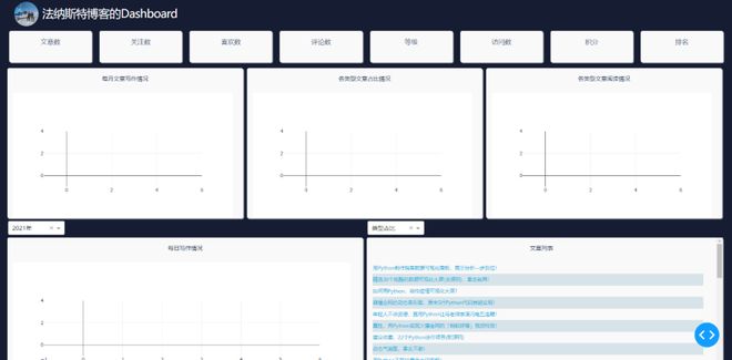
网页可以划分为三列。第一列为info表中的数据展示,第二、三列为博客文章的数据展示。
相关的数据需要通过回调函数进行更新,这样才能做到实时刷新。
各个数值及图表的回调函数代码如下所示。
# 回调函数, 60秒刷新info数据, 即第一列的数值实时刷新
@app.callback(Output('load_info', 'children'), [Input("stream", "n_intervals")])
def load_info(n):
try:
df = pd.read_sql('info', con=engine)
return df.to_json()
except:
pass
# 回调函数, 60分钟刷新今日数据, 即第二、三列的数值实时刷新(爬取文章数据, 并写入数据库中)
@app.callback(Output('load_click_data', 'children'), [Input("river", "n_intervals")])
def cwarl_data(n):
if n != 0:
df_article = get_blog()
df_article.to_sql(today, con=engine, if_exists='replace', index=True)
# 回调函数, 第一个柱状图
@app.callback(Output('bar', 'figure'), [Input("river", "n_intervals")])
def get_bar(n):
df = get_df()
df_date_month = pd.DataFrame(df['date_month'].value_counts(sort=False))
df_date_month.sort_index(inplace=True)
trace = go.Bar(
x=df_date_month.index,
y=df_date_month['date_month'],
text=df_date_month['date_month'],
textposition='auto',
marker=dict(color='#33ffe6')
)
layout = go.Layout(
margin=dict(l=40, r=40, t=10, b=50),
yaxis=dict(gridcolor='#e2e2e2'),
paper_bgcolor='rgba(0,0,0,0)',
plot_bgcolor='rgba(0,0,0,0)',
)
return go.Figure(data=[trace], layout=layout)
# 回调函数, 中间的饼图
@app.callback(Output('pie', 'figure'), [Input("river", "n_intervals")])
def get_pie(n):
df = get_df()
df_types = pd.DataFrame(df['type'].value_counts(sort=False))
trace = go.Pie(
labels=df_types.index,
values=df_types['type'],
marker=dict(colors=color_scale[:len(df_types.index)])
)
layout = go.Layout(
margin=dict(l=50, r=50, t=50, b=50),
paper_bgcolor='rgba(0,0,0,0)',
plot_bgcolor='rgba(0,0,0,0)',
)
return go.Figure(data=[trace], layout=layout)
# 回调函数, 左下角热力图
@app.callback(Output('heatmap', 'figure'),
[Input("dropdown1", "value"), Input('river', 'n_intervals')])
def get_heatmap(value, n):
df = get_df()
grouped_by_year = df.groupby('year')
data = grouped_by_year.get_group(value)
cross = pd.crosstab(data['weekday'], data['week'])
cross.sort_index(inplace=True)
trace = go.Heatmap(
x=['第{}周'.format(i) for i in cross.columns],
y=["星期{}".format(i+1) if i != 6 else "星期日" for i in cross.index],
z=cross.values,
colorscale="Blues",
reversescale=False,
xgap=4,
ygap=5,
showscale=False
)
layout = go.Layout(
margin=dict(l=50, r=40, t=30, b=50),
)
return go.Figure(data=[trace], layout=layout)
# 回调函数, 第二个柱状图(柱状图+折线图)
@app.callback(Output('mix', 'figure'), [Input("river", "n_intervals")])
def get_mix(n):
df = get_df()
df_type_visit_sum = pd.DataFrame(df['read_num'].groupby(df['type']).sum())
df['read_num'] = df['read_num'].astype('float')
df_type_visit_mean = pd.DataFrame(df['read_num'].groupby(df['type']).agg('mean').round(2))
trace1 = go.Bar(
x=df_type_visit_sum.index,
y=df_type_visit_sum['read_num'],
name='总阅读',
marker=dict(color='#ffc97b'),
yaxis='y',
)
trace2 = go.Scatter(
x=df_type_visit_mean.index,
y=df_type_visit_mean['read_num'],
name='平均阅读',
yaxis='y2',
line=dict(color='#161D33')
)
layout = go.Layout(
margin=dict(l=60, r=60, t=30, b=50),
showlegend=False,
yaxis=dict(
side='left',
title='阅读总数',
gridcolor='#e2e2e2'
),
yaxis2=dict(
showgrid=False, # 网格
title='阅读平均',
anchor='x',
overlaying='y',
side='right'
),
paper_bgcolor='rgba(0,0,0,0)',
plot_bgcolor='rgba(0,0,0,0)',
)
return go.Figure(data=[trace1, trace2], layout=layout)
# 点击事件, 选择两个下拉选项, 点击对应区域的图表, 文章列表会刷新
@app.callback(Output('click-data', 'children'),
[Input('pie', 'clickData'),
Input('bar', 'clickData'),
Input('mix', 'clickData'),
Input('heatmap', 'clickData'),
Input('dropdown1', 'value'),
Input('dropdown2', 'value'),
])
def display_click_data(pie, bar, mix, heatmap, d_value, fig_type):
try:
df = get_df()
if fig_type == 'pie':
type_value = pie['points'][0]['label']
# date_month_value = clickdata['points'][0]['x']
data = df[df['type'] == type_value]
elif fig_type == 'bar':
date_month_value = bar['points'][0]['x']
data = df[df['date_month'] == date_month_value]
elif fig_type == 'mix':
type_value = mix['points'][0]['x']
data = df[df['type'] == type_value]
else:
z = heatmap['points'][0]['z']
if z == 0:
return None
else:
week = heatmap['points'][0]['x'][1:-1]
weekday = heatmap['points'][0]['y'][-1]
if weekday == '日':
weekday = 7
year = d_value
data = df[(df['weekday'] == int(weekday)-1) & (df['week'] == int(week)) & (df['year'] == year)]
return get_news_table(data)
except:
return None
# 第一列的数值
def update_info(col):
def get_data(json, n):
df = pd.read_json(json)
return df[col][0]
return get_data
for col in columns:
app.callback(Output(col, "children"),
[Input('load_info', 'children'), Input("stream", "n_intervals")]
)(update_info(col))
图表的数据和样式全在这里设置,两个下拉栏的数据交互也在这里完成。
需要注意右侧下拉栏的类型,需和你所要点击图表类型一致,这样文章列表才会更新。
每日情况对应热力图,类型阅读量对应第二列第三个图表,类型占比对应饼图,每月文章对应第一个柱状图的点击事件。
最后启动程序代码。
if __name__ == '__main__':
# debug模式, 端口7777
app.run_server(debug=True, threaded=True, port=7777)
# 正常模式, 网页右下角的调试按钮将不会出现
# app.run_server(port=7777)
这样就能在本地看到可视化大屏页面,浏览器打开如下地址。
http://127.0.0.1:7777
对于网页的布局、背景颜色等,主要通过CSS进行设置。
这一部分可能是大家所要花费时间去理解的。
body{
margin:0;
padding: 0;
background-color: #161D33;
font-family: 'Open Sans', sans-serif;
color: #506784;
-webkit-user-select: none; /* Chrome all / Safari all */
-moz-user-select: none; /* Firefox all */
-ms-user-select: none; /* IE 10+ */
user-select: none; /* Likely future */
}
.modal {
display: block; /*Hidden by default */
position: fixed; /* Stay in place */
z-index: 1000; /* Sit on top */
left: 0;
top: 0;
width: 100%; /* Full width */
height: 100%; /* Full height */
overflow: auto; /* Enable scroll if needed */
background-color: rgb(0,0,0); /* Fallback color */
background-color: rgba(0,0,0,0.4); /* Black w/ opacity */
}
.modal-content {
background-color: white;
margin: 5% auto; /* 15% from the top and centered */
padding: 20px;
width: 30%; /* Could be more or less, depending on screen size */
color:#506784;
}
._dash-undo-redo {
display: none;
}
.app-title{
color:white;
font-size:3rem;
letter-spacing:-.1rem;
padding:10px;
vertical-align:middle
}
.header{
margin:0px;
background-color:#161D33;
height:70px;
color:white;
padding-right:2%;
padding-left:2%
}
.indicator{
border-radius: 5px;
background-color: #f9f9f9;
margin: 10px;
padding: 15px;
position: relative;
box-shadow: 2px 2px 2px lightgrey;
}
.indicator_text{
text-align: center;
float: left;
font-size: 17px;
}
.indicator_value{
text-align:center;
color: #2a3f5f;
font-size: 35px;
}
.add{
height: 34px;
background: #119DFF;
border: 1px solid #119DFF;
color: white;
}
.chart_div{
background-color: #f9f9f9;
border-radius: 5px;
height: 390px;
margin:5px;
padding: 15px;
position: relative;
box-shadow: 2px 2px 2px lightgrey;
}
.col-4 {
flex: 0 0 32.65%;
max-width: 33%;
}
.col-6 {
flex: 0 0 49.3%;
max-width: 50%;
}
.chart_div p{
color: #2a3f5f;
font-size: 15px;
text-align: center;
}
td{
text-align: left;
padding: 0px;
}
table{
border: 1px;
font-size:1.3rem;
width:100%;
font-family:Ubuntu;
}
.tabs_div{
margin:0px;
height:30px;
font-size:13px;
margin-top:1px
}
tr:nth-child(even) {
background-color: #d6e4ea;
-webkit-print-color-adjust: exact;
}
如今低代码平台的出现,或许以后再也不用去写烦人的HTML、CSS等。拖拖拽拽,即可轻松完成一个大屏的制作。
好了,今天的分享到此结束,大家可以自行去动手练习。
参考链接:
https://github.com/ffzs/dash_blog_dashboard
https://github.com/plotly/dash-sample-apps/tree/main/apps/dash-oil-and-gas
以上就是基于Python Dash库制作酷炫的可视化大屏的详细内容,更多关于Python Dash库制作可视化大屏的资料请关注其它相关文章!
以上是 基于Python Dash库制作酷炫的可视化大屏 的全部内容, 来源链接: utcz.com/z/256958.html