Vue中component标签解决项目组件化操作
一、 啰嗦几句
在vue项目组件化的过程中,遇到了一些问题,什么问题呢?就是在做一个多功能,多可用,多兼容的大组件的时候,发现在这个组件内部,实现了太多的if、for逻辑,包括大量的html元素,虽然说每段功能块都有批注,但是体积还是比较庞大,最近有些需求,需要将页面上的一大块筛选功能剥离开,形成单独的组件,统一数据渲染,统一组件管理,且这些功能无论是样式,或者是从结构来说,差异性都很大,所以考虑了以下几种开发方式:
1. 大容量单组件开发,渲染和传入的数据使用各种type、ctype判断
2. 使用插槽开发,根据type调用对应的组件
3. 使用component加载组件的方式,动态渲染调用组件
最终选择:第三种方式,采用<component>标签动态引入的方式开发
二、 官方文档解释
1. https://cn.vuejs.org/v2/guide/components.html#动态组件
2. https://cn.vuejs.org/v2/guide/components-dynamic-async.html
3. https://jsfiddle.net/chrisvfritz/o3nycadu/
三、 开发步骤
1. 首先按照大组件模式开发,功能拆分,统一在大组件中实现所有功能模块的样式 ( 注意:需要在在局部样式覆盖全局样式的条件需要在样式中使用 /deep/ 、 >>> )
<template>
<div class="filter-input-container">
<!-- 选项卡 -->
<div class="filter-line">
//...
</div>
<!-- 时间选择 -->
<div class="filter-line">
//...
</div>
<!-- 信息列别下拉框 -->
<div class="filter-line">
//...
</div>
<!-- 搜索表单框 -->
<div class="filter-line">
//...
</div>
</div>
</template>
<script scoped>
import { DatePicker, Select, Option, Button, Input } from 'element-ui';
export default {
components:{
'el-date-picker': DatePicker,
'el-select': Select,
'el-option': Option,
'el-button': Button,
'el-input': Input
}
}
</script>
<style scoped lang="stylus">
@import './stylus/filter-input.styl'
</style>
2. 单个功能组件剥离成单独的组件文件
(1)搜索:fi-search.vue
(2)下拉: fi-select.vue
(3)标签:fi-tab.vue
(4)时间:fi-time.vue
然后在每个单独的组件内设置默认的props值,通过这个值来动态渲染组件和绑定数据,根据组件类别绑定click或者change事件
3. 选择一个下拉功能文件源码示例分析
<template>
<div class="filter-line">
<section class="filter-line-title">{{title}}</section>
<section class="filter-line-content">
<span class="flc-span-wrap">
<!-- 下拉框选项卡 -->
<el-select v-model="contents.value" placeholder="请选择" :class="'selectBox'">
<el-option
v-for = "v,i in contents.options"
:key = "i"
:label = "v.label"
:value = "v.value">
</el-option>
</el-select>
</span>
</section>
</div>
</template>
<script scoped>
import { Select, Option } from 'element-ui';
export default {
name: 'fi-select',
data(){
return {
selectValue: ''
}
},
props:{
title:{
type: String,
default: '信息类别'
},
contents:{
type: Object,
default:() => ({
options: [
{ label: 'show option 1', value: 1 },
{ label: 'show option 2', value: 2 },
{ label: 'show option 3', value: 3 },
{ label: 'show option 4', value: 4 }
],
value: ''
})
}
},
methods:{
},
components:{
'el-select': Select,
'el-option': Option
}
}
</script>
4. 调用下拉框示例
<component v-bind:is="FiSelect" :title="'任务类别'"></component>
四、 数据渲染和管理的逻辑
我们将通过数据渲染及绑定所有组件内容,所以数据的结构如下:
export const listFilters = [{
title: '工作状态',
type: 'tab',
emit: '',
contents: [
{name:'all',text: '全部'},
{name:'not-issued', text: '未完成'},
{name: 'is-issued',text:'已完成'},
{name: 'is-ended',text: '已结束'}
]
},{
title: '工作时间',
type: 'time',
emit: '',
contents: [
{ type:'tab',name:'all',text: '全部' },
{ type:'tab',name:'today', text: '今天' },
{ type:'tab',name: 'week',text:'一周内' },
{ type:'tab',name: 'week',text:'这个月' },
{ type:'custom',name:'custom',sv:'',ev:'' }
]
},{
title: '来源类别',
type: 'select',
emit: '',
contents: {
options: [
{ label: '类型 1', value: 1 },
{ label: '类型 2', value: 2 },
{ label: '类型 3', value: 3 },
{ label: '类型 4', value: 4 }
],
value: ''
}
},{
title: '网站名称',
type: 'select',
emit: '',
contents: {
options: [
{ label: '腾讯网', value: 1 },
{ label: '新浪网', value: 2 },
{ label: '网易网', value: 3 },
{ label: '凤凰网', value: 4 },
{ label: '搜狐网', value: 5 }
],
value: ''
}
},{
title: '工作搜索',
type: 'search',
contents: {
inputValue: ''
}
}];
五、组件遍历调用渲染
<template>
<div class="filter-input-container">
<!-- 最终可以动态调用所有组件 -->
<component v-bind:is="'fi-'+v.type" :title="v.title" :contents="v.contents" v-for="v,i in listFilters" :key="i"></component>
</div>
</template>
<script scoped>
import {listFilters} from './scripts/filters.data.js';
export default {
data(){
return {
components:['fi-tab','fi-time','fi-select','fi-search','fi-input'],
listFilters: listFilters
}
},
props:{
},
methods:{
},
components:{
'fi-search': () => import('../components/fi-search.vue'), //搜索表单
'fi-tab': () => import('../components/fi-tab.vue'), // tab切换
'fi-time': () => import('../components/fi-time.vue'), // 时间选择
'fi-select': () => import('../components/fi-select.vue') // 选择下拉框
}
}
</script>
<style scoped lang="stylus">
@import './stylus/filter-input.styl'
</style>
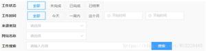
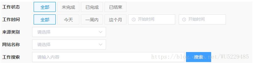
六、 最终案例预览效果
补充知识:vue中component组件使用——模块化开发和全局组件
1、模块化开发组件:
box1.vue文件如下:
<template>
<div class="hello">
<h1>测试</h1>
</div>
</template>
<script>
export default {
}
</script>
box2.vue文件如下:import引入box1.vue,components设置,然后设置成标签使用<box1><template>
<div>
<box1></box1>
</div>
</template>
<script>
import box1 from '@/components/box1'
export default {
components: {'box1': box1},
}
</script>
2、全局组建
<div id="example">
<my-component></my-component>
</div>
// 注册
Vue.component('my-component', {
template: '<div>A custom component!</div>'
})
// 创建根实例
new Vue({
el: '#example'
})
渲染为:
<div id="example">
<div>A custom component!</div>
</div>
以上这篇Vue中component标签解决项目组件化操作就是小编分享给大家的全部内容了,希望能给大家一个参考,也希望大家多多支持。
以上是 Vue中component标签解决项目组件化操作 的全部内容, 来源链接: utcz.com/p/238014.html