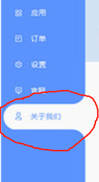
CSS求教这种效果如何实现
回答

<!DOCTYPE html><html>
<head>
<meta charset="UTF-8">
<title>Title</title>
<style>
.menu-list {padding-left:1em;width:200px;color:#FFF;background-color:#369;}
.menu-list .menu {position:relative;line-height:2em;text-align:center;}
.menu-list .menu.active {color:#369;border-top-left-radius:1em;border-bottom-left-radius:1em;background-color:#FFF;}
.menu-list .menu.active:before {content:'\\200B';position:absolute;height:1em;width:1em;right:0;top:-1em;border-bottom-right-radius:1em;box-shadow:1em 1em 0 1em #FFF;}
.menu-list .menu.active:after {content:'\\200B';position:absolute;height:1em;width:1em;right:0;bottom:-1em;border-top-right-radius:1em;box-shadow:1em -1em 0 1em #FFF;}
</style>
</head>
<body>
<div class="menu-list">
<div class="menu">应用</div>
<div class="menu">订单</div>
<div class="menu">设置</div>
<div class="menu active">官网</div>
<div class="menu">关于我们</div>
</div>
</body>
</html>
https://codepen.io/learningcn/pen/MWyqJYe

<!DOCTYPE html><html>
<head>
<meta charset="utf-8">
<title></title>
<style type="text/css">
* { padding: 0; margin: 0; border: 0; font-family: Helvetica, sans-serif; }
aside { background: #5993FD; width: 200px; height: 100vh; }
ul { padding-left: 10px; }
li { list-style: none; position: relative; color: #fff; height: 60px; line-height: 60px; font-size: 24px; box-sizing: border-box; padding: 0 0 0 30px; }
li.active { background: #fff; color: #5993FD; border-radius: 30px 0 0 30px; }
li.active:before,
li.active:after { content: ""; background: #5993FD; width: 30px; height: 30px; position: absolute; right: 0; }
li.active:before { top: -30px; border-radius: 0 0 30px 0; box-shadow: 15px 15px 0 15px #fff; }
li.active:after { bottom: -30px; border-radius: 0 30px 0 0; box-shadow: 15px -15px 0 15px #fff; }
</style>
</head>
<body>
<aside>
<nav>
<ul>
<li>First</li>
<li>Second</li>
<li>Third</li>
<li>Fouth</li>
<li class="active">Fifth</li>
</ul>
</nav>
</aside>
</body>
</html>

<template> <div>
<ul class="ul-wrapper">
<li
@click="(is_active = n)&(top = (n-1) * 48 + 'px')"
class="li-wrapper"
v-for="n in 8" :key="n"
>
<span :class="{'li-active':n===is_active}" class="li-span">xxxxxxx{{n}}</span>
</li>
<li class="li-mask" :style="{top}" />
</ul>
</div>
</template>
<script>
export default {
name: "test",
data() {
return {
is_active: 1,
top: 0
}
} }</script>
<style scoped>
.ul-wrapper {
list-style: none;
margin: 0;
padding: 0;
position: relative;
width: max-content;
overflow: hidden;
}
.li-wrapper {
width: 200px;
position: relative;
display: flex;
justify-content: center;
align-items: center;
height: 48px;
list-style: none;
color: #FFFFFF;
box-sizing: border-box;
background: #7436E6;
text-decoration: none;
cursor: pointer;
} .li-span{
position: relative;
z-index: 2;
transition: all .5s .25s ease-in-out; /* 延时动画 */ }
.li-active {
color: #7436E6 !important;
}
.li-mask {
position: absolute;
z-index: 1;
margin-left: 10%;
width: 90%;
height: 48px;
transition: all .5s ease-in-out;
border-top-left-radius: 20px;
border-bottom-left-radius: 20px;
background: #FFFFFF;
} .li-mask::before{
content:'';
position:absolute;
height:1em;
width:1em;
right:0;
top:-1em;
border-bottom-right-radius:1em;
box-shadow:1em 1em 0 1em #FFF;
} .li-mask::after{
content:'';
position:absolute;
height:1em;
width:1em;
right:0;
bottom:-1em;
border-top-right-radius:1em;
box-shadow:1em -1em 0 1em #FFF;
}</style>
border-top-left-radius
border-top-right-radius
border-bottom-left-radius
border-bottom-right-radius
参考下,可以满足你的问题
https://segmentfault.com/q/10...
以上是 CSS求教这种效果如何实现 的全部内容, 来源链接: utcz.com/a/43872.html