手把手教你玩转echarts(二)-折线图
前言
哈喽,everybody,我又来了。话不多说,这次给大家带来的是echarts系列之折线图,满满的干货。一个小实例让你对echarts折线图不再陌生!
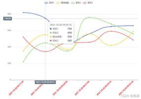
剖析你的心
啊呸,错了,是剖析设计图。心有啥好剖析的🙄
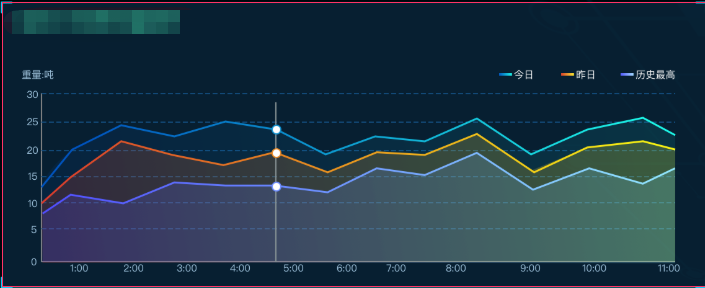
简简单单的设计图,那让我们来分析一下折线图的细节在哪里:
- 图例。今日、昨日、历史最高。位置在左侧。图标颜色为渐变色,高度大致2px。
- Y坐标轴。字体大致为10px,紧贴坐标轴线。
- X坐标轴最小值不显示。
- 折线图为区域显示,并显示渐变色从左至右。
- 折现同样为渐变色,从左至右。
- 分割线为虚线且有颜色。
绘制图形
基础的图形生成我就不再复述了,不会的同学可以看我的系列第一篇手把手教你玩转Echarts(一),这里我就继续讲配置了。
图例
legend: {right: "3%",
top: "5%",
textStyle: {
color: colors[3],
fontSize: 8
},
itemWidth: 15, // 图例标记的图形宽度
itemHeight: 3, // 图例标记的图形高度
icon: "rect", // 图例形状为方形
data: ["今日", "昨日", "历史最高"] // 图例的数据数组
},
Y坐标轴
yAxis: [{
type: "value",
axisLine: { // 坐标轴线的配置
show: false,
lineStyle: { // 轴线样式
color: colors[3]
}
},
splitLine: { // y轴分割线配置
show: true,
lineStyle: { // 分割线样式
type: 'dashed', // 虚线
color: '#1e47697d'
}
},
axisTick: { // 轴线上的刻度线配置
show: false
},
axisLabel: {
fontSize: 8,
formatter: v => {
return v >= 1000 ? v / 1000 + "k" : v;
}
}
}
],
稍微说下axisLabel.formatter,其实这里很灵活,支持字符串模板和回调函数两种形式,可以是string或者Function.其实是对刻度值的一个格式化。官方例子在这里
X坐标轴
xAxis: [{
type: "category",
boundaryGap: false,
axisLine: {
lineStyle: {
color: colors[3]
}
},
axisLabel: { // 坐标轴刻度设置
fontSize: 8,
margin: 4, // 距离坐标轴的距离
},
axisTick: { // 是否显示刻度
show: false
},
data: [] // 数据数组,可以异步获取赋值
}
],
渐变色
- 先引入echarts
import echarts from"echarts";- 定义色彩数组,也就是取色盘。
const colors = [new echarts.graphic.LinearGradient(0, 0, 1, 0, [
// 四个位置依次为左、下、右、上, 为逆时针。所以这里为横向渐变
{
offset: 0,
color: "#504DFF"
},
{
offset: 1,
color: "#91E6FF"
}
]),
"#A2C6E0",
"#1e47697d"
];
- 配置
series
// ...series: [
{
name: "今日", // 系列名称,用于tooltip的显示, 与legend的data是相对应的
type: "line", // 类型,是折线还是柱子还是其他的
// stack: "总量", // 是否显示图形堆叠
color: colors[0], // 这里是指对应折线`line`的颜色
areaStyle: {
opacity: ".3",
color: colors[0] // 一个颜色数组中的某个值
},
symbol: "none", // 标记的图形
smooth: false, // 是否平滑曲线显示
data: [120, 132, 101, 134, 90, 230, 210] // 对应x轴上的value值
},
// ...
]
完整配置
exportdefault {inject: ['queryD'],
data() {
return {
option: {...option},
timer: null
};
},
mounted() {
this.initChart();
this.getVolumn();
window.addEventListener("resize", this.initChart);
this.timer = setInterval(this.getVolumn, this.$store.state.demo.time)
},
methods: {
initChart() {
let myChart = echarts.init(document.getElementById("hourTrend"));
myChart.setOption(this.option);
myChart.resize();
},
async getVolumn() {
try {
const res = awaitthis.$axios.post("/api/weightHourInfo", JSON.parse(this.queryD));
// 这段代码如果有可优化的地方,请告知。反正我也不会承认自己菜的! 🤭
if (res.data && res.data.data) {
const arr = res.data.data;
this.option.xAxis[0].data = [];
this.option.series[0].data = [];
this.option.series[1].data = [];
this.option.series[2].data = [];
arr.forEach(el => {
this.option.xAxis[0].data.push(el.hour);
this.option.series[0].data.push(el.chargeableWeight);
this.option.series[1].data.push(el.chargeableWeightYest);
this.option.series[2].data.push(el.chargeableWeight9);
});
this.initChart();
}
} finally {
}
}
},
destroyed() {
window.removeEventListener("resize", this.initChart);
clearInterval(this.timer)
}
};
小结
这里不清楚大家是否有仔细看里面的配置,其实都有很多的相似点,比如:
x轴、y轴都可以设置name、axisLine、axisLabel、axisTick、color等等,这些都是有规律可循的,然后根据不同的类型在series设置不同的个性化配置。
写在最后
文笔垃圾,也没有觉得自己很厉害。都是基础的文章,写给自己的,也给一些么有接触过的同学一点方向。当然,还是那句废话“如果对你有用的话,记得给小仙女点个赞哟”♥

如果不给我点赞,那就给个机会,一起去爬山吧,好吗?毕竟挺急的,在线等~
以上是 手把手教你玩转echarts(二)-折线图 的全部内容, 来源链接: utcz.com/a/30312.html