iview render实现Poptip嵌套复杂内容
方法一:直接用render函数写,这样层次不太分明,而且我不太清楚点击取消后怎么关闭框,有谁知道可以告诉我吗?
render: (h, params) => {
return h('div', [ h('Poptip', {
props: {
placement:'left-start',
},
},[
h('Button', {
props: {
type: 'primary',
size: 'small'
},
on: {
click: () => {
//this.remove(params.index)
}
}
}, '移动'),
h('div', {
slot: 'content',
'class': 'api',
style:{
textAlign: 'center'
}
},[
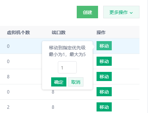
h('p','移动到指定优先级'),
h('p','最小为1,最大为5'),
h('InputNumber',{
props:{
value:'1'
},
style:{
width:'50px',
marginBottom: '10px',
marginTop: '10px',
}
}),
h('br'),
h('Button', {
style:{
marginRight: '5px'
},
props: {
type: 'primary',
size: 'small'
},
on: {
click: (e) => {
e.stopPropagation();
//this.remove(params.index)
}
}
}, '确定'),
h('Button', {
props: {
type: 'default',
size: 'small'
},
on: {
click: (e) => {
e.stopPropagation();
//this.remove(params.index)
}
}
}, '取消'),
]),
]),
])
}
方法二:组件引入
test.vue
<template> <Poptip v-model="visible" placement="left-start">
<Button type="primary">移动</Button>
<div class="api" slot="content">
<div style="text-align: center;">
<div>移动到指定优先级</div>
<div>最小为1,最大为5</div>
<div style="margin: 10px 0;">
<InputNumber v-model="value" style="width: 50px" />
</div>
<Button type="primary" size="small" @click.stop="ok">确定</Button>
<Button type="default" size="small" @click.stop="cancel">取消</Button>
</div>
</div>
</Poptip>
</template>
<script>
export default {
name: "test",
data(){
return{
value:1,
visible: false
}
},
methods:{
ok(){
},
cancel(){
this.visible = false;
}
}
}
</script>
需要的文件里引入
import test from './test';render: (h, params) => { return h(test, {
style: { // 定义组件样式
cursor: 'pointer'
},
})
}
以上是 iview render实现Poptip嵌套复杂内容 的全部内容, 来源链接: utcz.com/a/14546.html