bootstrap响应式表格实例详解
Bootstrap 的响应式 CSS 能够自适应于台式机、平板电脑和手机,现在就bootstrap的响应式举一个例子:
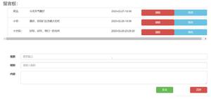
如上图所示,要实现该表格在手机等移动端上只显示代号、名称、和价格,其他以查看详情的方式显示(也就是下图:)
首先,先实现在移动端能由左图到右图的转换:
代码如下:
<meta charset="UTF-8">
<title></title>
<!--引入bootstrap的css文件-->
<link type="text/css" rel="stylesheet" href="../bootstrap-3.3.7-dist/css/bootstrap.min.css" rel="external nofollow" >
<!--引入js包-->
<!--引入bootstrap的js文件-->
query($sql);
foreach($arr as $v){
echo "
";
//为什么id='xq'不行?不要用id,id是唯一的,此处有多个查看详情。。。。记住了!!!!
}
?>
<table class="table table-striped">
<thead>
<tr>
<th>代号</th>
<th>名称</th>
<th>价格</th>
<th class="hidden-xs">产地</th> <!-- class="hidden-xs" 目的是在手机上不显示这一列-->
<th class="hidden-xs">库存</th>
<th class="hidden-xs">数量</th>
<th class="visible-xs-block">操作</th>
</tr>
</thead>
<tbody>
<!--?php
require "../DB.class.php";
$db = new DB();
$sql = "select * from buyfruits";
$arr = $db---><tr>
<td>{$v[0]}</td>
<td>{$v[1]}</td>
<td>{$v[2]}</td>
<td class="hidden-xs">{$v[3]}</td>
<td class="hidden-xs">{$v[4]}</td>
<td class="hidden-xs">{$v[5]}</td>
<td class="visible-xs-block">
<button type="button" class="btn btn-primary btn-sm xq" code="{$v[0]}" id="xq">查看详情</button>
</td>
</tr></tbody>
</table>
其次:实现点击查看详情出现模态框
<!-- 引用模态框(Modal),可以放在任何地方 -->
<div class="modal fade" id="myModal" tabindex="-1" role="dialog" aria-labelledby="myModalLabel" aria-hidden="true">
<div class="modal-dialog">
<div class="modal-content">
<div class="modal-header">
<button type="button" class="close" data-dismiss="modal" aria-hidden="true">×</button>
<h4 class="modal-title" id="myModalLabel">水果信息</h4>
</div>
<div class="modal-body nr" id="neirong"></div>
<div class="modal-footer">
<button type="button" class="btn btn-default" data-dismiss="modal">关闭</button>
</div>
</div><!-- /.modal-content -->
</div><!-- /.modal -->
</div>
<script type="text/javascript">
$(".xq").click(function(){
var code = $(this).attr("code"); //取属性值
$.ajax({
url:"chuli.php",
data:{code:code},
type:"POST",
dataType:"TEXT",
success:function(data){
var lie = data.trim().split("^");
var str="<div>代号:"+lie[0]+"</div><div>名称:"+lie[1]+"</div><div>价格:"+lie[2]+"</div><div>产地:"+lie[3]+"</div><div>库存:"+lie[4]+"</div><div>数量:"+lie[5]+"</div>";
$("#neirong").html(str);
// $("#mymodal").modal("show"); 双引号不行!!!
//触发模态框
$('#myModal').modal('show');
}
});
})
</script>
处理页面:chuli.php
<?php
$code=$_POST["code"];
require "../DB.class.php";
$db=new DB();
$sql = "select * from buyfruits where ids='{$code}'";
$arr = $db->strquery($sql);
echo $arr;
?>
以上是 bootstrap响应式表格实例详解 的全部内容, 来源链接: utcz.com/z/344785.html