请问python应该如何画这种图?
就是这种形式的图,我现在有几组数据A、B、C,每组数据有两个中心点core1和core2,中心点core1对应一组置信区间的上界up1和下界down1,中心点core2有一组置信区间的上界up2和下界down2。
也就是说,数据长这样:
A:core1, up1, down1, core2, up2, down2
B:core1, up1, down1, core2, up2, down2
C:core1, up1, down1, core2, up2, down2
然后我想要画成种图,就用一张图表示,不用两个子图,应该如何画呢?

回答:
https://matplotlib.net/stable/gallery/statistics/errorbar_lim...
https://matplotlib.net/stable/gallery/statistics/errorbar_fea...
在示例里挑个类似的. 实在不行, 就自己用 matplot 的 Line 对象往figure上加元素.plt.subplots(1, 2) 这是一个一行2列的图
回答:
研究了一上午弄出来了,绘图结果如下: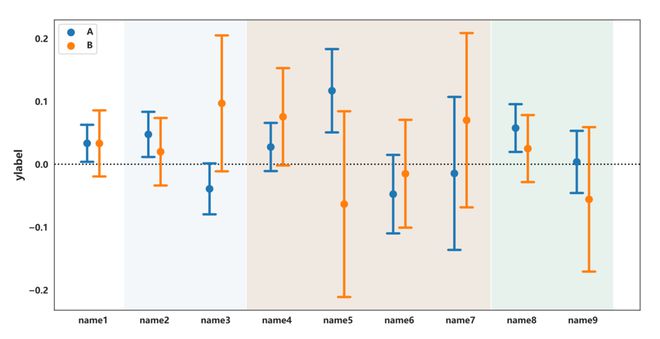
表格数据如下: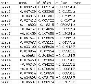
绘画的代码如下,我懒得整理了,所以比较凌乱,看看就好
import seaborn as snsimport matplotlib.pyplot as plt
import matplotlib as mpl
mpl.rc("font",family='MicroSoft YaHei',weight="bold")
def draw_errorbar(ax):
capsize = .2
at_group = np.array([0, 1, 2, 3, 4, 5, 6, 7, 8])
mew = 2.0250000000000004
markersize = 45.80442088933919
kws = {'lw': 2.7}
confint = confints1.to_numpy()
colors=[(0.12156862745098039, 0.4666666666666667, 0.7058823529411765)] * 9
for at, (ci_low, ci_high), color in zip(at_group,
confint,
colors):
ax.plot([at, at], [ci_low, ci_high], color=color, **kws)
ax.plot([at - capsize / 2, at + capsize / 2],
[ci_low, ci_low], color=color, **kws)
ax.plot([at - capsize / 2, at + capsize / 2],
[ci_high, ci_high], color=color, **kws)
ax.scatter(at_group, df['cent'][:9], linewidth=mew, marker='o', s=markersize, label='A')
offset = 0.2
at_group = at_group + offset
confint = confints2.to_numpy()
colors=[(1.0, 0.4980392156862745, 0.054901960784313725)] * 9
for at, (ci_low, ci_high), color in zip(at_group,
confint,
colors):
ax.plot([at, at], [ci_low, ci_high], color=color, **kws)
ax.plot([at - capsize / 2, at + capsize / 2],
[ci_low, ci_low], color=color, **kws)
ax.plot([at - capsize / 2, at + capsize / 2],
[ci_high, ci_high], color=color, **kws)
ax.scatter(at_group, df['cent'][9:], linewidth=mew, marker='o', s=markersize, label='B')
ax.set_ylabel('ylabel', fontdict={'fontsize': 12, 'font': 'MicroSoft YaHei'})
ax.set_xticks(np.arange(9) + offset / 2)
ax.set_xticklabels(df['name'][:9])
ax.legend(loc='best', title='')
ax.axvspan(0.6, 2.6, facecolor='#F3F7FA', zorder=0)
ax.axvspan(2.6, 6.6, facecolor='#F0E9E1', zorder=0)
ax.axvspan(6.6, 8.6, facecolor='#E7F2EC', zorder=0)
ax.axhline(0, color='#000', linestyle=':', zorder=0)
plt.figure(figsize=(12, 6))
ax = plt.gca()
draw_errorbar(ax)
plt.savefig('t.pdf')
以上是 请问python应该如何画这种图? 的全部内容, 来源链接: utcz.com/p/938791.html