子容器的宽度,为什么没有把父级容器撑开
有一个布局,整个页面的宽度,随着某一个子级div的宽度的最大值,定位这个页面的最大宽度,父级的div的宽度一直是屏幕的宽度,而不是子级的实际宽度!不会布局了!请教。。。。
<!DOCTYPE html><html lang="en">
<head>
<meta charset="UTF-8" />
<meta http-equiv="X-UA-Compatible" content="IE=edge" />
<meta name="viewport" content="width=device-width, initial-scale=1.0" />
<title>Document</title>
<style>
* {
margin: 0;
padding: 0;
box-sizing: border-box;
}
body {
background-color: #f5f5f5;
}
.box {
width: 100%;
height: 100vh;
overflow: hidden;
background-color: #f5f5f5;
}
.container {
width: 100%;
height: 100%;
overflow: auto;
}
.header {
background-color: #fff;
height: 46px;
display: flex;
justify-content: space-between;
align-items: center;
padding: 0 18px;
border-bottom: 1px solid #eaeaea;
position: relative;
}
h3 {
color: #323232;
}
.lay {
background-color: #ffc;
}
.content {
width: auto;
white-space: nowrap;
}
.content span {
display: inline-block;
width: 180px;
min-height: 200px;
border-right: 1px solid #ccc;
}
</style>
</head>
<body>
<div class="box">
<div class="container">
<div class="lay">
<div class="header">
<h3>标题位置</h3>
<span>其余</span>
</div>
<div class="content">
<span>111</span>
<span>222</span>
<span>333</span>
<span>444</span>
<span>555</span>
<span>666</span>
<span>777</span>
<span>888</span>
<span>999</span>
<span>101010</span>
</div>
</div>
</div>
</div>
</body>
</html>
其中一个图为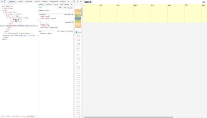
还有一个是这样的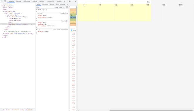
其中.content的宽度为什么没有被撑开
我所希望得到的结果是.content, .lay, .container都是子级的宽度!纯css如何实现
回答:

这样么
以上是 子容器的宽度,为什么没有把父级容器撑开 的全部内容, 来源链接: utcz.com/p/935799.html