除了自己写个样式用定位的方法,有没有直接用边框设置成这种效果?

回答:
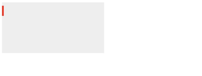
用渐变吧
.card{ width: 300px;
height: 150px;
background: linear-gradient(red,red) 0 10px/5px 30px no-repeat #eee;
}
下面是一个 demo
https://codepen.io/xboxyan/pe...
回答:
使用伪元素。
<!DOCTYPE html><html lang="en">
<head>
<meta charset="UTF-8">
<meta http-equiv="X-UA-Compatible" content="IE=edge">
<meta name="viewport" content="width=device-width, initial-scale=1.0">
<title>Document</title>
</head>
<style>
.box {
width: 200px;
height: 100px;
background: red;
}
.box::before {
content: " ";
width: 5px;
height: 40px;
border-radius: 10px;
position: relative;
top: 25px;
display: block;
background: yellow;
}
</style>
<body>
<div class="box">
</div>
</body>
</html>
以上是 除了自己写个样式用定位的方法,有没有直接用边框设置成这种效果? 的全部内容, 来源链接: utcz.com/p/933215.html