
想通过dataset方式设置echarts图形,怎么也无法展示正确结果?
vue 2.7、echarts 5.4、vue-echarts 6.2.3
预期结果: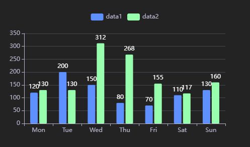
实际结果:
但是把代码option复制到https://echarts.apache.org/examples/zh/editor.html?c=bar-tick-align 却能正常展示,服了啊。
代码如下:
<template> <div style="width: 500px; height: 300px;">
<v-chart ref="chartRef" :option="option" autoresize />
</div>
</template>
<script>
import { use } from "echarts/core";
import { CanvasRenderer } from "echarts/renderers";
import { BarChart, PieChart } from "echarts/charts";
import { TitleComponent, GridComponent, TooltipComponent, LegendComponent } from "echarts/components";
import VChart, { THEME_KEY } from "vue-echarts";
use([
CanvasRenderer,
BarChart,
PieChart,
GridComponent,
TitleComponent,
TooltipComponent,
LegendComponent
]);
export default {
components: {
VChart
},
data() {
return {
option: {
backgroundColor: "rgba(0,0,0,0)",
title: {
text: '用例数据'
},
legend: {
show: true,
top: "5%",
textStyle: { color: "#B9B8CE" }
},
"grid": {
"show": false,
"left": "10%",
"top": "60",
"right": "10%",
"bottom": "60"
},
"tooltip": {
"show": true,
"trigger": "axis",
"axisPointer": { "show": true, "type": "shadow" }
},
"xAxis": {
"show": true,
"name": "",
"nameGap": 15,
"nameTextStyle": { "color": "#B9B8CE", "fontSize": 12 },
"inverse": false,
"axisLabel": {
"show": true,
"fontSize": 12,
"color": "#B9B8CE",
"rotate": 0
},
"position": "bottom",
"axisLine": {
"show": true,
"lineStyle": { "color": "#B9B8CE", "width": 1 },
"onZero": true
},
"axisTick": { "show": true, "length": 5 },
"splitLine": {
"show": false,
"lineStyle": { "color": "#484753", "width": 1, "type": "solid" }
},
"type": "category"
},
"yAxis": {
"show": true,
"name": "",
"nameGap": 15,
"nameTextStyle": { "color": "#B9B8CE", "fontSize": 12 },
"inverse": false,
"axisLabel": {
"show": true,
"fontSize": 12,
"color": "#B9B8CE",
"rotate": 0
},
"position": "left",
"axisLine": {
"show": true,
"lineStyle": { "color": "#B9B8CE", "width": 1 },
"onZero": true
},
"axisTick": { "show": true, "length": 5 },
"splitLine": {
"show": true,
"lineStyle": { "color": "#484753", "width": 1, "type": "solid" }
},
"type": "value"
},
//用 dataset 方式,无法正确展示图形
"dataset": {
"dimensions": ["product", "data1", "data2"],
"source": [
{ "product": "Mon", "data1": 120, "data2": 130 },
{ "product": "Tue", "data1": 200, "data2": 130 },
{ "product": "Wed", "data1": 150, "data2": 312 },
{ "product": "Thu", "data1": 80, "data2": 268 },
{ "product": "Fri", "data1": 70, "data2": 155 },
{ "product": "Sat", "data1": 110, "data2": 117 },
{ "product": "Sun", "data1": 130, "data2": 160 }
]
},
"series": [
{
"type": "bar",
"barWidth": 15,
"label": {
"show": true,
"position": "top",
"color": "#fff",
"fontSize": 12
},
"itemStyle": { "color": null, "borderRadius": 2 },
},
{
"type": "bar",
"barWidth": 15,
"label": {
"show": true,
"position": "top",
"color": "#fff",
"fontSize": 12
},
"itemStyle": { "color": null, "borderRadius": 2 },
}
],
}
}
}
}
</script>
回答:
import * as echarts from 'echarts/core';import {
DatasetComponent,
TitleComponent,
TooltipComponent,
GridComponent,
LegendComponent
} from 'echarts/components';
import { BarChart } from 'echarts/charts';
import { CanvasRenderer } from 'echarts/renderers';
echarts.use([
DatasetComponent,
TitleComponent,
TooltipComponent,
GridComponent,
LegendComponent,
BarChart,
CanvasRenderer
]);
以上是 想通过dataset方式设置echarts图形,怎么也无法展示正确结果? 的全部内容, 来源链接: utcz.com/p/933113.html

