Android MaterialCardView的使用介绍与示例
Android—MaterialCardView的使用

我们的征程是星辰大海,而非人间烟尘
文章目录 Android---MaterialCardView的使用演示xml布局其他的属性
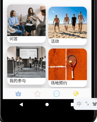
演示
xml布局
<com.google.android.material.card.MaterialCardView
android:id="@+id/materialCardView2"
android:layout_width="170dp"
android:layout_height="170dp"
android:layout_marginLeft="20dp"
android:layout_marginTop="20dp"
android:clickable="true" // 是否可点击
app:cardCornerRadius="20dp" // 圆角半径
app:cardElevation="20dp" // 阴影范围
app:layout_constraintStart_toStartOf="parent"
app:layout_constraintTop_toBottomOf="@+id/banner"
app:rippleColor="#A8C0EC" // 点击阴影特效的颜色
app:state_dragged="true">
<ImageView
android:layout_width="match_parent"
android:layout_height="140dp"
android:scaleType="centerCrop"
android:src="@drawable/quesans" />
<TextView
android:layout_width="match_parent"
android:layout_height="30dp"
android:layout_marginLeft="10dp"
android:layout_marginTop="140dp"
android:text="问答"
android:textColor="@color/black"
android:textFontWeight="@android:integer/config_mediumAnimTime"
android:textSize="18sp" />
</com.google.android.material.card.MaterialCardView>
其他的属性
| 特征 | 相关属性 |
|---|---|
| Border | app:strokeColor app:strokeWidth |
| Checkable | android:checkable |
| Checked Icon | app:checkedIcon app:checkedIconTint |
| Foreground Color | app:cardForegroundColor |
| Ripple Color | app:rippleColor |
当然你还可以在Java/Kotlin代码中使用一些方法:
void setCheckable (boolean checkable)//设置是否可以选择
void setChecked (boolean checked)//选中的状态
void setCheckedIcon (Drawable checkedIcon)//选中图标的样式
void setCheckedIconResource (int id)//选中图标的样式
void setDragged (boolean dragged)//是否可拖动
void setRippleColor (ColorStateList rippleColor)//波纹效果的颜色
void setStrokeColor (int strokeColor)//卡片边的颜色
void setStrokeWidth (int strokeWidth)//卡片边的宽带
void toggle ()//控制checkable的开关
到此这篇关于Android MaterialCardView的使用介绍与示例 的文章就介绍到这了,更多相关Android MaterialCardView内容请搜索以前的文章或继续浏览下面的相关文章希望大家以后多多支持!
以上是 Android MaterialCardView的使用介绍与示例 的全部内容, 来源链接: utcz.com/p/244093.html