Android自定义分段式进度条
安卓自定义分段式的进度条,供大家参考,具体内容如下
前一段时间公司新项目接到一个新需求,其中界面需要用到一个分段式的进度条,找了半天没有发现类似的控件,于是决定自己写一个,话不多说,上代码
package com.djt.aienglish.widget;
import android.content.Context;
import android.content.res.TypedArray;
import android.graphics.Canvas;
import android.graphics.Color;
import android.graphics.Paint;
import android.os.Build;
import android.util.AttributeSet;
import android.util.TypedValue;
import android.view.View;
import androidx.annotation.Nullable;
import androidx.annotation.RequiresApi;
import com.djt.aienglish.R;
/**
* 分段式进度条
*
* @author qiu
* @date 2021/3/2 14:34
*/
public class SegmentProgressBar extends View {
/**
* 设置各种默认值
*/
private static final int DEFAULT_HEIGHT_PROGRESS_BAR = 10;
/**
* 进度条圆角
*/
private static final float mRadius = 60;
/**
* 背景色
*/
private int defaultBackgroundColor = Color.parseColor("#DDE4F4");
/**
* 进度条颜色
*/
private int defaultProgressBarColor = Color.parseColor("#3D7EFE");
/**
* 所有画图所用的画笔
*/
protected Paint mPaint = new Paint();
/**
* 进度条间距
*/
protected float mOffset = 0;
protected float mDefaultOffset = 10;
/**
* 进度条高度
*/
protected int mProgressBarHeight = dp2px(DEFAULT_HEIGHT_PROGRESS_BAR);
/**
* 除padding外的视图宽度
*/
protected float mRealWidth;
/**
* 最大值
*/
private int mMax = 100;
/**
* 当前进度
*/
private int mProgress = 0;
/**
* 分段宽度
*/
private float progressWith = 0;
public SegmentProgressBar(Context context) {
this(context, null);
}
public SegmentProgressBar(Context context, @Nullable AttributeSet attrs) {
this(context, attrs, 0);
}
public SegmentProgressBar(Context context, @Nullable AttributeSet attrs, int defStyleAttr) {
super(context, attrs, defStyleAttr);
initDefaultValues(context, attrs, defStyleAttr);
init();
}
@RequiresApi(api = Build.VERSION_CODES.LOLLIPOP)
public SegmentProgressBar(Context context, @Nullable AttributeSet attrs, int defStyleAttr, int defStyleRes) {
super(context, attrs, defStyleAttr, defStyleRes);
initDefaultValues(context, attrs, defStyleAttr);
init();
}
/**
* 初始化布局
*
* @param context
* @param attrs
* @param defStyleAttr
*/
private void initDefaultValues(Context context, @Nullable AttributeSet attrs, int defStyleAttr) {
TypedArray arr =
context.obtainStyledAttributes(attrs, R.styleable.ProgressBar, defStyleAttr, defStyleAttr);
if (arr != null) {
mProgress = arr.getInt(R.styleable.ProgressBar_progress, 0);
mMax = arr.getInt(R.styleable.ProgressBar_max, 0);
defaultBackgroundColor = arr.getColor(R.styleable.ProgressBar_progressBackground, Color.parseColor("#DDE4F4"));
defaultProgressBarColor = arr.getColor(R.styleable.ProgressBar_progressBarColor, Color.parseColor("#3D7EFE"));
}
arr.recycle();
}
/**
* 初始化布局
*/
private void init() {
}
/**
* 最大值
*
* @param max
*/
public void setMax(int max) {
this.mMax = max;
if (max > 0) {
mOffset = mRealWidth / mMax / 8;
if (mOffset > mDefaultOffset) {
mOffset = mDefaultOffset;
}
progressWith = (mRealWidth - (mMax - 1) * mOffset) / mMax;
}
invalidate();
}
/**
* 进度值
*
* @param progress
*/
public void setProgress(int progress) {
this.mProgress = progress;
invalidate();
}
@Override
protected synchronized void onMeasure(int widthMeasureSpec, int heightMeasureSpec) {
super.onMeasure(widthMeasureSpec, heightMeasureSpec);
int width = MeasureSpec.getSize(widthMeasureSpec);
//高度
int height = measureHeight(heightMeasureSpec);
//必须调用该方法来存储View经过测量的到的宽度和高度
setMeasuredDimension(width, height);
//真正的宽度值是减去左右padding
mRealWidth = getMeasuredWidth() - getPaddingRight() - getPaddingLeft();
//使用画笔在画布上绘制进度
if (mMax > 0) {
mOffset = mRealWidth / mMax / 8;
if (mOffset > mDefaultOffset) {
mOffset = mDefaultOffset;
}
progressWith = (mRealWidth - (mMax - 1) * mOffset) / mMax;
}
}
@Override
protected void onSizeChanged(int w, int h, int oldw, int oldh) {
super.onSizeChanged(w, h, oldw, oldh);
//真正的宽度值是减去左右padding
mRealWidth = w - getPaddingRight() - getPaddingLeft();
//使用画笔在画布上绘制进度
if (mMax > 0) {
mOffset = mRealWidth / mMax / 8;
if (mOffset > mDefaultOffset) {
mOffset = mDefaultOffset;
}
progressWith = (mRealWidth - (mMax - 1) * mOffset) / mMax;
}
invalidate();
}
/**
* EXACTLY:父控件告诉我们子控件了一个确定的大小,你就按这个大小来布局。比如我们指定了确定的dp值和macth_parent的情况。
* AT_MOST:当前控件不能超过一个固定的最大值,一般是wrap_content的情况。
* UNSPECIFIED:当前控件没有限制,要多大就有多大,这种情况很少出现。
*
* @param measureSpec
* @return 视图的高度
*/
private int measureHeight(int measureSpec) {
int result = 0;
//父布局告诉我们控件的类型
int specMode = MeasureSpec.getMode(measureSpec);
//父布局传过来的视图大小
int specSize = MeasureSpec.getSize(measureSpec);
if (specMode == MeasureSpec.EXACTLY) {
result = specSize;
} else {
result = (int) (getPaddingTop() + getPaddingBottom() + mProgressBarHeight);
if (specMode == MeasureSpec.AT_MOST) {
result = Math.min(result, specSize);
}
}
return result;
}
@RequiresApi(api = Build.VERSION_CODES.LOLLIPOP)
@Override
protected synchronized void onDraw(Canvas canvas) {
super.onDraw(canvas);
mPaint.setColor(defaultBackgroundColor);
//设置画笔类型
mPaint.setStyle(Paint.Style.FILL);
//去除锯齿
mPaint.setAntiAlias(true);
//使用画笔在画布上绘制背景
canvas.drawRoundRect(0, 0, mRealWidth, getHeight(), mRadius, mRadius, mPaint);
//绘制进度条
mPaint.setColor(defaultProgressBarColor);
for (int i = 0; i < mProgress; i++) {
canvas.drawRoundRect(i * (progressWith + mOffset), 0, progressWith + i * (progressWith + mOffset), getHeight(), mRadius, mRadius, mPaint);
}
}
/**
* dp 2 px
*
* @param dpVal
*/
protected int dp2px(int dpVal) {
return (int) TypedValue.applyDimension(TypedValue.COMPLEX_UNIT_DIP,
dpVal, getResources().getDisplayMetrics());
}
}
别忘了在value下的attr.xml加上默认属性配置
<!--分段式进度条-->
<declare-styleable name="ProgressBar">
<attr name="progress" format="integer" />
<attr name="max" format="integer" />
<attr name="progressBarColor" format="color" />
<attr name="progressBackground" format="color" />
</declare-styleable>
在布局中使用
<com.djt.aienglish.widget.SegmentProgressBar
android:id="@+id/spb"
android:layout_width="0dp"
android:layout_height="wrap_content"
android:layout_weight="1"
app:max="10"
app:progress="1" />
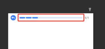
最后再来一个实际使用效果。
以上就是本文的全部内容,希望对大家的学习有所帮助,也希望大家多多支持。
以上是 Android自定义分段式进度条 的全部内容, 来源链接: utcz.com/p/243436.html