Android实现图片加载进度提示
本文实例为大家分享了Android实现图片加载进度提示的具体代码,供大家参考,具体内容如下
先上图:
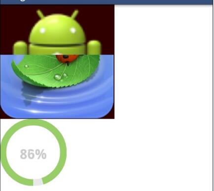
实现原理:
第一个控件的实现原理是重写ImageView的onDraw()方法,利用Canvas的clipRect()方法控制图片的显示区域,主键扩大图片的显示区域,从而实现逐渐增加的效果
关键代码:
public class LoadingImageView extends ImageView {
/*** 背景图片 */
private Drawable bgDrawable;
/**前景图片*/
private Drawable fgDrawable;
/**是否显示加载进度条*/
private boolean isShowProgress;
private Resources rsc;
private int progress;
private int progressHeight;
private int progressLeft;
private int progressTop;
private int progressRight;
private int progressBottom;
public LoadingImageView(Context context) {
this(context,null);
}
public LoadingImageView(Context context, AttributeSet attrs) {
this(context, attrs,0);
}
public LoadingImageView(Context context, AttributeSet attrs, int defStyle) {
super(context, attrs, defStyle);
rsc = getResources();
}
@Override
protected void onMeasure(int widthMeasureSpec, int heightMeasureSpec) {
super.onMeasure(widthMeasureSpec, heightMeasureSpec);
if(bgDrawable==null){
return;
}
progressLeft = getMeasuredWidth()/2-(fgDrawable.getIntrinsicWidth()/2);
progressTop = getMeasuredHeight()/2-(fgDrawable.getIntrinsicHeight()/2);
progressRight = getMeasuredWidth()/2+(fgDrawable.getIntrinsicWidth()/2);
progressBottom = getMeasuredHeight()/2+(fgDrawable.getIntrinsicHeight()/2);
}
@Override
public boolean onTouchEvent(MotionEvent event) {
return super.onTouchEvent(event);
}
/**
* 设置背景图片
* @param drawableRes
*/
public void setBgDrawableRes(int drawableRes){
bgDrawable = rsc.getDrawable(drawableRes);
invalidate();
}
public void setFgDrawableRes(int drawableRes){
fgDrawable = rsc.getDrawable(drawableRes);
invalidate();
}
public void setProgress(int progress,boolean flag) {
isShowProgress = flag;
if(progress>=0&progress<=100){
this.progress = progress;
invalidate();
}
}
@Override
protected void onDraw(Canvas canvas) {
if(bgDrawable!=null){
bgDrawable.setBounds(progressLeft, progressTop, progressRight, progressBottom);
bgDrawable.draw(canvas);
}
super.onDraw(canvas);
if(bgDrawable!=null&&isShowProgress){
bgDrawable.setBounds(progressLeft, progressTop, progressRight, progressBottom);
bgDrawable.draw(canvas);
}
if(fgDrawable!=null&&isShowProgress){
//根据进度计算图片显示的高的比
progressHeight = fgDrawable.getIntrinsicHeight()*progress/100;
//关键代码,设置图片的显示区域
canvas.clipRect(progressLeft,progressBottom-progressHeight,progressRight,progressBottom);
fgDrawable.setBounds(progressLeft, progressTop, progressRight, progressBottom);
fgDrawable.draw(canvas);
}
}
}
第二个圆形加载进度的原理其实也很简单,就是画弧线,不断增加弧线的角度,实现改变进度的功能
关键代码:
public class LoadingCircleView extends View {
private final Paint paint;
private final Context context;
private Resources res;
private int progress;
private int ringWidth;
//圆环的颜色
private int ringColor;
//进度条颜色
private int progressColor;
//字体颜色
private int textColor;
//字的大小
private int textSize;
private String textProgress;
public LoadingCircleView(Context context, AttributeSet attrs, int defStyle) {
super(context, attrs, defStyle);
this.context = context;
this.paint = new Paint();
this.res = context.getResources();
this.paint.setAntiAlias(true); //消除锯齿
this.ringWidth = dip2px(context, 10); //设置圆环宽度
this.ringColor = Color.rgb(233, 233, 233);
this.progressColor = Color.rgb(146, 206, 108);
this.textColor = Color.rgb(203, 203, 203);
this.textSize = 30;
}
public LoadingCircleView(Context context, AttributeSet attrs) {
this(context, attrs,0);
}
public LoadingCircleView(Context context) {
this(context,null);
}
/**
* 设置加载进度,取值范围在0~100之间
* @param progress
*/
public void setProgress(int progress) {
if(progress>=0&&progress<=100){
this.progress = progress;
invalidate();
}
}
/**
* 设置圆环背景色
* @param ringColor
*/
public void setRingColor(int ringColor) {
this.ringColor = res.getColor(ringColor);
}
/**
* 设置进度条颜色
* @param progressColor
*/
public void setProgressColor(int progressColor) {
this.progressColor = res.getColor(progressColor);
}
/**
* 设置字体颜色
* @param textColor
*/
public void setTextColor(int textColor) {
this.textColor = res.getColor(textColor);
}
/**
* 设置字体大小
* @param textSize
*/
public void setTextSize(int textSize) {
this.textSize = textSize;
}
/**
* 设置圆环半径
* @param ringWidth
*/
public void setRingWidthDip(int ringWidth) {
this.ringWidth = dip2px(context, ringWidth);
}
/**
* 通过不断画弧的方式更新界面,实现进度增加
*/
@Override
protected void onDraw(Canvas canvas) {
int center = getWidth()/2;
int radios = center-ringWidth/2;
//绘制圆环
this.paint.setStyle(Paint.Style.STROKE); //绘制空心圆
this.paint.setColor(ringColor);
this.paint.setStrokeWidth(ringWidth);
canvas.drawCircle(center,center, radios, this.paint);
RectF oval = new RectF(center-radios, center-radios, center+radios, center+radios);
this.paint.setColor(progressColor);
canvas.drawArc(oval, 90, 360*progress/100, false, paint);
this.paint.setStyle(Paint.Style.FILL);
this.paint.setColor(textColor);
this.paint.setStrokeWidth(0);
this.paint.setTextSize(textSize);
this.paint.setTypeface(Typeface.DEFAULT_BOLD);
textProgress = progress+"%";
float textWidth = paint.measureText(textProgress);
canvas.drawText(textProgress, center-textWidth/2, center+textSize/2, paint);
super.onDraw(canvas);
}
/**
* 根据手机的分辨率从 dp 的单位 转成为 px(像素)
*/
public static int dip2px(Context context, float dpValue) {
final float scale = context.getResources().getDisplayMetrics().density;
return (int) (dpValue * scale + 0.5f);
} }
控件定义好后就可以再Xml里面调用了:
<LinearLayout xmlns:android="http://schemas.android.com/apk/res/android"
android:layout_width="fill_parent"
android:layout_height="fill_parent"
android:orientation="vertical"
>
<com.example.imagetest.LoadingImageView
android:id="@+id/loading_image_view"
android:layout_width="258px"
android:layout_height="257px"
android:background="#330000"
>
</com.example.imagetest.LoadingImageView>
<com.example.imagetest.LoadingCircleView
android:id="@+id/loading_cirle_view"
android:layout_width="100dp"
android:layout_height="100dp"
>
</com.example.imagetest.LoadingCircleView>
<!--
<ListView
android:id="@+id/listview"
android:layout_width="fill_parent"
android:layout_height="fill_parent"
></ListView> -->
</LinearLayout>
最后就可以使用了,在主线程里面模拟加载进度,起一个线程,模仿加载进度逐渐增加:
public class MainActivity extends Activity {
ListView listview;
private LoadingImageView loadingImageView;
private LoadingCircleView loadingCircleView;
private Handler handler = new Handler(){
public void handleMessage(android.os.Message msg) {
loadingImageView.setProgress(msg.what,true);
loadingCircleView.setProgress(msg.what);
};
};
@Override
protected void onCreate(Bundle savedInstanceState) {
super.onCreate(savedInstanceState);
setContentView(R.layout.activity_main);
loadingImageView = (LoadingImageView) findViewById(R.id.loading_image_view);
loadingImageView.setFgDrawableRes(R.drawable.bg_click_load_img);
loadingImageView.setBgDrawableRes(R.drawable.ic_launcher);
loadingImageView.setOnClickListener(new OnClickListener() {
@Override
public void onClick(View v) {
loading();
}
});
loadingCircleView = (LoadingCircleView) findViewById(R.id.loading_cirle_view);
loadingCircleView.setOnClickListener(new OnClickListener() {
@Override
public void onClick(View v) {
loading();
}
});
// listview = (ListView) findViewById(R.id.listview);
// showImage();
}
private void loading(){
Thread t = new Thread(){
@Override
public void run() {
int i = 0;
while(i<=100){
try {
i++;
handler.sendEmptyMessage(i);
this.sleep(10);
} catch (InterruptedException e) {
e.printStackTrace();
}
}
super.run();
}
};
t.start();
}
@Override
protected void onResume() {
super.onResume();
}
@Override
protected void onPause() {
super.onPause();
}
@Override
protected void onDestroy() {
super.onDestroy();
}
}
好了,大工告成,可以运行了
资源地址:Android图片加载进度提示
以上就是本文的全部内容,希望对大家的学习有所帮助,也希望大家多多支持。
以上是 Android实现图片加载进度提示 的全部内容, 来源链接: utcz.com/p/242829.html