用Vue封装导航栏组件
前言:把一个功能模块使用组件化的思想充分封装,如导航栏,这无论对我们的开发思想还是效率都有许多好处,在开发中,我们要尽量多得运用组件化的开发思想,不要把所有代码都写在同一个.vue文件中,这样能大大提高代码的可读性。
封装导航栏
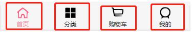
主要思路:把红色的部分当成一个个组件,而他们只是图片和文字不同,所以我们可以把他们封装成同一个组件,然后向组件里传入图片信息和文字信息即可(可以用插槽)。
//TabBarItem.vue
<template>
<div class="tabBarItem" @click="tabBarItemClick">
<div v-if="!isActive">
<slot name="item-icon"></slot>
</div>
<div v-else>
<slot name="item-icon-active"></slot>
</div>
<div :style="isActiveColor">
<slot name="item-text"></slot>
</div>
</div>
</template>
<script>
export default {
name:"TabBarItem",
props:{
path:String,
activeColor:{
type:String,
default:"pink"
}
},
computed:{
isActive:{
get(){
return this.$route.path.indexOf(this.path)!==-1;
},
set(){}
},
isActiveColor(){
return this.isActive?{color:this.activeColor}:{}
}
},
methods:{
tabBarItemClick(){
this.$router.push(this.path);
}
}
}
</script>
<style scoped>
.tabBarItem{
flex: 1;
font-size: 12px;
}
.tabBarItem img{
margin-top: 3px;
width: 24px;
padding-bottom:3px ;
}
</style>
接下来就是封装一个把这4个选项放在同一个地方的容器。
//TabBar.vue
<template>
<div class="tabBar">
<slot></slot>
</div>
</template>
<script>
export default {
name:"TabBar"
}
</script>
<style scoped>
.tabBar{
display: flex;
height: 49px;
position: fixed;
left: 0;
right: 0;
bottom: 0;
text-align: center;
box-shadow: 0px -1px 1px rgba(100, 100, 100, .1);
background-color: #f6f6f6;
}
</style>
再接下来就是使用了,给每一个不同的TabBarItem的插槽写入不同的图片和文字信息。
//MainTabBar.vue
<template>
<div class="mainTabBar">
<tab-bar>
<tab-bar-item path="/home" activeColor="#ff8198">
<img src="~assets/img/tabbar/home.svg" alt="" slot="item-icon">
<img src="~assets/img/tabbar/home_active.svg" alt="" slot="item-icon-active">
<div slot="item-text">首页</div>
</tab-bar-item>
<tab-bar-item path="/category" activeColor="#ff8198">
<img src="~assets/img/tabbar/category.svg" alt="" slot="item-icon">
<img src="~assets/img/tabbar/category_active.svg" alt="" slot="item-icon-active">
<div slot="item-text">分类</div>
</tab-bar-item>
<tab-bar-item path="/cart" activeColor="#ff8198">
<img src="~assets/img/tabbar/shopcart.svg" alt="" slot="item-icon">
<img src="~assets/img/tabbar/shopcart_active.svg" alt="" slot="item-icon-active">
<div slot="item-text">购物车</div>
</tab-bar-item>
<tab-bar-item path="/profile" activeColor="#ff8198">
<img src="~assets/img/tabbar/profile.svg" alt="" slot="item-icon">
<img src="~assets/img/tabbar/profile_active.svg" alt="" slot="item-icon-active">
<div slot="item-text">我的</div>
</tab-bar-item>
</tab-bar>
</div>
</template>
<script>
import TabBar from "components/common/tabbar/TabBar"
import TabBarItem from "components/content/tabbar/TabBarItem"
export default {
name:"MainTabBar",
components:{
TabBar,
TabBarItem
}
}
</script>
<style>
</style>
导航栏一般都在主页中使用,所以我们把这个导航栏放在App.vue
<template>
<div id="app">
<main-tab-bar></main-tab-bar>
</div>
</template>
<script>
import MainTabBar from "components/content/tabbar/MainTabBar";
export default {
name: 'App',
components:{
MainTabBar
}
}
总结:这样看来,我们写一个导航栏用了3个文件,这可能看起来是麻烦的,但这也大大提高了代码的可读性,如果我们还需要在该项目别的地方使用导航栏,我们只需要直接创建一个MainTabBar类似的文件,然后把你要的图片和文字写进入即可,甚至于在别的项目用到时,我们可以直接将文件拷贝过去就能够直接使用,连CSS样式都不需要我们去写,这就大大提高了我们的开发效率。
以上就是本文的全部内容,希望对大家的学习有所帮助,也希望大家多多支持。
以上是 用Vue封装导航栏组件 的全部内容, 来源链接: utcz.com/p/239722.html