在 Vue 中编写 SVG 图标组件的方法

在考虑了将矢量图标从图标字体迁移到内联 SVG 的 原因 之后,我在 Vue.js 中找到了一个用 SVG 替换图标字体的解决方案,同时仍能保持使用图标字体的灵活性和易用性——能够使用 CSS 轻松改变图标的大小、颜色以及其它属性。
一种流行的方法是使用 v-html 指令和 npm 模块 html-loader 来将 SVG 导入到我们的 Vue 模板中,并在 Vue 的生命周期函数 mounted() 中修改渲染的 <svg> 元素。CSS 样式可以直接应用到 <svg> 元素或者是其父元素上,并且这些能够组成一个可复用的组件。
创建 Svg-icon 组件
让我们创建 Svg-icon.vue 组件文件,并在里面接收三个 prop 变量。
- icon 是一个字符串类型的 prop 变量用来传递 .svg 文件名的导入
- hasFill 是一个布尔类型的 prop 变量来告诉组件 fill 属性是否用于更改 <svg> 元素的颜色,默认值为 false 即不使用 fill 属性
- growByHeight 是一个布尔类型的 prop 变量来决定 height 或 width 是否相对于 font-size 进行缩放,默认值为 true 即使用 height
<script>
function recursivelyRemoveFill(el) {
if (!el) {
return;
}
el.removeAttribute('fill');
[].forEach.call(el.children, child => {
recursivelyRemoveFill(child);
});
}
export default {
name: 'svg-icon',
props: {
icon: {
type: String,
default: null
},
hasFill: {
type: Boolean,
default: false
},
growByHeight: {
type: Boolean,
default: true
},
},
mounted() {
if (this.$el.firstElementChild.nodeName === 'svg') {
const svgElement = this.$el.firstElementChild;
const widthToHeight = (svgElement.clientWidth / svgElement.clientHeight).toFixed(2);
if (this.hasFill) {
// recursively remove all fill attribute of element and its nested children
recursivelyRemoveFill(svgElement);
}
// set width and height relative to font size
// if growByHeight is true, height set to 1em else width set to 1em and remaining is calculated based on widthToHeight ratio
if (this.growByHeight) {
svgElement.setAttribute('height', '1em');
svgElement.setAttribute('width', `${widthToHeight}em`);
} else {
svgElement.setAttribute('width', '1em');
svgElement.setAttribute('height', `${1 / widthToHeight}em`);
}
svgElement.classList.add('svg-class');
}
}
}
</script>
<template>
<div v-html="require(`html-loader!../assets/svg/${icon}.svg`)" class="svg-container"></div>
</template>
<style lang="scss" scoped>
.svg-container {
display: inline-flex;
}
.svg-class {
vertical-align: middle;
}
</style>
我们将 .svg 图标文件通过 require() 传递给 html-loader 方法,该方法会将文件字符串化,并且通过 v-html 指令将其渲染为 <svg> 元素。
所有对 <svg> 元素修改的地方都在 mounted() 生命周期方法里面。
- 将由 growByHeight 定义的 <svg> 元素的 height 或 width 属性设置为 1em ( font-size 的一倍)并对另一个元素使用 widthToHeight 。由于并非所有的 SVG 都是正方形的,因此我们从渲染的元素计算 withToHeight 比率,以便 SVG 在父元素的 font-size 属性大小改变的时候按比例缩放到其原始尺寸。
- 为了设置 <svg> 元素的 fill 属性,我们需要覆盖掉 SVG 文件内部附带的 fill 属性。当 hasFill 值为 true 的时候,我们从 <svg> 元素及其子元素中递归地删除 fill 属性。然后使用 CSS 选择器将 fill 值添加到其父元素或 <svg> 元素就可以了。
- 还可以向元素中添加例如 class 等其它 DOM 属性,这些属性可用于设置组件中的范围样式
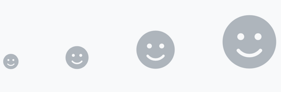
创建微笑图标
让我们使用 Font Awesome 和我们的 Svg-icon 组件中的图标字体创建一个微笑图标。
使用图标字体
<template>
<i class="fas fa-smile smile-icon"></i>
</template>
<style lang="scss" scoped>
.smile-icon {
font-size: 24px;
color: #aaa;
&:hover {
color: #666;
}
}
</style>
.smile-icon 类的 CSS 选择器以及伪类选择器 :hover 来设置图标的 font-size 和 color 属性。
使用 Svg-icon 组件
<script>
import SvgIcon from './components/Svg-icon';
export default {
name: 'my-component',
components: {
'svg-icon': SvgIcon,
},
}
</script>
<template>
<div class="smile-icon">
<svg-icon icon="smile-solid" :hasFill="true"></svg-icon>
</div>
</template>
<style lang="scss" scoped>
.smile-icon {
font-size: 24px;
fill: #aaa;
&:hover {
fill: #666;
}
}
</style>
上面的实现和图标字体方法相同,除了 .smile-icon 类在父元素中,在 Svg-icon 组件中, color 属性被替换为 fill 。我们还必须确保 smile-solid.svg 文件位于 Svg-icon 组件的 require() 方法指定的路径( ./assets/svg/ )中。
渲染成 HTML
这是由 v-html 的输出渲染的 HTML。注意:会删除掉所有的 fill 属性,并将 height 和 width 属性添加到 <svg> 中。
<div class="smile-icon">
<svg height="1em" width="1em" aria-hidden="true" focusable="false" data-prefix="fas" data-icon="smile" class="svg-inline--fa fa-smile fa-w-16" role="img" xmlns="http://www.w3.org/2000/svg" viewBox="0 0 496 512">
<path d="M248 8C111 8 0 119 0 256s111 248 248 248 248-111 248-248S385 8 248 8zm80 168c17.7 0 32 14.3 32 32s-14.3 32-32 32-32-14.3-32-32 14.3-32 32-32zm-160 0c17.7 0 32 14.3 32 32s-14.3 32-32 32-32-14.3-32-32 14.3-32 32-32zm194.8 170.2C334.3 380.4 292.5 400 248 400s-86.3-19.6-114.8-53.8c-13.6-16.3 11-36.7 24.6-20.5 22.4 26.9 55.2 42.2 90.2 42.2s67.8-15.4 90.2-42.2c13.4-16.2 38.1 4.2 24.6 20.5z">
</path>
</svg>
</div>
过渡到 SVG
由于 SVG 被认为是未来的发展方向,因此最好是在保留图标字体的易用性的基础上,逐步放弃使用图标字体。 Svg-icon 组件是一个例子,告诉了我们如何使用可用的库来抽离出 <svg> 元素中的混乱部分,同时模仿使用图标字体的好处!
总结
到此这篇关于在 Vue 中编写 SVG 图标组件的文章就介绍到这了,更多相关vue SVG 图标组件内容请搜索以前的文章或继续浏览下面的相关文章希望大家以后多多支持!
以上是 在 Vue 中编写 SVG 图标组件的方法 的全部内容, 来源链接: utcz.com/p/237046.html