CSS3 线性渐变 Linear Gradients
Gradients 是CSS3中新加入的一个功能,允许我们使用多个颜色作为网页元素的背景,还有多种变现形式,让我们不依赖于在网页中使用图片,也可以有效的减少网页的HTTP请求,优化网站代码,提高用户体验等,不过这个属性只是实验性的,而且兼容性不好,你可以根据你的网站的用户属性,酌情使用这个属性。
如果你要使用Gradients属性,你可能会想到最常见的两种渐变方式,线性渐变和径向渐变,这两种方法会在接下来的文字中相应的介绍。
创建Gradients渐变
在w3c的规范中,说明CSS3 的 Gradients 是一种图像,他没有像其它新发布的属性的新功能,所以他是使用 background-image 属性而不是文档声明的方式定义。
如果我们一起来看看Gradients 的语法,这看起来有点太多了,很复杂的样子,其实这是因为加入了浏览器厂商的前缀,达到兼容的效果。
div { background-image: -webkit-linear-gradient(top, #FF5A00 0%, #FFAE00 100%);
background-image: -moz-linear-gradient(top, #FF5A00 0%, #FFAE00 100%);
background-image: -ms-linear-gradient(top, #FF5A00 0%, #FFAE00 100%);
background-image: -o-linear-gradient(top, #FF5A00 0%, #FFAE00 100%);
background-image: linear-gradient(top, #FF5A00 0%, #FFAE00 100%);
}
参数讲解
让我们把语法的每一部分详细介绍弄清楚。
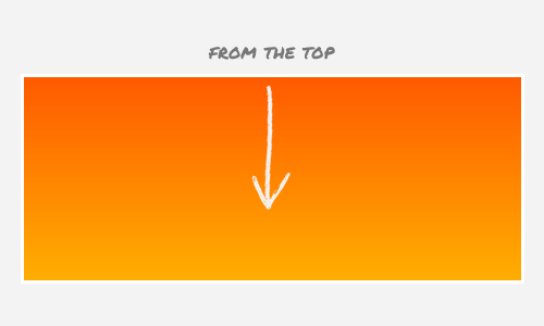
首先,线性渐变与linear-gradient()属性声明。这个功能有三个主要的参数。第一个参数定义渐变的起始位置。你可以使用一个描述性的关键字,如TOP(顶)开始渐变;

你也可以使用 bottom 作为起始渐变的位置,或者是 right 和 left。
点击这里查看示例
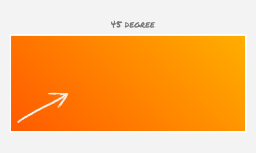
我们也可以创建有一定角度的渐变,这里有一个例子:
div { background-image: linear-gradient(45deg, #FF5A00, #FFAE00);
}
上面的片段将创建以下的颜色渐变:
点击这里查看示例
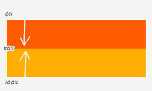
第二个参数会告诉第一颜色和它的停止位置使用百分比表示。停止位置实际上是可选的;浏览器有足够的聪明来确定适当的位置,所以当我们不指定第一个颜色的停止位置浏览器将用0%作为默认的值。
然后,下一个值是第二颜色组合。它像以前的值,只要它是最后的色彩应用,我们不指定停车位置,值100%将作为默认的。现在,让我们看看下面的例子:
div { background-image: linear-gradient(top, #FF5A00 0%, #FFAE00 100%);
}
上面的片段将创建一个像我们所看到的梯度早期(无差异)但现在我们指定的颜色停止位置;
Now let’s change the color stop, and this time we will specify 50% for the first color and 51% for the second color, and let’s see how it turns out;
div { background-image: linear-gradient(top, #FF5A00 50%, #FFAE00 51%);
}
点击这里查看示例
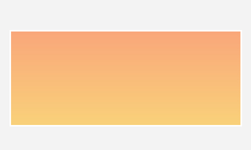
Transparency
Creating transparency in gradient is also possible. To create the effect we need to translate the color hex into rgba mode and lower the alpha channel.
div { background-image: linear-gradient(top, rgba(255,90,0,0.2), rgb(255,174,0,0.2));
}
The snippet above will lower the color intensity by 20%, and the gradient will turn out like this:
点击这里查看示例
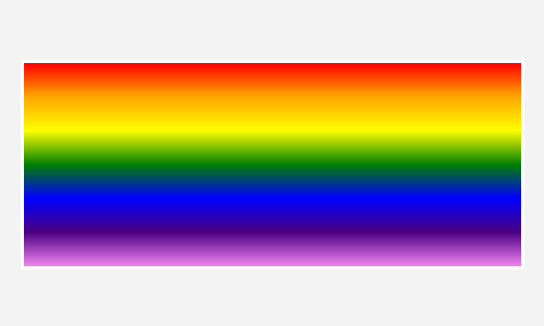
Multiple Colors
Should you want more colors to be added, just add the colors next to another with a comma delimiter and let the browser determine each color stop position.
div { background-image: linear-gradient(top, red, orange, yellow, green, blue, indigo, violet);
}
The snippet above will create the following rainbow.
点击这里查看示例
Browser Compatibility
Unfortunately, at the time of this writing, all current browsers have yet to support the standard syntax. They still need the vendor prefix (-webkit-, -moz-, -ms- and -o-). So, that is why the complete syntax appears like this:
div { background-image: -webkit-linear-gradient(top, #FF5A00 0%, #FFAE00 100%);
background-image: -moz-linear-gradient(top, #FF5A00 0%, #FFAE00 100%);
background-image: -ms-linear-gradient(top, #FF5A00 0%, #FFAE00 100%);
background-image: -o-linear-gradient(top, #FF5A00 0%, #FFAE00 100%);
background-image: linear-gradient(top, #FF5A00 0%, #FFAE00 100%);
}
On the other hand, the Internet Explorer, specifically version 9 and lower, is far from the standard. The gradient in IE9 and below is declared with filter, so if we want to add gradient on those browsers, we have to write something like this;
div { filter: progid:DXImageTransform.Microsoft.gradient(startColorstr=#FF5A00, endColorstr=#FFAE00);
}
The filter has its limitations: first, it does not allow more than three colors added, and creating the transparency effect is also a bit tricky – it does not allow rgba, but the IE filter uses #ARGB;
div { filter: progid:DXImageTransform.Microsoft.gradient(startColorstr=#33FF5A00, endColorstr=#33FFAE00);
}
Here is a tool to help you convert rgba to #ARGB.
以上是 CSS3 线性渐变 Linear Gradients 的全部内容, 来源链接: utcz.com/p/231959.html